
Working Large
Working Large
Working large begins small. A few thoughts on murals and other unusual projects!

Happenstance
Once you open your door as a full service graphic design studio there will be calls for every kind of artwork need imaginable, many beyond the ordinary. Numerous projects have materialized over the years:
Gold leaf on windows. Yes!
White ink on wood paneling, enamel on porcelain, sumi on vellum. Of course!
Startup branding, logo design, architectural elements. If the shoe fits…
Wordmark design in neon tubing for a Fortune 500 company. Absolutely!
A formula one racer was destroyed in a fiery crash at Laguna Seca. I traced the blackened lettering off the wrecked quarterpanel and made a fresh template for the new quarterpanel. Done!
The scales of justice drawn in detail and scaled to a one-inch brass die to be blind-embossed on a letterhead. No problem. It came out well!
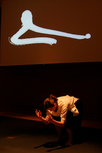
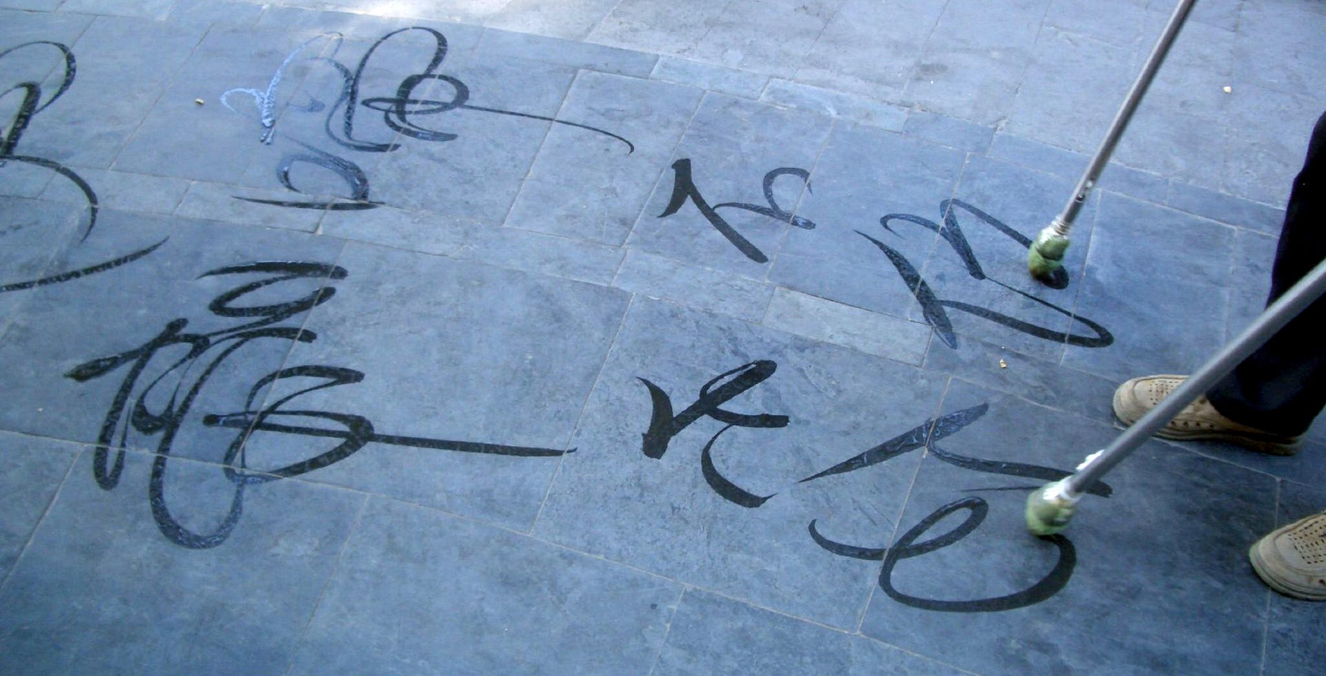
A roll of washi with eastern style kanji and brush stroke elements creating a video background for a master’s dance performance, deadline in 3 days. Yes, we’ll figure out the details! (see image below)
A series of murals for a new public library building. Yes!
The answer is almost always Yes. Relying on strengths, experience, known quantities and doing the research on every new detail as it comes.
Being prepared for whatever might come to you is important, especially when it’s challenging, requiring new equipment, new moves, highest quality, and on time. Be sure to own the project and be proud to sign your name to the result.
Murals
The first time I painted a large public board was shortly after I opened my door in 1979. It was a 4 x 8 foot plywood wall menu for a new restaurant in Burlingame: Danilo’s. Lots of vines and grapes around the edges and the best lettering I could do. I used what I had: Grumbacher oil paints. There’s a photo somewhere…
My second mural came in 2004. A family was expecting a child and wanted a colorful mural above the crib. It was based on an illustration in the mother’s childhood storybook. I copied the illustration and added the boy on the right tossing a ball to the family’s dog Millie and developed the scene using acrylic tube paint.

In complete contrast, a commission from the startup across the hall from my office in 2006 required some type and a hard edge image. I produced a digital file from their artwork, then had a die-line printed to scale which I transferred to the wall using Saral transfer paper. Filling in with gray paint was next, and getting those ovals to line up as I was painting was difficult. The company’s logotype went down easily with an adhesive transfer stencil.

Also in 2006, this mural project was designed to catch the candlelight in a formal dining room, directly over a classic portrait of the client’s late wife. A wide-format printed die line provided a loose guide for transferring the design using a pounce wheel and light dusting of powder through the holes. The surface was extremely sensitive to any extra marks. I painted the text directly on the dark cinnabar walls using rich gold acrylic paint and a 1/2 inch flat brush. On some of the letters I applied 23k patent gold leaf for areas of brighter reflectiveness. The irregular and eclectic text was the client’s choice, and there was no leeway for adjustments of any kind on the wall surface.

A fascinating video project appeared in 2012. Interestingly, the client was doing her master’s thesis in choreography at Stanford. She had just returned from Beijing and her dance concept was based on the movements of dishu, or ground-writing, which she had observed on that recent trip. We had 3 days to produce the work, so we pooled resources. I took a long roll of 18” wide rice paper and stretched it across a sheet of heavy glass between two sawhorses. The client’s partner, a videographer, positioned himself under the glass, camera pointing up. We placed two very bright and very hot workshop lamps on either side of the glass. I wrote on the entire roll in sumi, section by section, as the client (pictured below) scrolled the paper. I tried to capture the slow dance-like movements of ground calligraphy artists as well as pulling forms from ballet and shodo. Finally, the black strokes were reversed digitally and projected as white on black on the theatre screen during her well-attended hour-long performance at the theatre in the Stanford Museum.
Typographer and author Francois Chastanet has since written an excellent book on Dishu (2013) which I read and later used to develop a workshop on ground writing for a workshop at the San Francisco Center for the Book.
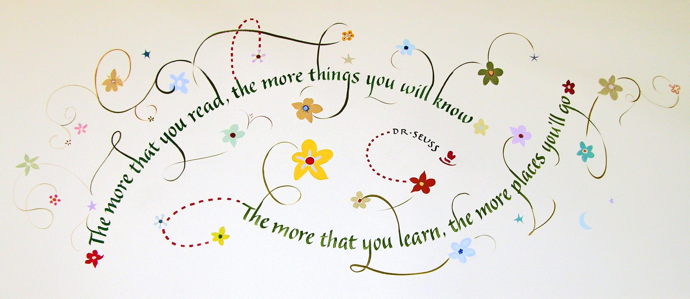
The lead photo in this blogpost, along with the following images, represents the mural project I did in 2006 for the Belmont Library. Working with the library staff and the architects, a group of quotes was selected for the walls. The high-ceilinged rooms meant climbing on tall wobbly scaffolding, with the lowest work 10’ above the floor. The most difficult part of working on this scale was figuring which brush to use for the letters in order for them to be seen well, in the right proportions, at a distance of 200 feet.
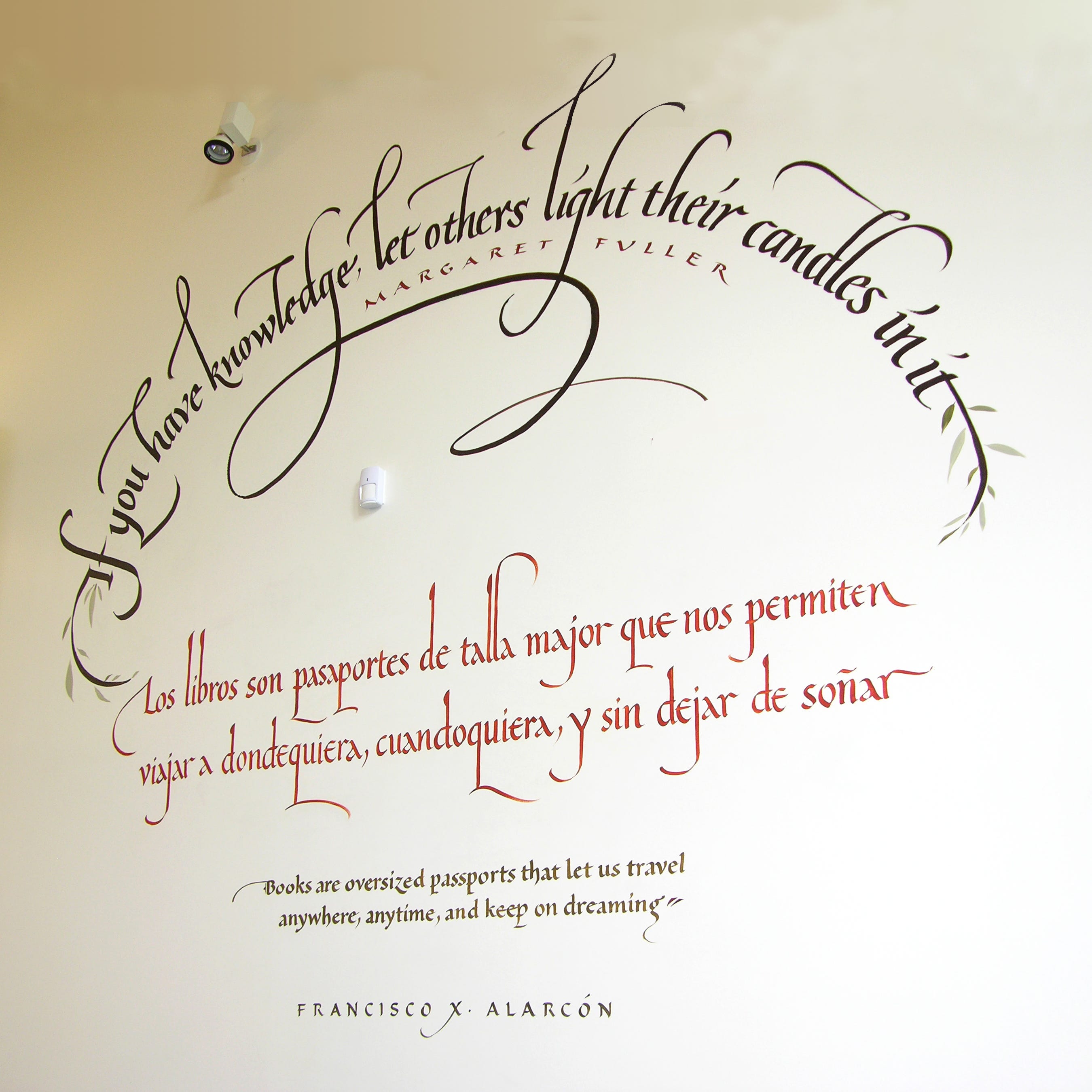
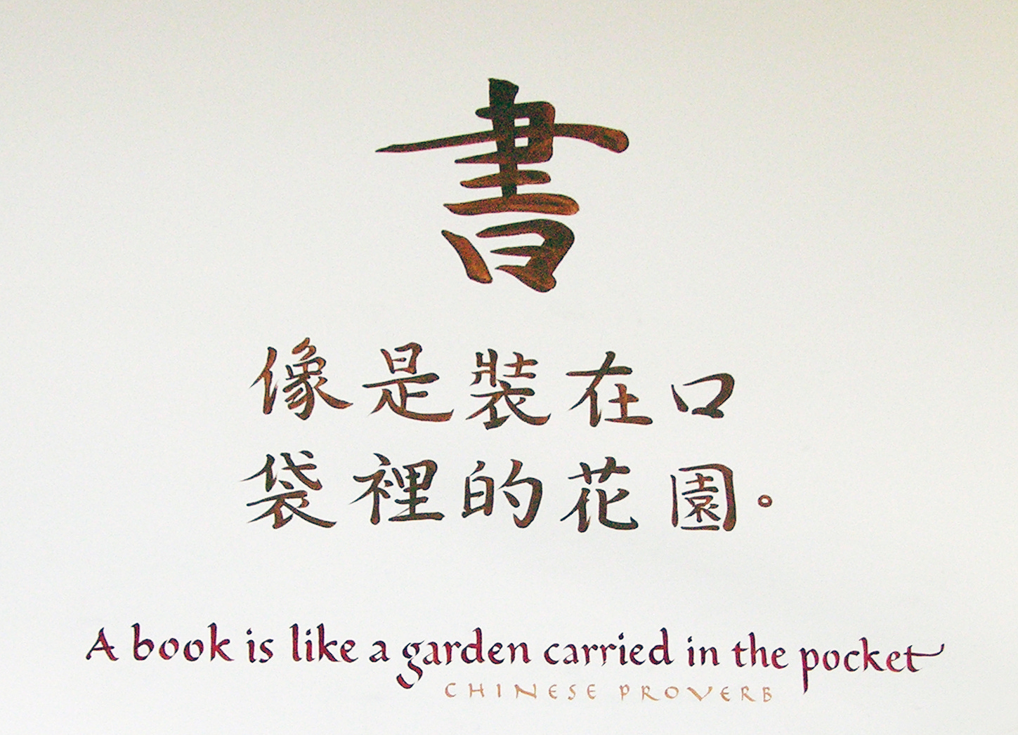

It was great working on these walls when the building was empty, before the furniture was installed!
If you’re in the Bay Area, Silicon Valley Open Studios is happening the second weekend of May (Sat 11th - Sun 12th) in San Mateo in my studio (part of Peninsula Studios) on North Idaho. Small to large paintings and drawings will be available for purchase. Complete information will be forthcoming soon.
Thank you for liking and sharing Getting Inky! I welcome your free or paid subscriptions.
If you are also working, keep bringing your words to life! Stay inky.
©Ann Miller 2024. All rights reserved.
Impressive! Thanks for sharing.
Jane Brenner
Beautiful work, Ann. Enjoyed your remarks too!