If you have something to say, say it.
Today’s post is about the choices we face when uttering words is not enough. Sooner or later, the words must end up on the page.
A “text art” project is organized, a visual design. It can come as a reply to a formal prompt or mandatory school assignment. It’s natural to doodle a few favorite words or current thought, or you might just have to indulge yourself and write out that earworm that won’t stop bugging you. You might just end up writing your name, as we often see in the ubiquitous tags of graffiti artists, telling the world you’ve “been there”, along the lines of WWII’s famous image of Kilroy. Or if you are a poet who pulls words together in all the right order, dancing effortlessly through the streaming space, let your words be written to endure.
Get your words together.
Assuming you have a pencil at hand, jot down the words on paper as a rough draft. Already there are decisions to be made:
How big is your final page? The size of your hand or even smaller, or a wall by Anself Kiefer? Kiefer’s huge work (Ducal Palace, Venice, 2022 installation) quotes Venetian philosopher Andrea Emo: “These writings, when they are burned, will finally give some light.” Read about this painting, and much more, here.
What is the surface texture? Is it paper or another material, interior or exterior, permanent or temporary, soft or fibrous or hard and slick, or uneven and porous? You test your medium and your tools for compatibility, ease of application and receptivity of the material.
What feeling do you want to achieve? This shodo brushwork of the Japanese word for “ocean” takes the effect of bleed to the most extreme limit with a combination of diluted sumi and an absorbent washi panel. The strokes crossing over each other combine with the lag in drying time to create a shadowy overlap, a three-dimensional effect at each junction. The ocean image is flowing with a sense of water and kelp.
How many rows of text should there be (for balance): one, three, seven, or a single word per line, as in some of Larry Eigner’s groundbreaking poetry work in the late 20th century?
Where will the words be located in relation to the margin, that transitional area between the image on the page and the rest of the world? Flush left, centered on the page, flush right, randomly placed with attention to flow and balance, or designed cleverly to make a point (or a shape, or even a volume, or some aspect of kinesis)?

How much margin should there be, if any? Habitually, we use a standard margin that rings the text image in white space, perhaps an inch all around with a bit more at the bottom for optics, as found in most of today’s printed books. A giant margin will leave a small area for text, drawing the eye to focus without disruption on the contents, which should be meticulously designed, an isolated gem. Conversely, having no margin allows the text to bleed off the page on any or all edges, with the result that it is seen as a detail of the larger world and contiguous with the immediate surroundings and outward.

How large do the letters want to be? Will they be seen from a distance by crowds of people, or held close by one. Will refinements make a difference in the visual texture? What emotion is carried by the words? How bold, how heavy, how light? How solid, how delicate? We have an idea, but practical concerns will let you know which size of tool you will be able to use. Do you have it now? If not, go get it, or make it! There are tools for every feeling, and some will work for you while others may not.
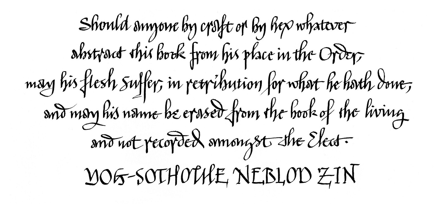
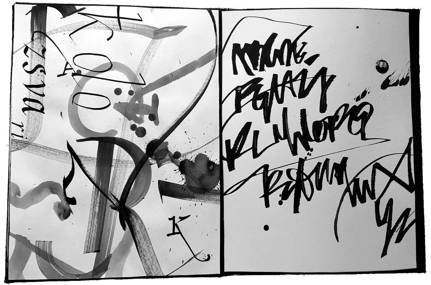
What script will you choose? The answer depends on your exposure to text, environment, education, sensibilities and sensitivities, knowledge of letterform history, street wisdom, your motor skill level, your general gumption and will to live and be known, and the extent of your passion for personal expression. You might choose a style such as block lettering, uncial, cursive freehand, slanted, backslanted, carolingian, gothic, polyrhythmic, wedding script, graffiti, asemic, formal Roman capitals, or any of the Eastern or brushy non-Latin scripts. The list goes on and on and on, since we’ve been writing for thousands of years. Your own script is linked inexorably to the tools you love to use and the singular qualities of your own individuality. Explore and find your visual voice, the one that is not written on the wind. Then let it develop.
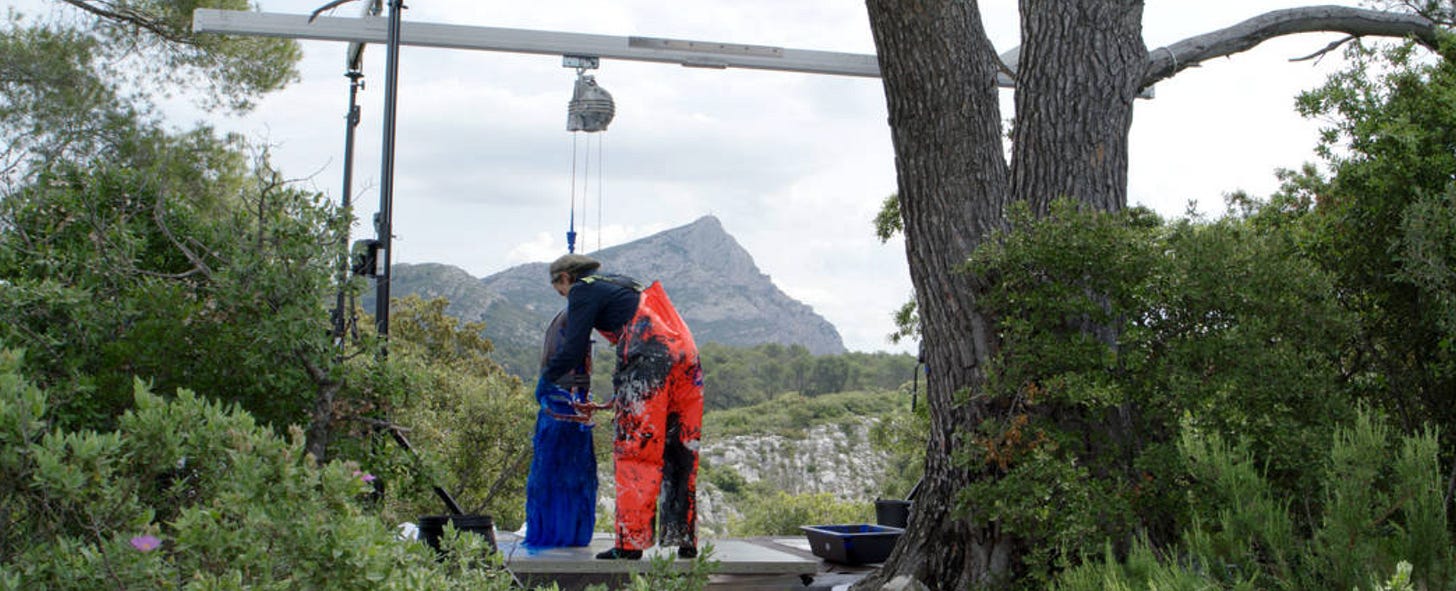
Of note, since we’re talking about tools, is the single-minded expertise of Fabienne Verdier, whose calligraphic work deserves a longer discussion! She develops and uses suspended giant shodo brushes as an assist to convey paint onto her canvases.

Our choices define our lives. What is written down persists and is there for the others. It is the footprint we leave behind. It shapes the future, echoing down the proverbial halls of time. So it is not a small thing to ponder whether to pick up a No. 2 pencil or to go for the 6B. To use a margin or not. Exercising freedom on any scale is important. Fashion, fad, and trend do not apply to this adventure.
Calligraphy Workshop
REGISTRATION DEADLINE EXTENDED TO TODAY, SUNDAY, AUGUST 16 by 9pm!
JOIN IN! There is still time to sign up for my local workshop on Tuesday 19th! It’s specifically designed for beginners, crafts enthusiasts, and people who like to set a nice table (even at a picnic). Click link above.
Thank you all for reading and enjoying my posts. It’s great to be here with you.
NOTE TO ALL: This blogpost on Substack will always be free. Upgrade to Paid for interactive activities, individual comments and discussion, and exclusive articles. Your contribution is always immensely appreciated, and helps keep things coming your way. All images copyrighted by Ann Miller unless otherwise noted.
PAID SUBSCRIBERS: All paid subscriptions are now $75 annually or $7.50 monthly. I am eager to devote time to interactive projects and individual discussions on this basis. For you, it’s an ongoing investment in your research and graphic skills in the book arts, handwriting, and letterform/calligraphy. I will be posting exercises that you can follow and work with on your own and upload for feedback.
EDUCATIONAL DISCOUNT: I’m now offering a special 50% discount on the annual paid subscription for art instructors [you@your school.edu] and those in the art education field.
A paid subscription gives you access to ongoing conversations on my chat feed, permanent access to all archives, and access to exercises and how-tos. Let’s continue to talk about art and keep it fed, nourished, and productive.


I think I'm full of both! Nice presentation, Ann. Recently had cataract surgery so have been out of the loop of late. Have a great workshop!
R