


Weaving, a Theme
Warp and weft, a reliable scheme!

Two parts as one
When looking for a way to begin a drawing, we often imagine the metaphor of the loom, the framework of vertical strings that will hold the horizontal patterning. Text art is closely related to textile, and not just etymologically (Latin: textilis, meaning “woven”). In design we often refer to the fabric of the elements as they relate on the page. Because we read and write, usually between guidelines, we are imprinted with a naturally evolved sense of the grid, and it’s there, underlying everything, in varying degrees of visibility.
Recently I have been collecting some work for an upcoming retrospective article. Going through decades of images I noticed many of my pieces were based on the idea of something woven. I seem to return to the subject of interwoven patterns, a real string theory.
A sketchbook doodle from many decades ago that I called The Weave.

Another sketch from way back shows a zipper-like composition.

Even my representational drawings and paintings contain woven elements, as in this detail of my watercolor of the preening egret.

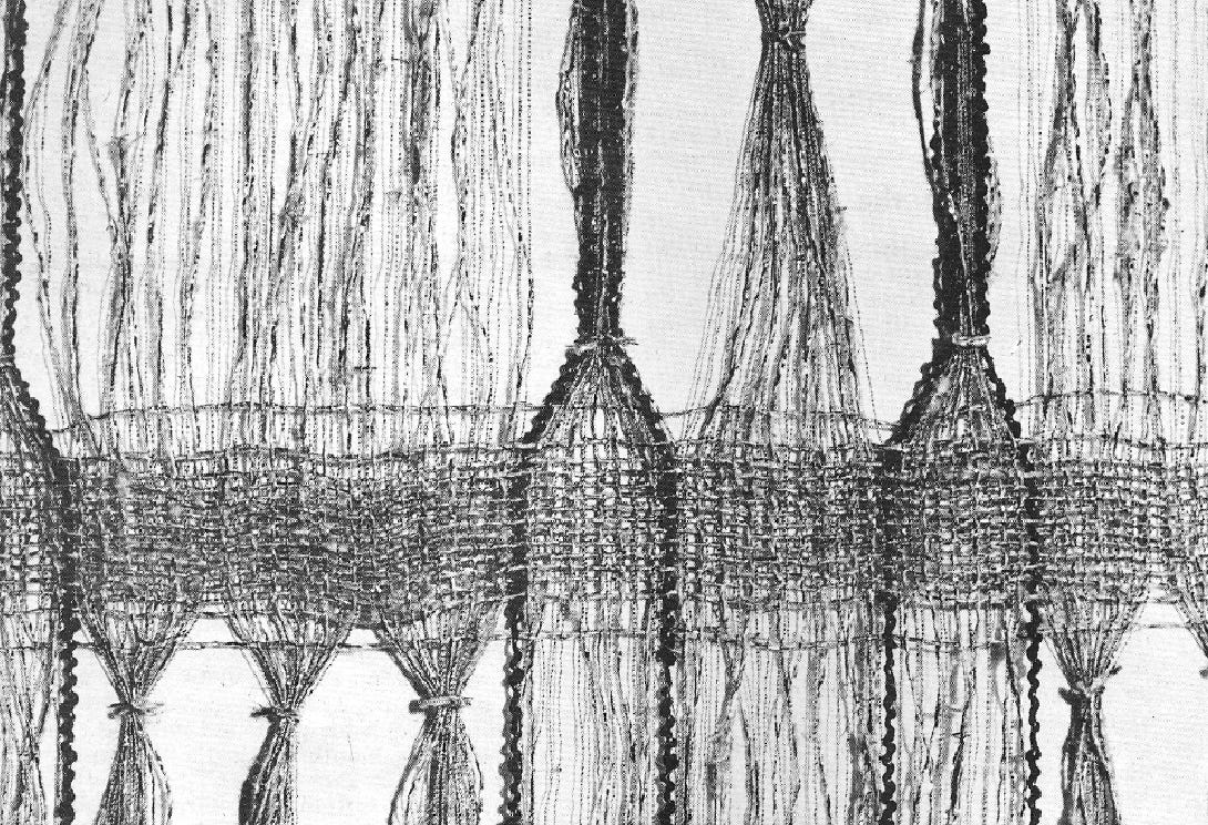
And sometimes the subject is all about the weaving itself. This Prismacolor and charcoal drawing is of one of my Chinese baskets.

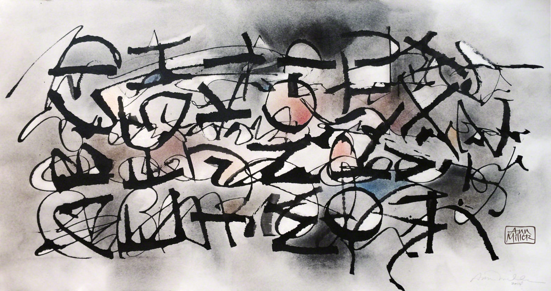
When showing students a way to practice letters with a ruling pen (while also saving paper) I came up with the following result, which is basically overlapped writing in two directions. First, I wrote several horizontal rows of minuscules across the page, followed by a 90º rotation of the page and more horizontal rows of capitals in a contrasting weight and style. The grid holds it together and presents an opportunity for interwoven color and shading, creating a sense of space. The more you use this overlapping method, the more careful you become about where you place your strokes in relation to each other, bringing attention to the spaces formed between and within the lettering. The effect is energetic due to unfettered movement. The goal is 1) to enhance the layers for better overall balance, and 2) to discover how you can work differently, turning routine practice into something that contains movement, color, atmosphere, spatial depth, mood and, most importantly, surprise. Doing this exercise is a powerful learning experience.
Texture is another way to address your surface. Using gesso and a scoring tool, I crosshatched pattern into the neutral background. I brushed my initials AM in red Phoenician symbols, later adding wavelike patterns that allow the underneath to show through. I think this piece will benefit from another layer.
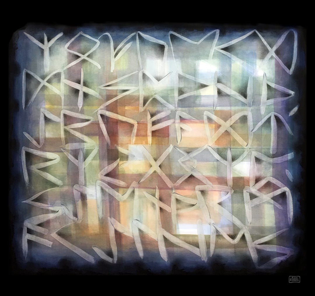
An abstract composition, using Elder Futhark runes as structural elements, the plaid panel of vertical and horizontal strokes provides a framework for the floating and yet connected runes. I painted the runes first using transparent matte medium, then the stripes of watercolor were applied over that resist layer followed by charcoal shadowing. In fabric, everything is connected.
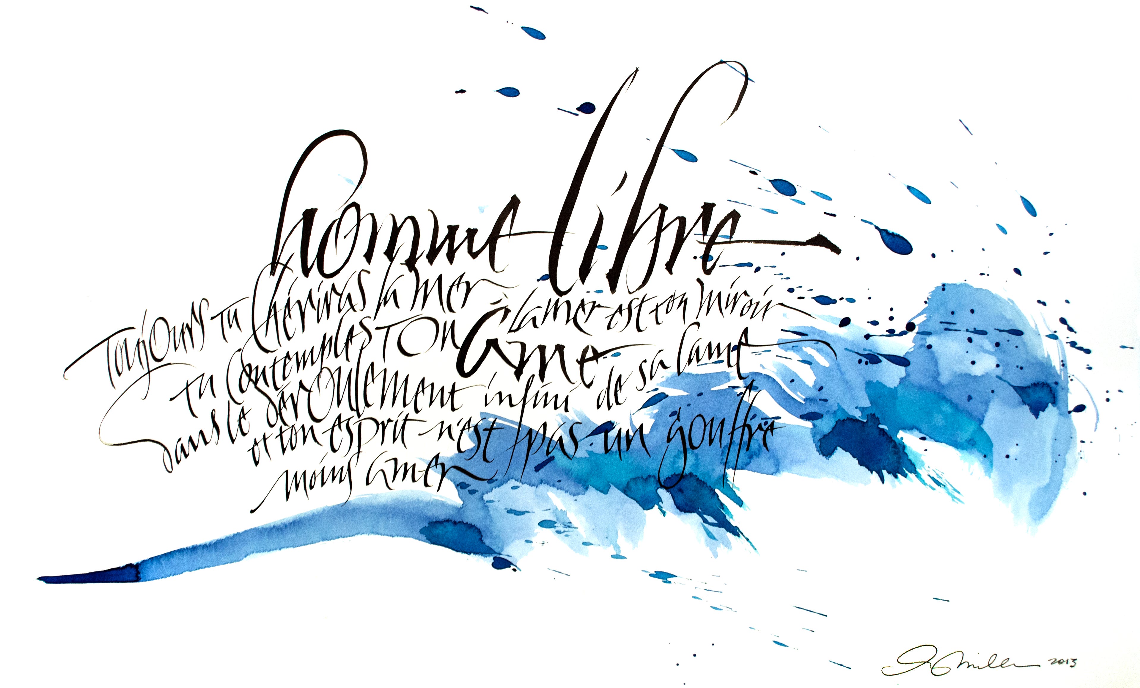
The grid can be as flexible as a piece of gauzy cheesecloth. It doesn’t have to be drawn if you can see it in your mind’s eye. This quote from Charles Baudelaire (L’Homme et La Mer) was written freehand, with all “guidelines” formed by imagining curved or wave patterns, and allowing the lettering to grow and shrink according to some poetic cadence creating a hierarchy of importance. The blue watercolor stroke was laid down first and allowed to dry. The text was written spontaneously.
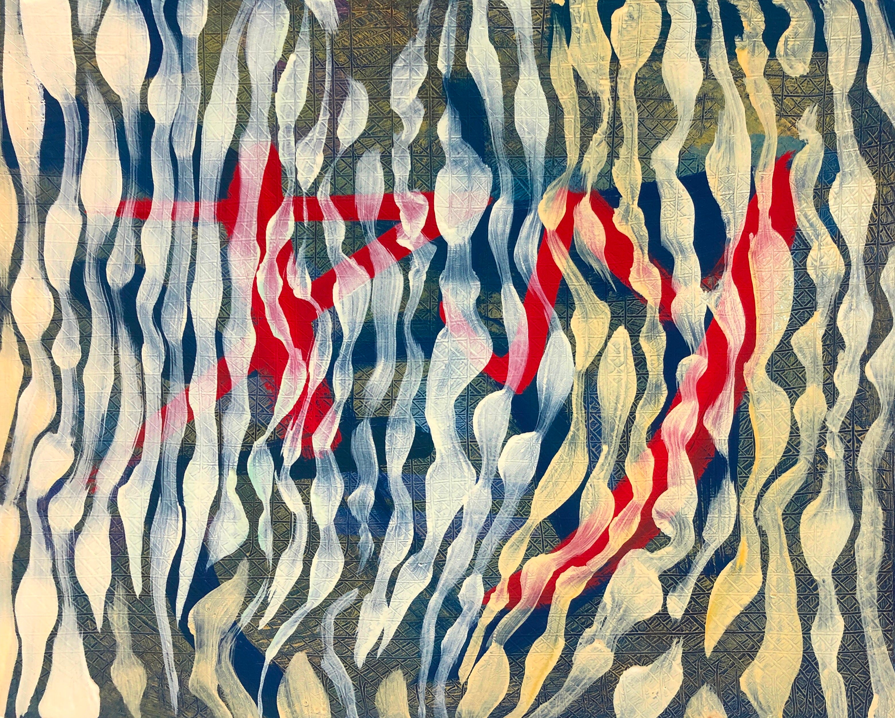
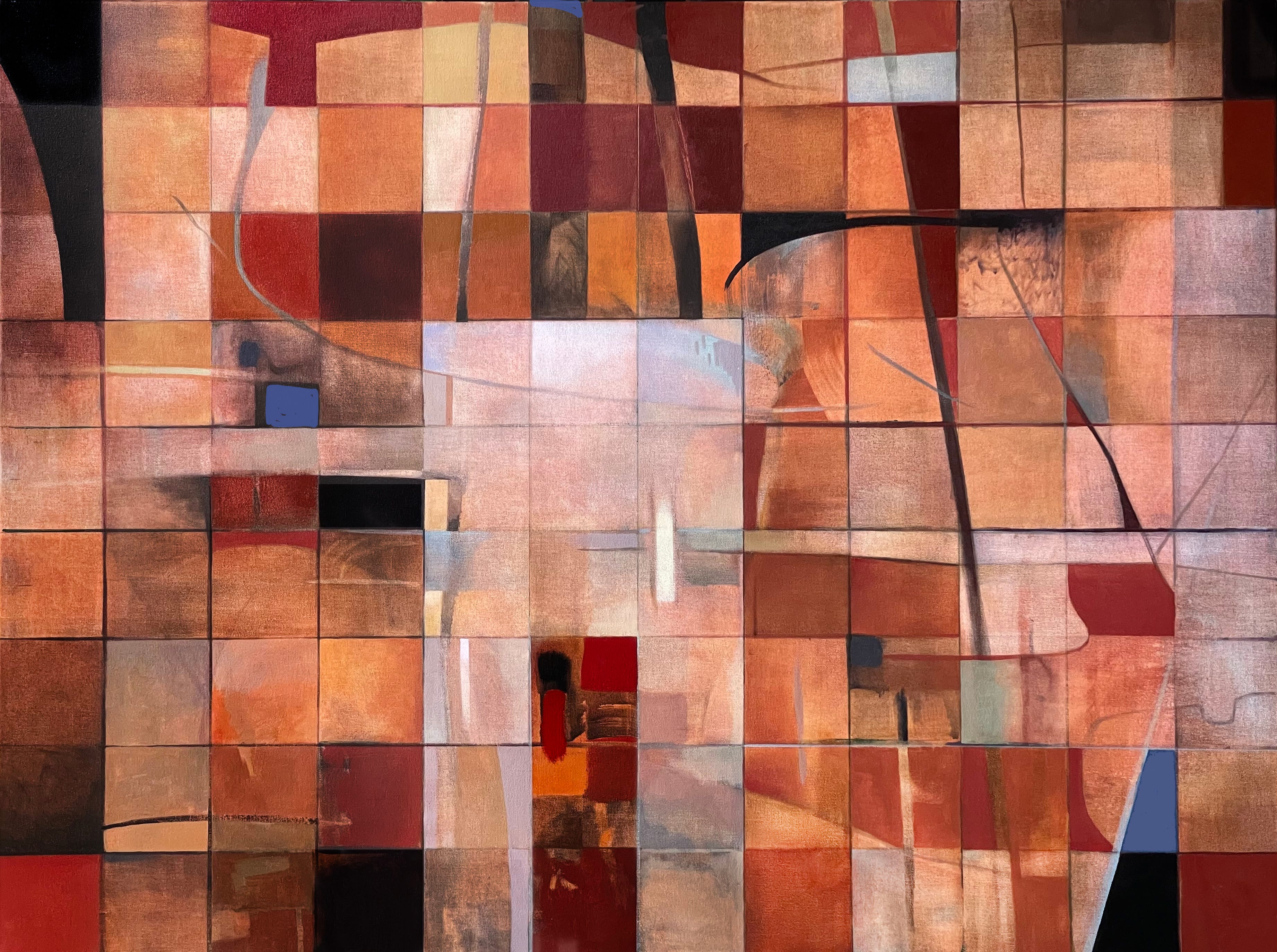
Janus Weave, 2018. Sometimes a painting just weaves together like strips of colored paper in a collage, with a sense of fabric creating strong shapes and more subtle threads in the strokes.
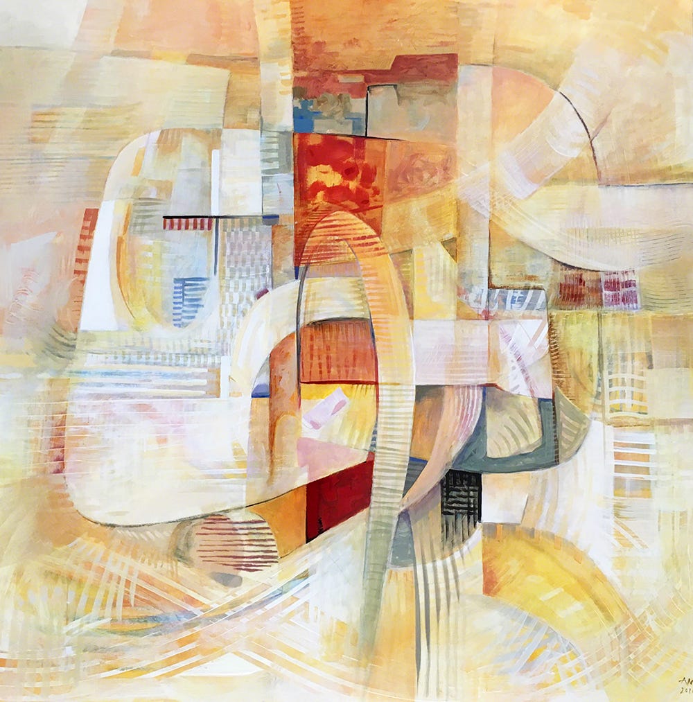
And sometimes the grid will be the starting point, as in the case of Congress, which began as 108 squares that began to suggest organic and architectural forms as the painting evolved, forming pathways for the eye to follow, subtle colors to entertain.
Remember warp and weft when you sit down to draw. It’s your built-in talent!
Thank you all for reading and enjoying my posts. It’s great to be here with you.
NOTE TO ALL: This blogpost on Substack will always be free. Upgrade to Paid for interactive activities, individual comments and discussion, and content-rich articles. Your contribution is always immensely appreciated, and helps keep things coming your way. All images copyrighted by Ann Miller unless otherwise noted.
PAID SUBSCRIBERS: All paid subscriptions are now $75 annually or $7.50 monthly. I am eager to devote time to interactive projects and individual discussions on this basis. For you, it’s an ongoing investment in growing your graphic skills and supporting your performance in the areas of book arts, handwriting, letterformation, and calligraphy.
EDUCATIONAL DISCOUNT: I’m now offering a special 50% discount on the annual paid subscription for art instructors [your school.edu] and those in the art education field.
A paid subscription gives you access to ongoing conversations on my chat feed, asking questions, permanent access to exercises and how-tos and all archives. Let’s continue to talk about art and keep it fed, nourished, and productive.