


Watercolor and Resist
We join the resistance one way or another.

Special Effects, Part II
Throw a little surprise into the works.
Last week I wrote about using salt to create new textures when working with watercolor. Today we’ll look at various kinds of resists you can use to expand your watercolor skills, creating decorative papers for calligraphy, further painting, and collage elements. Those who enjoy the complexities of paper marbling may be intrigued by the asymmetrical effects of using resist techniques.
Resists
Anything that is not water soluble will repel or resist ink and watercolor. Matte medium, wax, tar, grease of all kinds, acrylic ink, and even oils from our fingers will adhere to paper and prevent the absorption of moisture. Oils from the handling of paper by those with sweaty or grimy fingers will show up forensically the minute one tries to apply ink to a sheet!
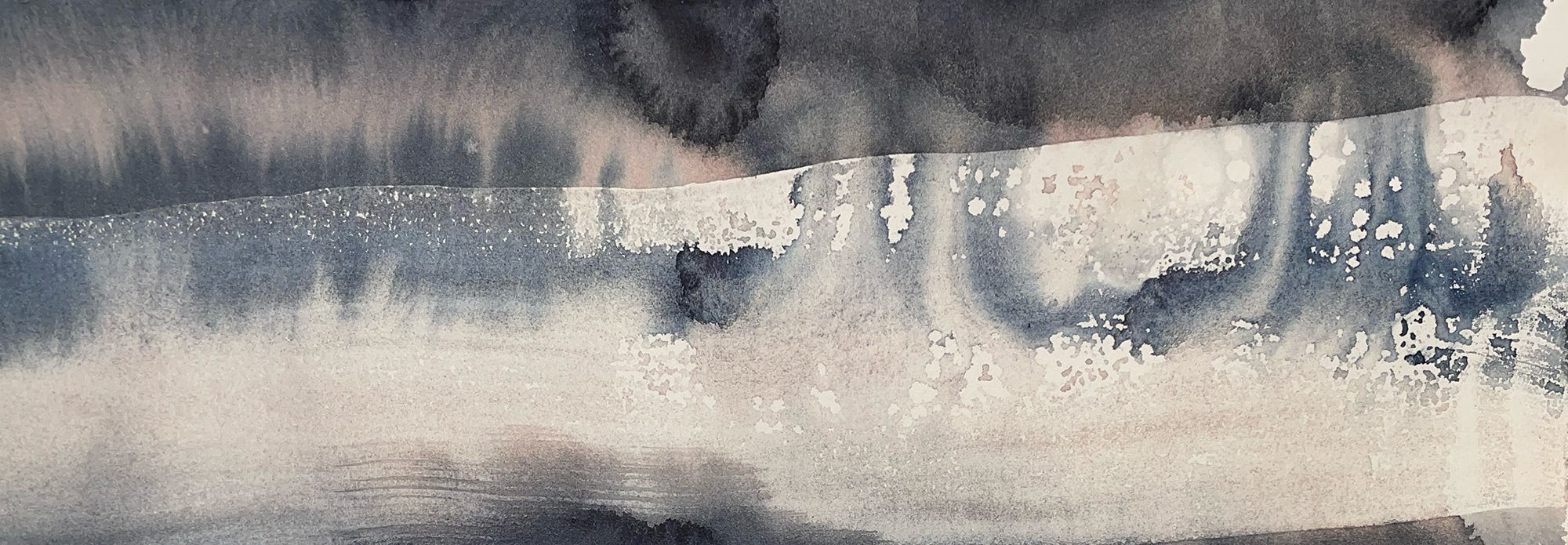
Fluid Matte Medium by Golden has great holdout, flow, and consistency. Since I do a lot of calligraphy, I often use it full strength for lettering or graphic elements to protect the white of the page. It will not sink into the paper, so there will be a ridge when it dries, but it will stay where it’s put, and will repel water-based media layer after layer. If the medium is diluted to the consistency of heavy cream, it can be spread across a large sheet of good paper with a large wash brush or hake, creating the type of texture you see in the banner image above. It will be much flatter than the 100% undiluted medium. The only drawback is that ink will not adhere well to acrylic media on a subsequent layer, so if you want detail and precision it’s best not to write across it, especially with pen and link. Always test on a small area to scope out your process; patience is rewarded with satisfaction.
Here is a sequence of three images showing steps you can take using matte medium:
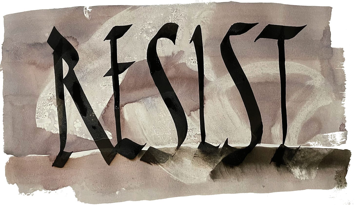
Wet your large hake (Japanese flat brush) or your wash brush and then dip it in diluted matte medium mixture. Work a few gestural strokes on your page. Once it dries you can take a large wash brush and go across the resist area to reveal the image.
Diluted fluid matte medium with watercolor wash Once the image is scanned, it can be used as a background. In the image below I drew with a digital brush in Rustica script. The overlay is naturally opaque/solid. I increased the contrast and saturation of the background in Photoshop.

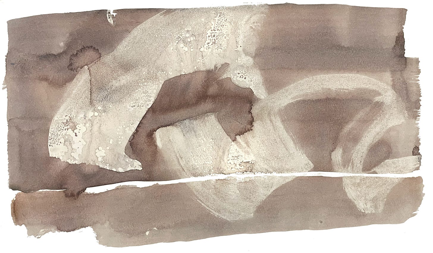
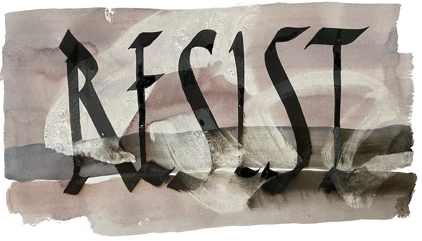
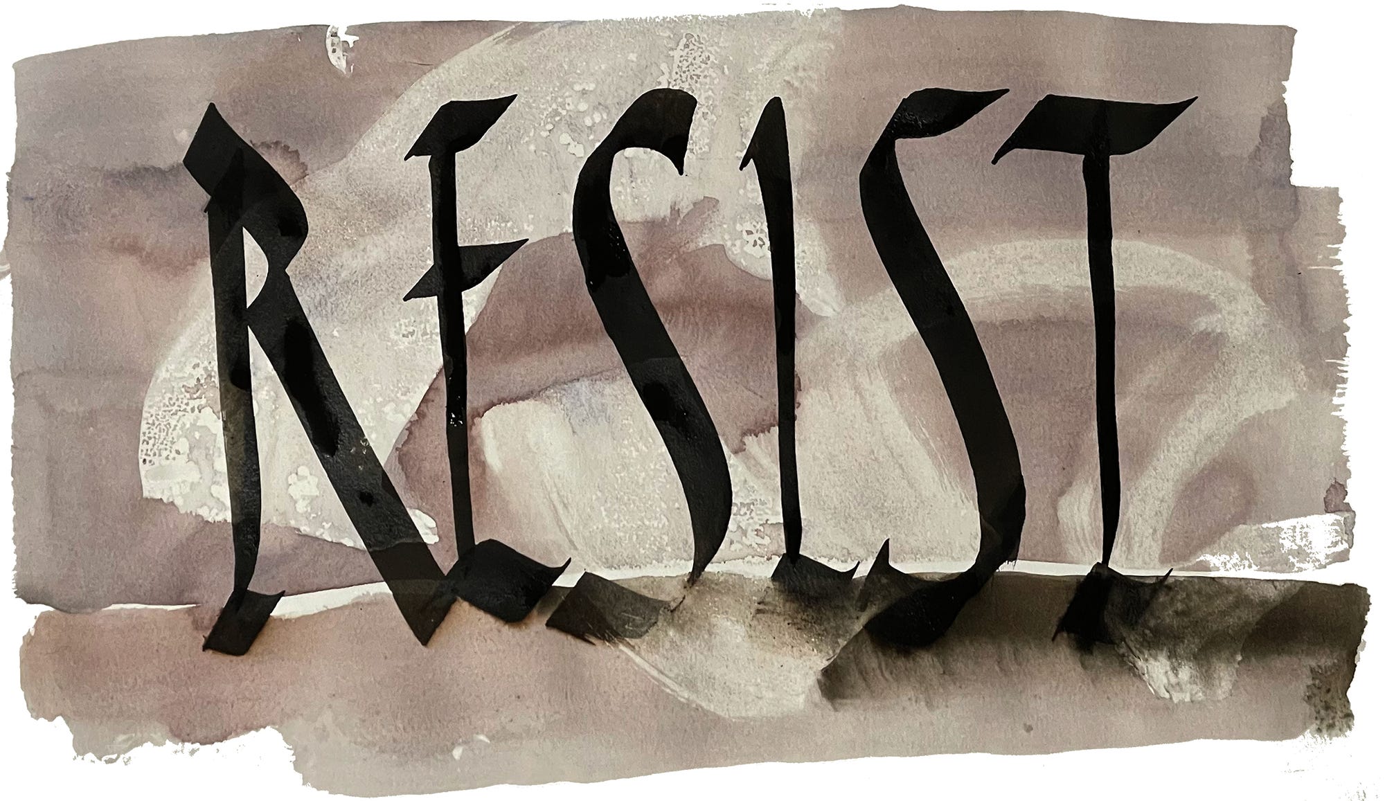
Background with digital Rustica lettering added on a separate layer After working with the digital lettering, I returned to the watercolor page and used an Automatic #6 pen, similar to the digital shape, to write the same word. Now, with much more control over the stroke placement and speed, I needed no ruled guides or pencil marks, just freehand sumi lettering. At this point the shapes between the letters should get your full attention! Mind also how the terminals of letters meet. Don’t worry if the nib catches or slips on your page. Let it be. It is always a test of momentary reaction vs. ultimate goal. When the ink was mostly dry, I took a 1.5” hake, wet with clear water, and drew it across the lower section, below the white linear element and in the same footprint as the base stroke, knowing some of the ink would bleed out as it was not quite dry. The ink blended into the stroke, merging to create spatial depth and mood with its dark contrast.
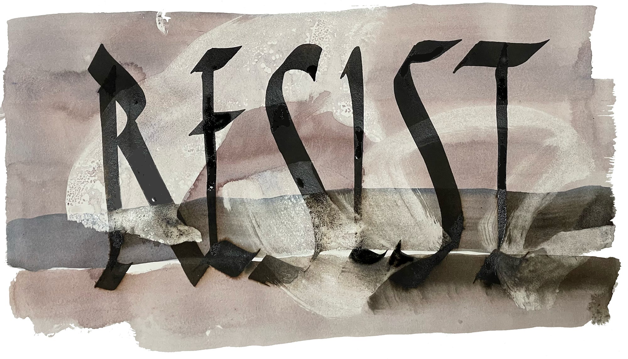
Water added to lower strip, allowing damp sumi to blend out naturally Finally, I introduced another stroke in a bluish tone above the white horizon line. The indigo tone tends to recede spatially. This stroke augmented the white resist with more contrast, bringing out the motion and texture detail. Traditionally we learn to paint from background to foreground, but with resist it is possible to paint forms in the distance at the very last.
A blue-toned stroke created a sense of distance “behind” the text


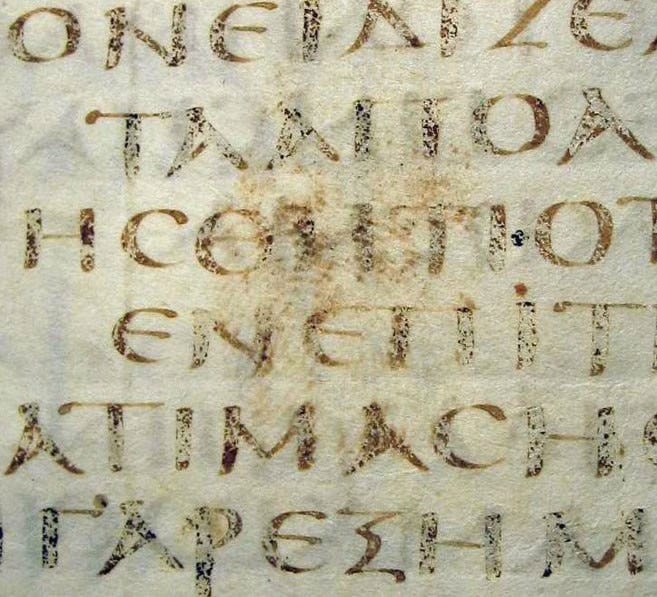
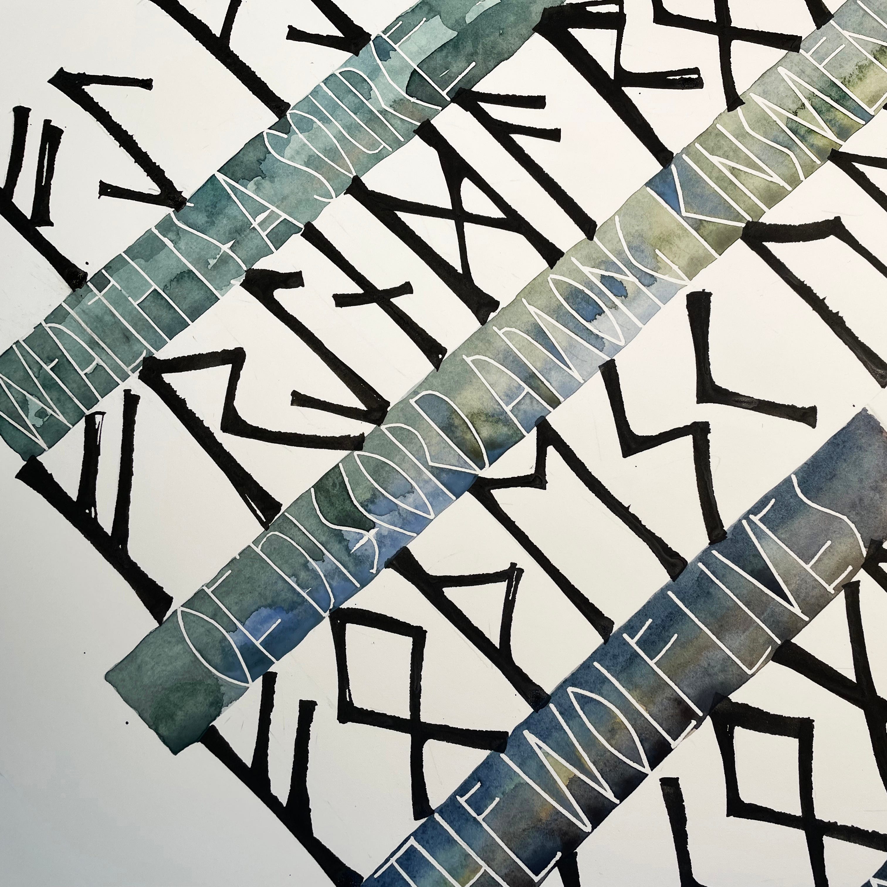
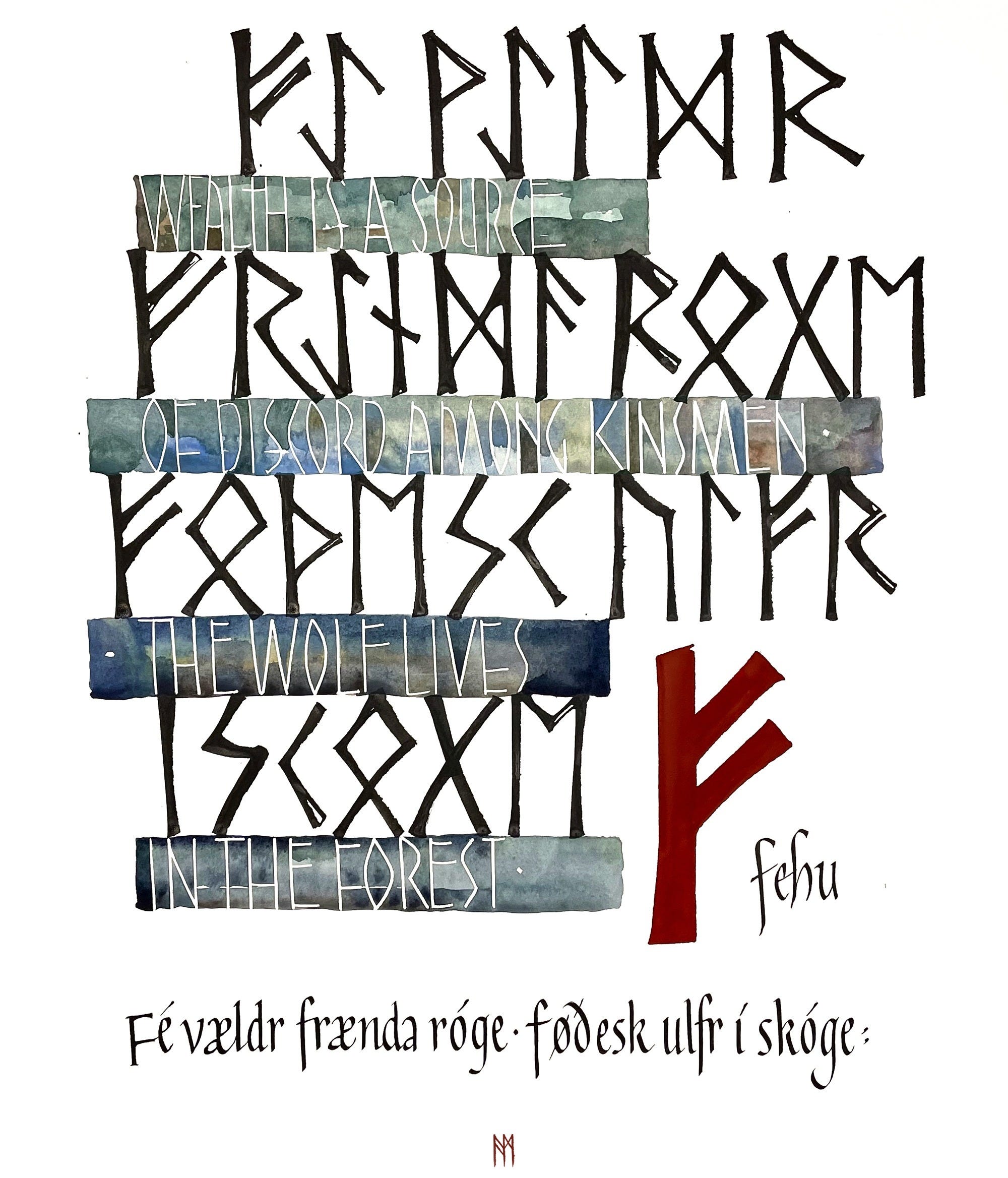
Pebeo Drawing Gum is latex-based. It has the benefit of being able to be removed after subsequent layers of watercolor have dried. Here is an example, a detail of my calligraphy piece “Fehu” based on an Anglo-Saxon rune poem. I lightly penciled the guidelines and used a drafting style ruling pen filled with the liquid latex drawing gum to draw the letters in English between the rows of runes. The gum is slightly tinted blue, so you can see what you’re doing. Then, you can take your time with the wash, starting light and then beginning to introduce more intense color and shade. The resist will not budge. Let it sit overnight and add further bits of color. Watercolor tends to be less intense when it dries, and can use some punch up! The gum sits up on the page, so it’s easy to work up to the ridges cleanly. When satisfied, let the piece rest until the watercolor is fully dry, and remove the gum with a rubber cement pickup. It is elastic in quality, and should pull off easily.
Acrylic paint will also act as a resist, accepting washes and other treatments to build a broadside design. This collection of Berber language tifinagh signs has one layer done with brush and white acrylic paint. If watercolor dries on top of acrylic paint, it can be lifted off with a Qtip, tissue, or damp brush to increase contrast and manage the nuances and modulation of color. Pigments with aniline dyes like Phthalo Blue have high staining power and will sink into acrylic paint and cause permanent coloration. Just be aware. One cannot know enough about color physics and interaction. Some colors will not photograph accurately (especially in the indian red and brown sectors), and some will pose no problem. Be aware!
Prismacolor pencils and white China markers are also great for beginning a page. They provide strong motion that contrasts well with more refined script elements. Just let it evolve according to the idea you have in mind for the text. Both of these tools are waxy, and marks will stay on the page and resist the watercolor. Use them for borders or to roughly avoid an area saved for text. Ink will not write well over these strokes, but careful placement of textual items and some thoughtful planning should help you to incorporate the strong freedoms of these strokes into your text art design.
Paper
Use watercolor paper whenever possible. Whether block or sheet, Arches Hot Press or Rough, Whatman or Hahnemühle, it should be 100% rag and archival. Aquabee also makes a deluxe sketch pad that has a very nice texture and weight.
Resist techniques form an important part of building your watercolor skills. They lead you into the many levels and layers of development, which of course mimic life itself. Thinking in layers is incredibly beneficial for the artist. The layered structure triggers awareness of what is needed depending upon what is already there.
Use matte medium when you want an underlying text to influence subsequent layers. Use drawing gum when you want the text to stand out in a remarkable way, pristine and white (or color of the paper). Use waxy media when you are developing a close network of text and color, fabrics and weaves. Use acrylic paint when you want the text to build and survive under layers of watercolor. Use acrylic inks to write across pages of acrylic and watercolor, layering thoughts and feelings, phrases heard and remembered. Using resists to create a sumptuous foundation for your texts is a game-changer. It allows you to come in to the picture far beyond the beginning of the so-called blank page!
Learning to use resists releases you from tight planning. They lift you to address the building of a piece, enable you to address spatial definition more clearly with dark and light, figure and ground, and elevate the quality of your work to a new level. It’s important to surprise yourself when working! The element of surprise is a treasure beyond naming. If you’re not having fun, you’re not doing it right.
Next week: Writing on mats for your framed artwork!
Thank you all for reading and enjoying my posts. It’s great to be here with you.
NOTE TO ALL: This blogpost on Substack will always be free. Upgrade to Paid for interactive activities, individual comments and discussion, and content-rich articles. Your contribution is always immensely appreciated, and helps keep things coming your way.
PAID SUBSCRIBERS: All paid subscriptions are now $75 annually or $7.50 monthly. I am eager to devote time to interactive projects and individual discussions on this basis. For you, it’s an ongoing investment in growing your graphic skills and supporting your performance in the areas of book arts, handwriting, letterformation, and calligraphy.
EDUCATIONAL DISCOUNT: I’m now offering a special 50% discount on the annual paid subscription for art instructors and those in the art education field.
A paid subscription gives you access to ongoing conversations on my chat feed, permanent access to all archives, and access to exercises and how-tos. Let’s continue to talk about art and keep it fed, nourished, and productive.
Thanks for sharing all these techniques Ann--I have used some or most of them at one point or another but these encourage me to look again and include them in current work.