

The Silent Scriptorium
The annual Spring Retreat is next week, and I'm going!

I’ll be away next week, at least for the space of a long article, but I’m looking forward to being at a calligraphy retreat along with my script-loving friends for a workmen’s holiday right here on the San Francisco Peninsula.
Spring Retreat
Friends of Calligraphy guild members come together once a year to spend time on their custom projects, scripts, and just to see and talk with each other in a relaxed environment. Kicking back, catching up with each other. And making our second voice come alive.
For four full days we set up our inks and tools and welcome the freeform time to think on paper and blacken the page.
My plan is to work on some images to illustrate concepts for my upcoming summer course, ART 232: The Design of Light and Dark: Text Art and Notan. I’ll be building exercises that aim to promote awareness of that often elusive “background” noise known as negative space.
Pioneers in the field of dark/light design, Dorr Bothwell and Marlys Frey published a momentous book in 1968 that boosted awareness of Notan to the world. Reprinted in 1978 and again in 1991, it remains in publication today for use by all students studying the relationship of figure to ground. It is a guide that illustrates Notan reversal, in which the negative and positive shapes are equally assertive and interactive.
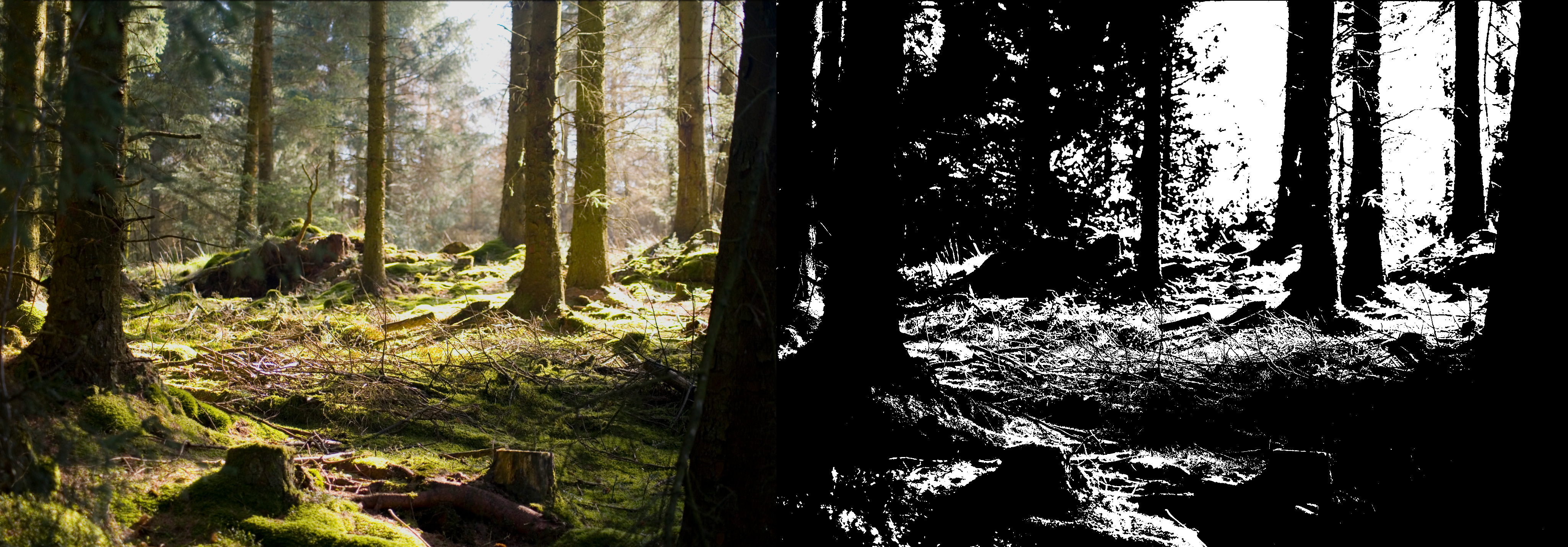
Learning to see black and white simultaneously is a process. We may understand innately when something is optically off balance, but knowing how to describe it in terms of design, or how to prevent it, is something that bears investigation, because it enables critical thinking and helps us communicate with other interested parties. Taking a posterized view of a photograph shows us the distribution of dark and light in any composition, making it easier to weed out inconsequential elements and promote our personal take.
We emit personal energy naturally and directly, without deflection, obfuscation, or modification. But when we speak, we can choose to mumble it out or say it clearly. When it comes to visual art, the expression should be clear as well, with no mumbling!
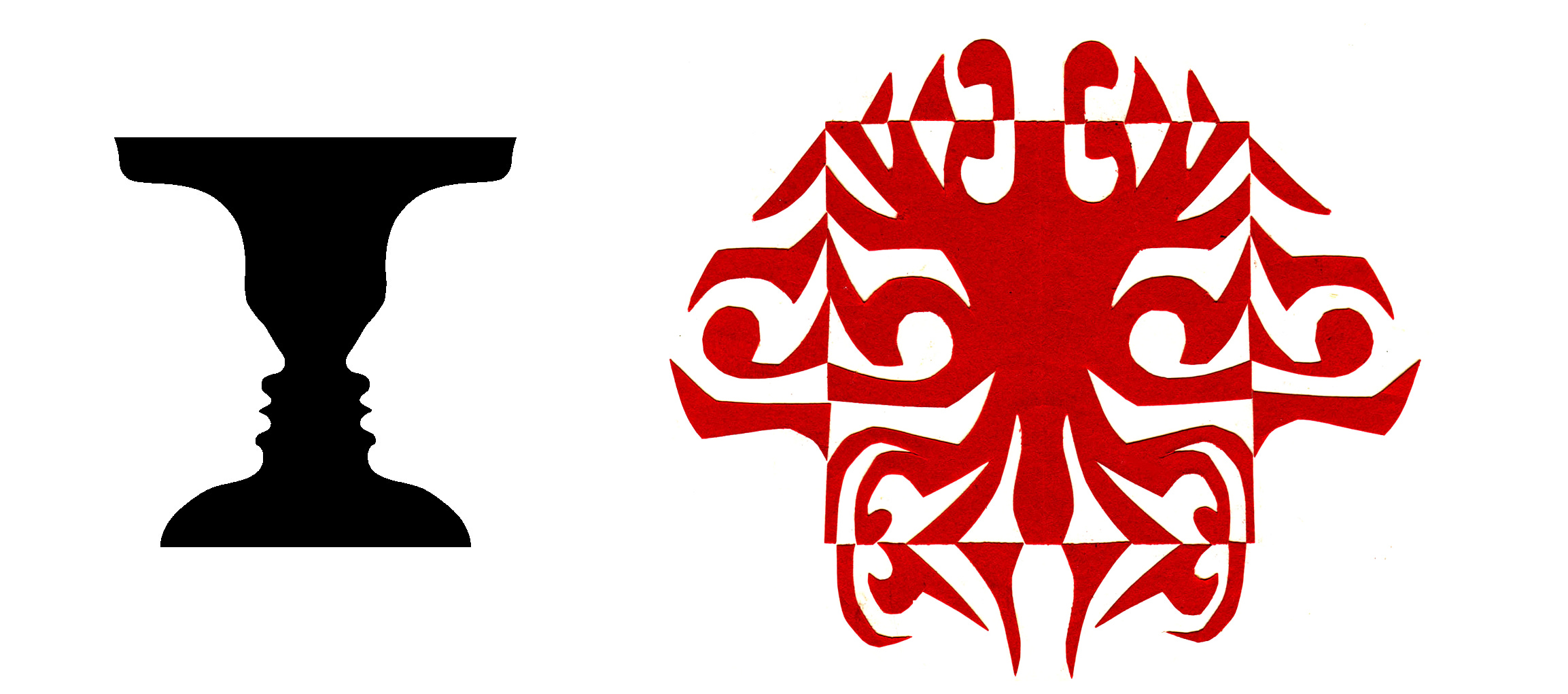
Even on the simplest level, the skill of logo design is dependent on good black and white contrast. The World Wildlife Fund used this panda bear image as their logo. The negative white and black serve positive functions in the design. But Notan is much more than value contrast!

Optical illusions are always fascinating. But when it comes to creating visual artwork and making shapes fit together well, we feel the challenge. A drawing may have too much detail and lack structure. Or the subject may be rendered lifeless by too much emphasis on structure. Ultimately, form is perceived by the give and take of light and shadow, exactly how we perceive nature. This is what we will be studying.
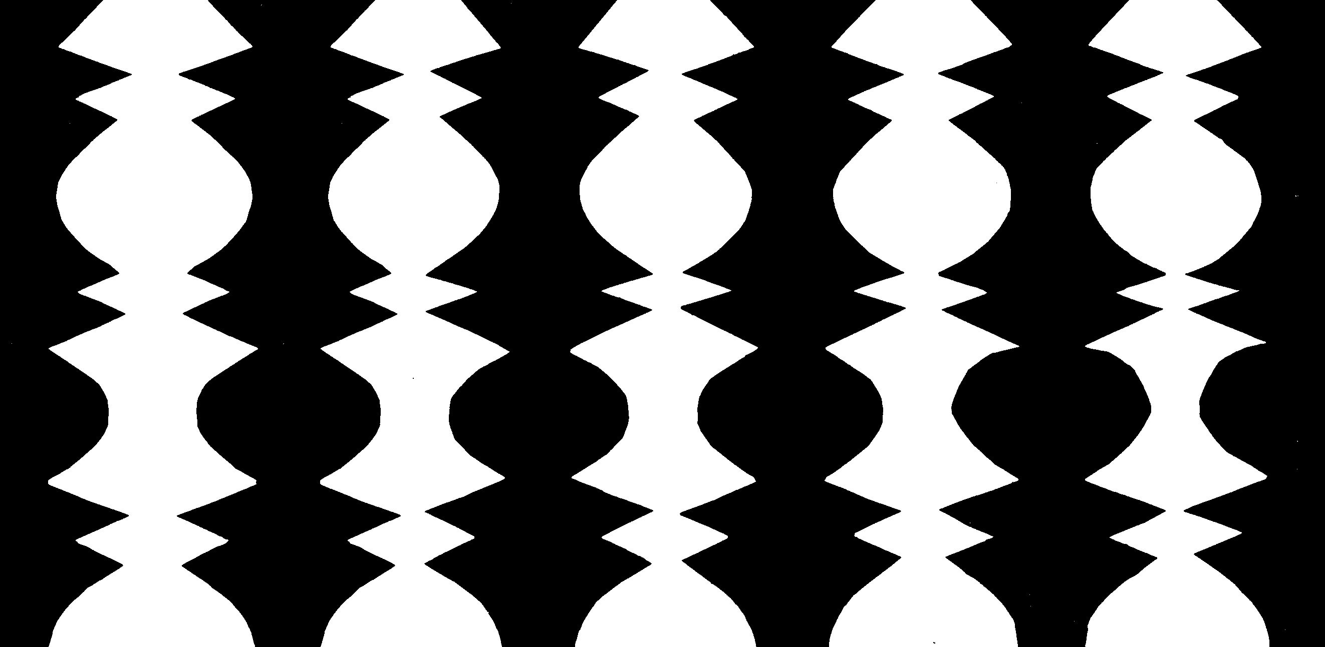
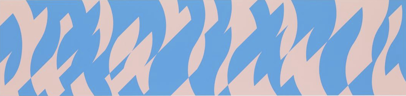
Looking at the image below, we might identify a black line on a light background instead of two light shapes on a background of black. It’s how we habitually think. Much of our perception comes from the proportion of white to black. But other factors such as shape, placement, color, value, and kinetic sense are involved. This has nothing to do with subject matter! And we’ll isolate and explore each element.

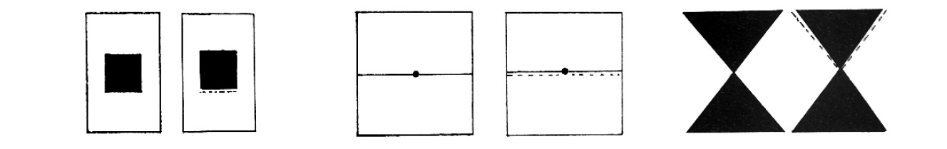
When making visual art from scratch, the first mark affects everything that follows. A line divides the surface into two parts. A second line adds further complexity. We ourselves are in motion, and a drawing evolves. But there is always a duality. Not just what we intend, and the result, but how a configuration of elements in perfect balance can begin to resonate on its own. What we see around us and in our mind’s eye merges to become a new creation that is made up of parts that make a particular and definable contribution to that vibrant wholeness.
What we know about optics governs how we approach the page. The mathematical center of the page is below the optical center, so we compensate for that by choosing the optical center for placement of important graphic junctures.
Bridget Riley had a retrospective exhibit at the Morgan Library in 2023 and this page contains a video that clearly shows her transition from early representional drawing to the abstract optical artwork for which she is noted. This process of translating natural perception to created perception is central to understanding how Notan works. We observe, then translate into our own graphic language, venturing as far as possible to capture what it means to us.
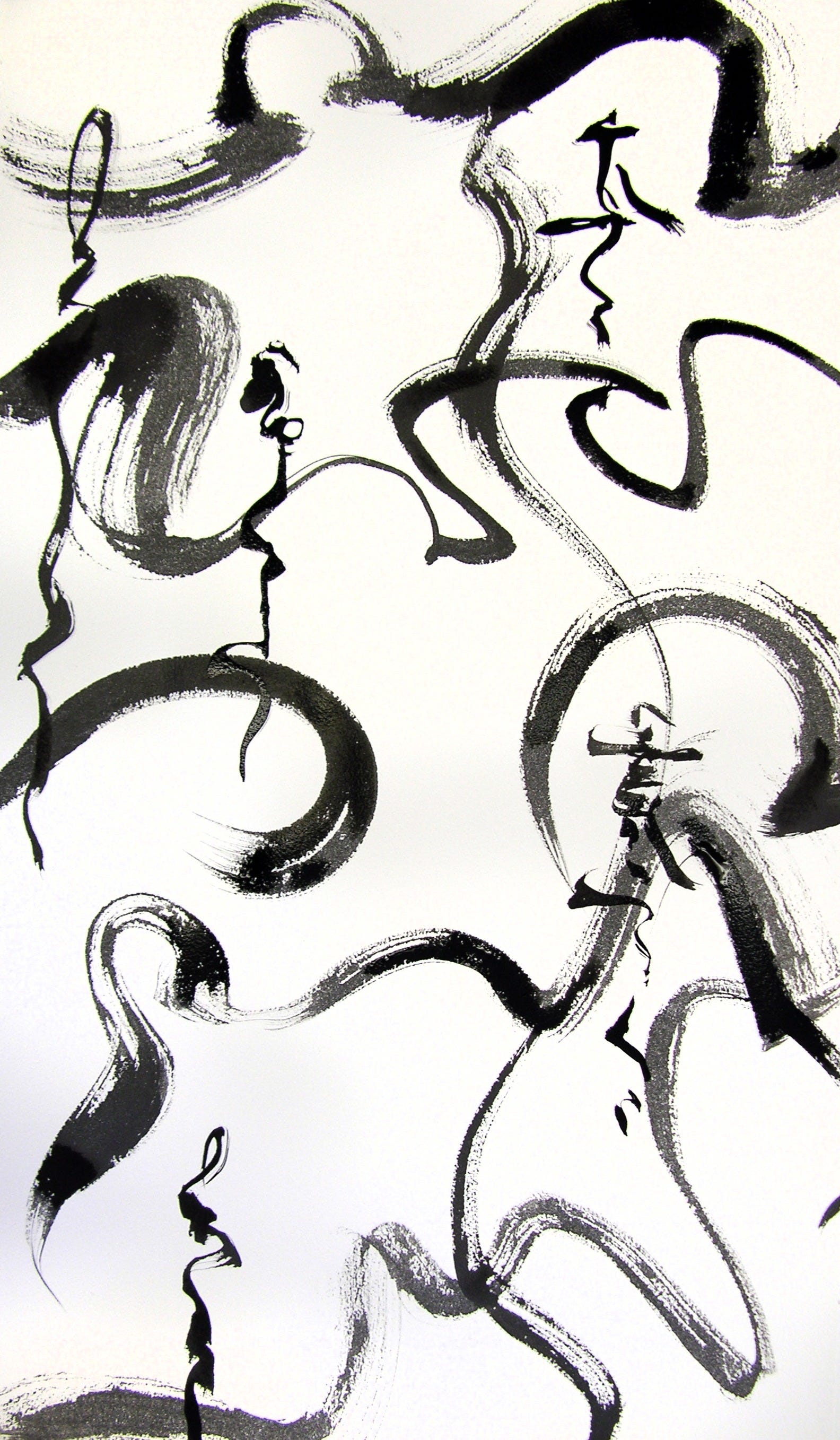
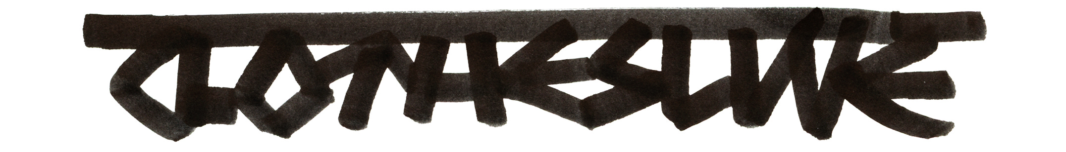
With an eye to negative shapes, we can write energetically with closely packed letters forming bright white forms. In the following exercise, the first line of simple strokes creates a jagged white edge. In the second, the word “swerve” hangs from a stroke, aware of the white shapes formed. In the third line, a binary IOIOIO string presents an opportunity to focus on the repetition of triangles and squares.
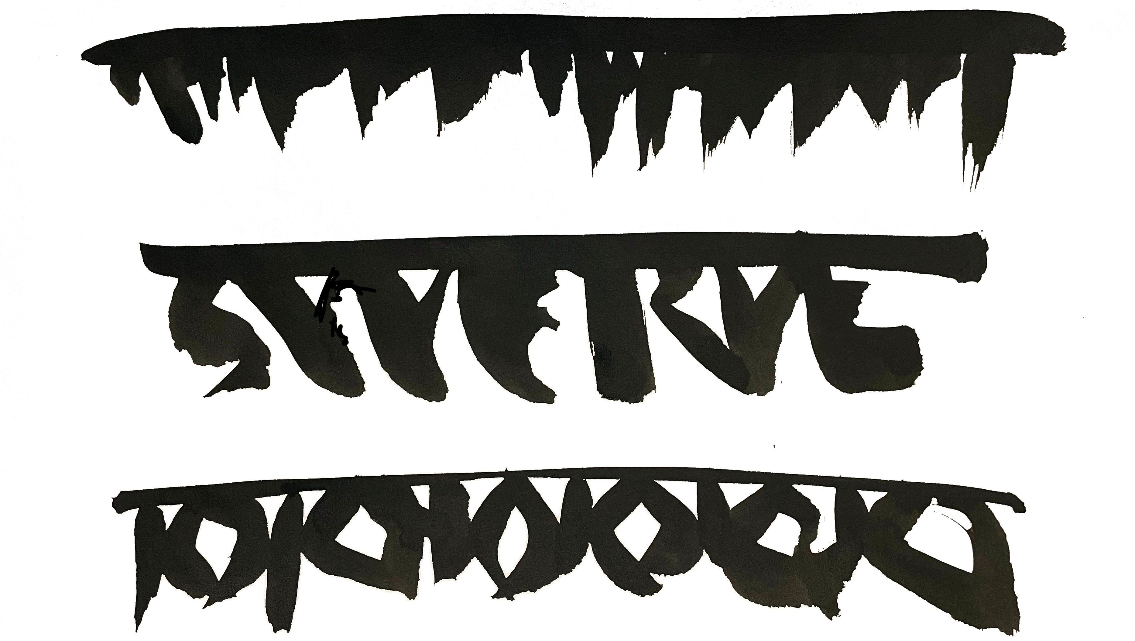
These exercises are called “clothesline letters” and are meant to strengthen awareness of the white shapes we make when writing. Seen abstractly, the white shapes form a set that can be viewed independently of the lettered strokes. These shapes can be refined and designed to form progressions or to embody a subject of their own. This allows us to examine only the counters and peripheral shape, and to critically pursue refinements.
Studying Notan makes us more aware of the balance of dark and light and helps to strengthen the visual effect of our art, whether it’s fine art, graphic design, typography, or calligraphy. We can thus omit every extraneous element that doesn’t contribute to the design and we can enhance everything that creates the targeted effect. It’s like when you think you’re finished, you’re not; you’re not done until your art passes your Notan scrutiny!
Never expect perfection. It’s only the doing, honestly, that will get you to your next level.
Thank you all for reading and enjoying my posts. It’s great to be here with you.
ONLINE SUMMER 2026!
ART 232: The Design of Light and Dark: Text Art and Notan will cover optics, figure/ground theories and compositional methods in studio art, design, and letterform. I’m looking forward intensely to plunge into this area with you.
PRODUCTS
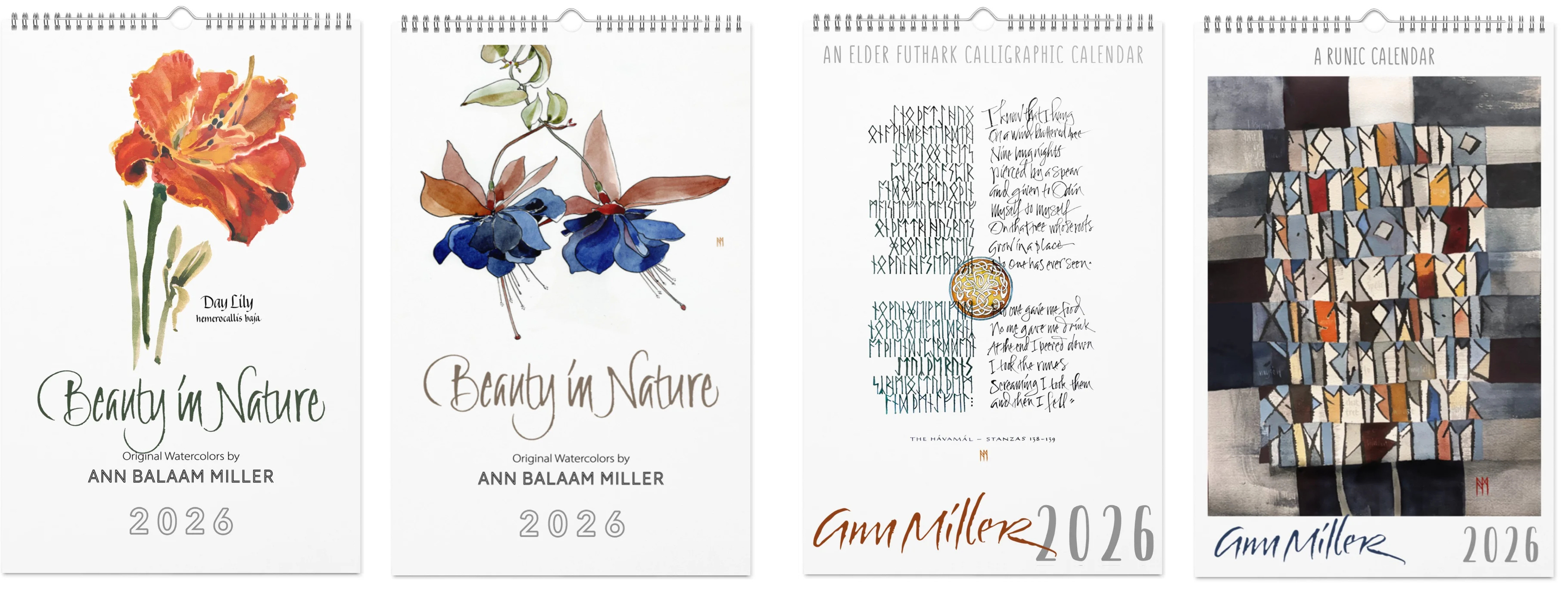
In my shop there are four art calendars for 2026 (it’s never too late!) and a few other items (mouse pads, mugs, pillows, scarves, jigsaw puzzles, and more). Email me for info or assistance with a custom order.
This blogpost on Substack will always be available free. The “paid” area is more interactive, with exercises and activities, discussion, and individual one-on-one conversation and critiques, like an online tutoring session. Your contribution is always appreciated, and helps keep my writing coming your way.
PAID SUBSCRIBERS: All paid subscriptions are now $75 annually or $7.50 monthly. I am eager to devote time to interactive projects and individual discussions on this basis. Invest in improving your graphic skills, design perception, and performance in the visual arts, handwriting, letterformation, and calligraphy.
EDUCATIONAL DISCOUNT: I offer a 50% discount on the annual paid subscription for art instructors and those in the art education field.
A paid subscription gives you access to ongoing conversations on my chat feed, permanent access to all archives, and access to exercises and how-tos. Let’s continue to talk about art and keep it fed, nourished, and productive.