


The Handlettering / Type Design Combo
Calligraphy and typography: a natural twosome.


Bold Strokes For Impact
We know from history that all typography stems from the first marks. Notches on a stick for counting, dots and lines on a cave wall for marking time and season, petroglyphs and stone inscriptions for more information are the very beginnings; there is no end to the possible combinations of surface, tool, and form. And no one makes a mark in the same way. Handmade letters will always have more impact; you can see the breath, feel the touch, and hear them speak.
Handmade letters bring a unique energy to graphic design.
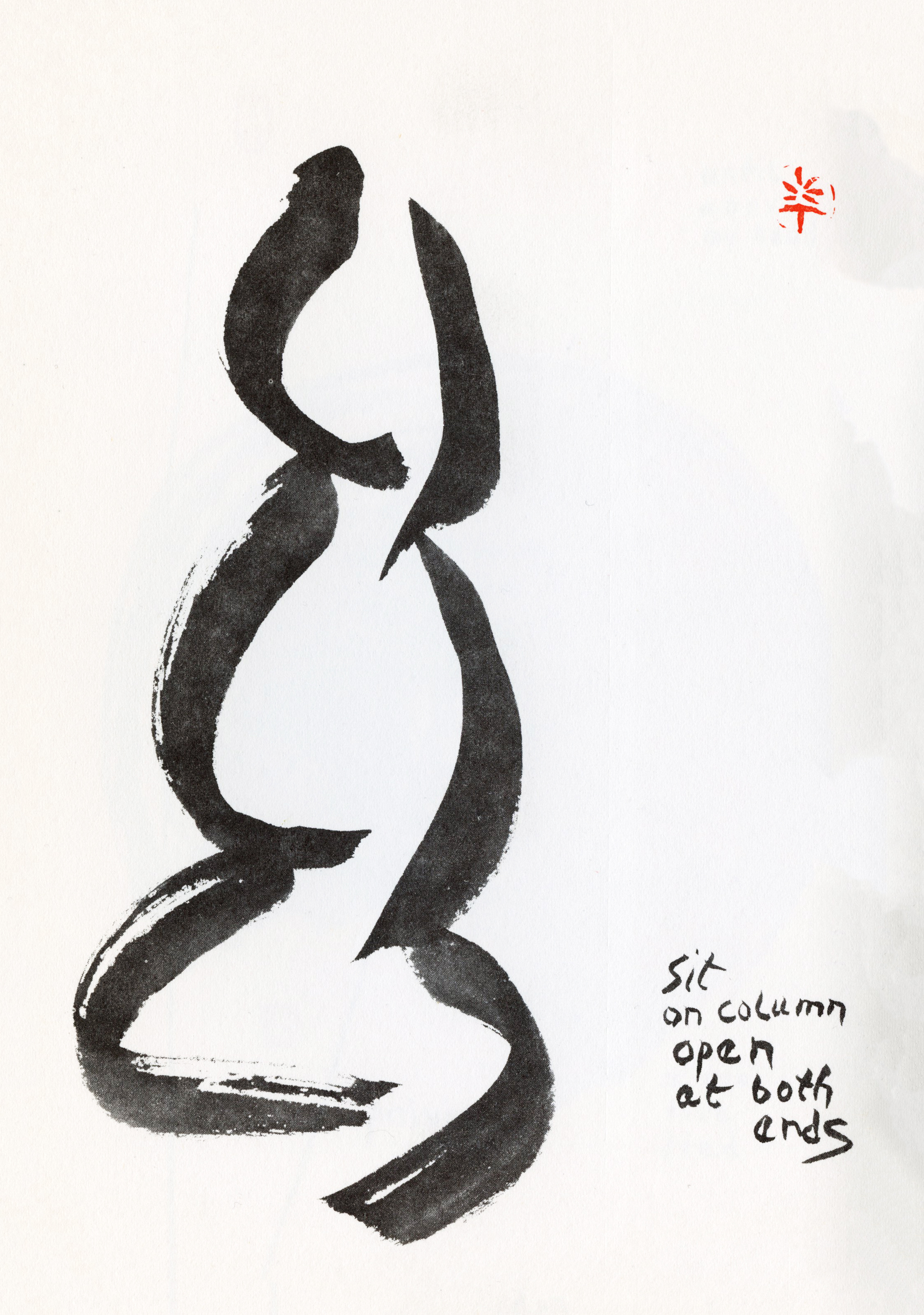
Jumping to the present moment, book arts have always been a big part of life and commerce in the San Francisco Bay Area, famed for its printing and publishing houses from the Gold Rush to the mid 20th century. The counterculture and beat movements spurred an upsurge in small book publishing, and then calligraphy, in its renaissance on the west coast, introduced a new element to the printed page: the handwritten letterform. Reading full pages of beautiful, rhythmic handwriting was a pleasure, especially as people were reacting to and recovering from the brutal horrors of both WWII and the Korean war, as well as their aftermath. One of the Zen influenced poets, Paul Reps, used drawing and writing in a new way, freeing the hand to the moment of thought. Instant and ineffable communication.
Until computers came along—finally available to most people in the 1980s—instructional books were often written completely by hand (the patience of educators!) and each page veloxed for printing. Some of my favorite books were handwritten, and many of my early texts for the study of calligraphy were written by the calligrapher. The first manual for most people was Edward Johnston’s Writing and Illuminating and Lettering, 1906, a groundbreaking publication. His examples and instruction sheets were all done by hand and it is so definitive that it still sells today in undiminished numbers.
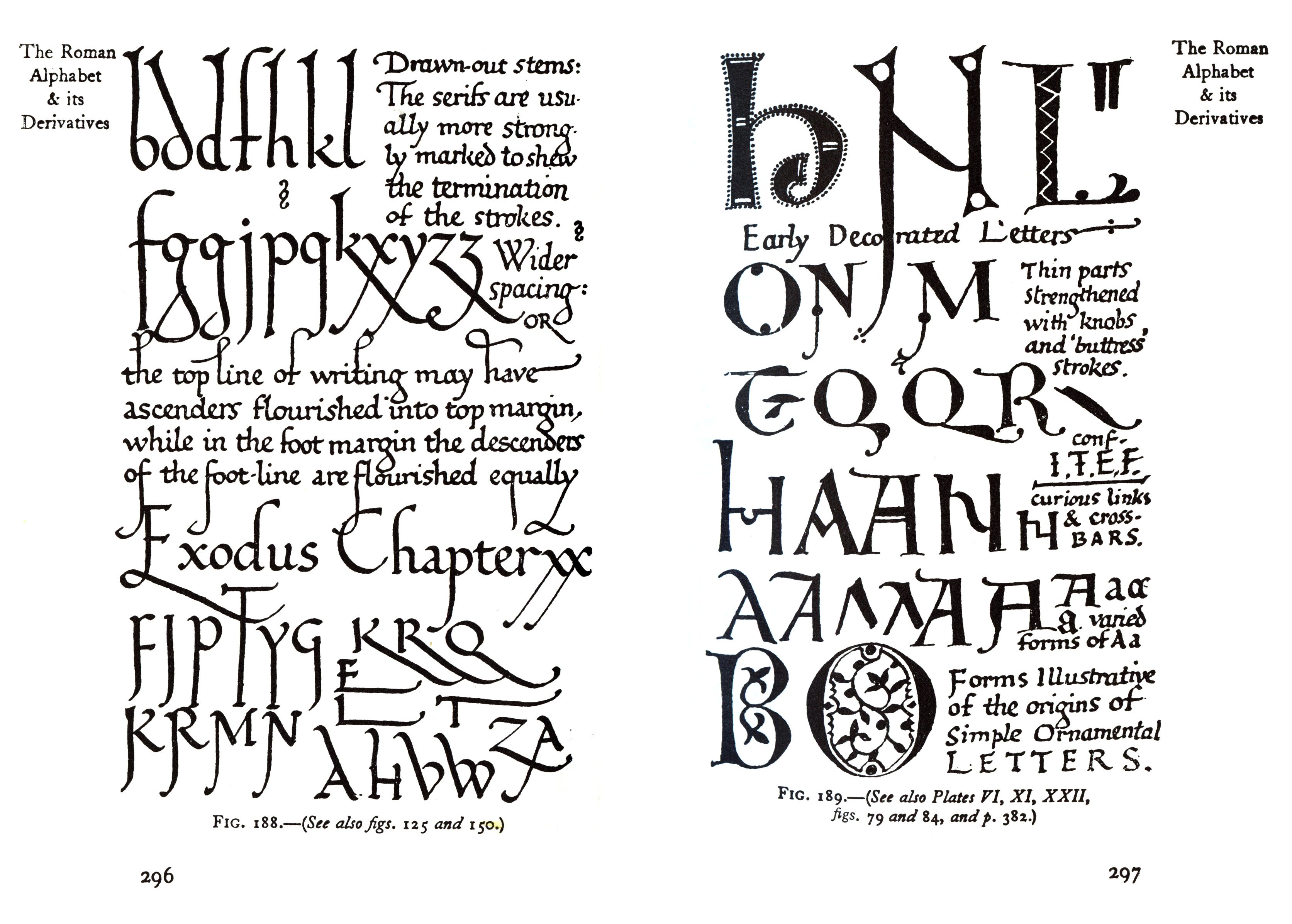
When I began studying letterform with more immediacy, I located books by Ralph Douglass, Tom Gourdie, Lloyd Reynolds, and a few years later found Jacqueline Svaren’s wonderful Written Letters (still available). Lettering artists were energized by the freedom of writing their own words in their own way, without having to rely on working with a committee or paying for expensive typesetting and printing.

The wider public finally had access to skills in the proper use of the edged pen, and its use exploded. Now, in conjunction with layout design and choice of typeface, many handmade options were available to the designer: expressive initial letters, chapter heads, subheads, drop caps, rubrics, accent graphics, and hand-embossed or textural treatments. This of course led eventually to a flood of typefaces and fonts derived from the handmade lettering, and it continues apace, for better or for worse. The caveat: there’s a fine line between refined improvement of a letterform and blind copying or change for change’s sake.
Hand and Machine Come Together
The Antiquarian Book Fair is an event, sometimes held in San Francisco, that draws people from all over the world, showing and selling their first editions, antique books and incunabula, and original vellum manuscripts. Demonstrations of book arts techniques were part of the fair. Printers demonstrated how to print a keepsake on a small press, calligraphers inscribed initial capitals on the spot, marblers showed each step in making the cover papers, and hand-binders stitched the pages together. The group effort produced enough finished examples to give out to all who stopped by.
You can make your own keepsake! It will speak for you as it changes hands.

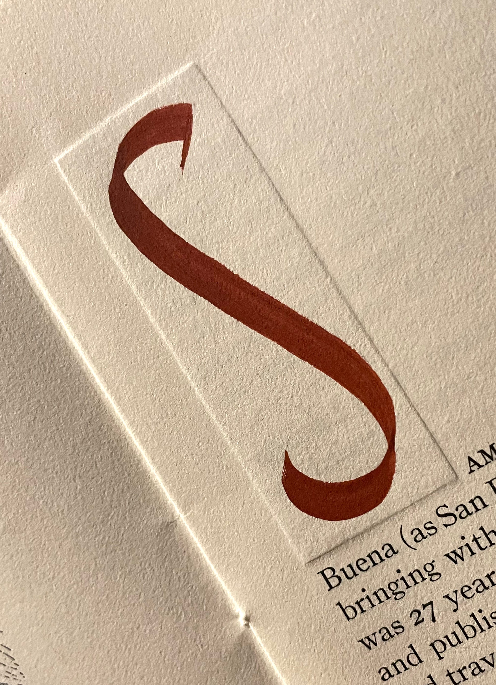
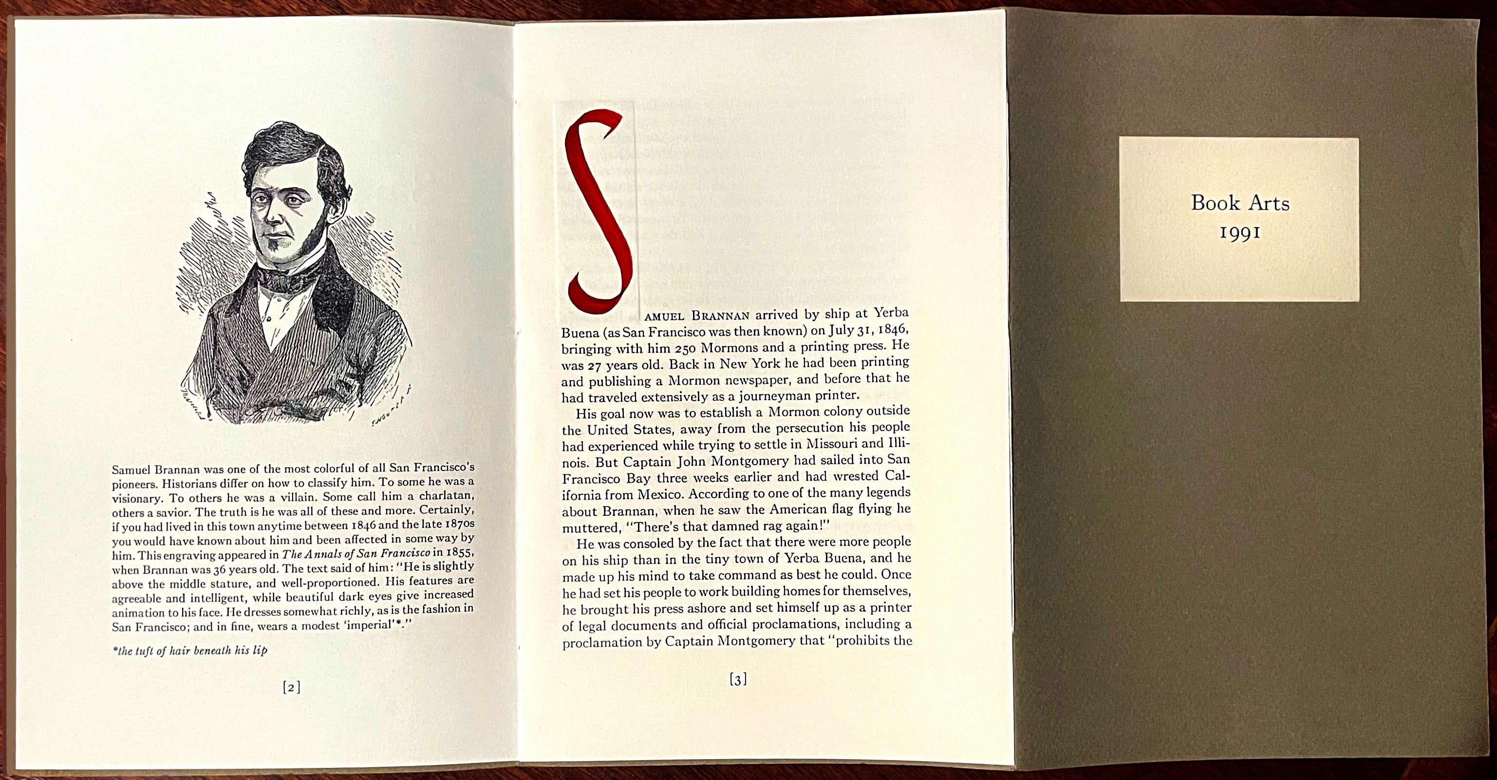
Another way to make an initial capital is to use blind embossing to create shapes that accent and balance your page designs. This keepsake from the 1991 Book Fair was about Samuel Brannan. I cut a small rectangle of card stock, placed it under the page, and used a bone folder to press against the edges all around. Paper can be debossed also, or any combination of ups and downs. Finally, I made an S with Indian Red gouache and a flat brush. Here’s a closeup and the tri-fold piece. The letter becomes a central anchor for the full spread.
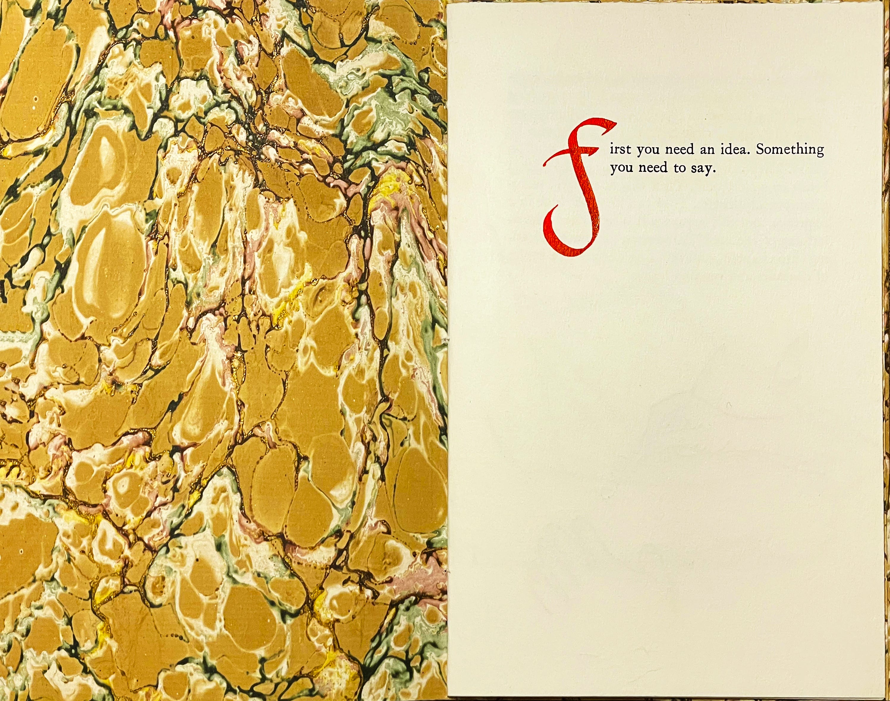
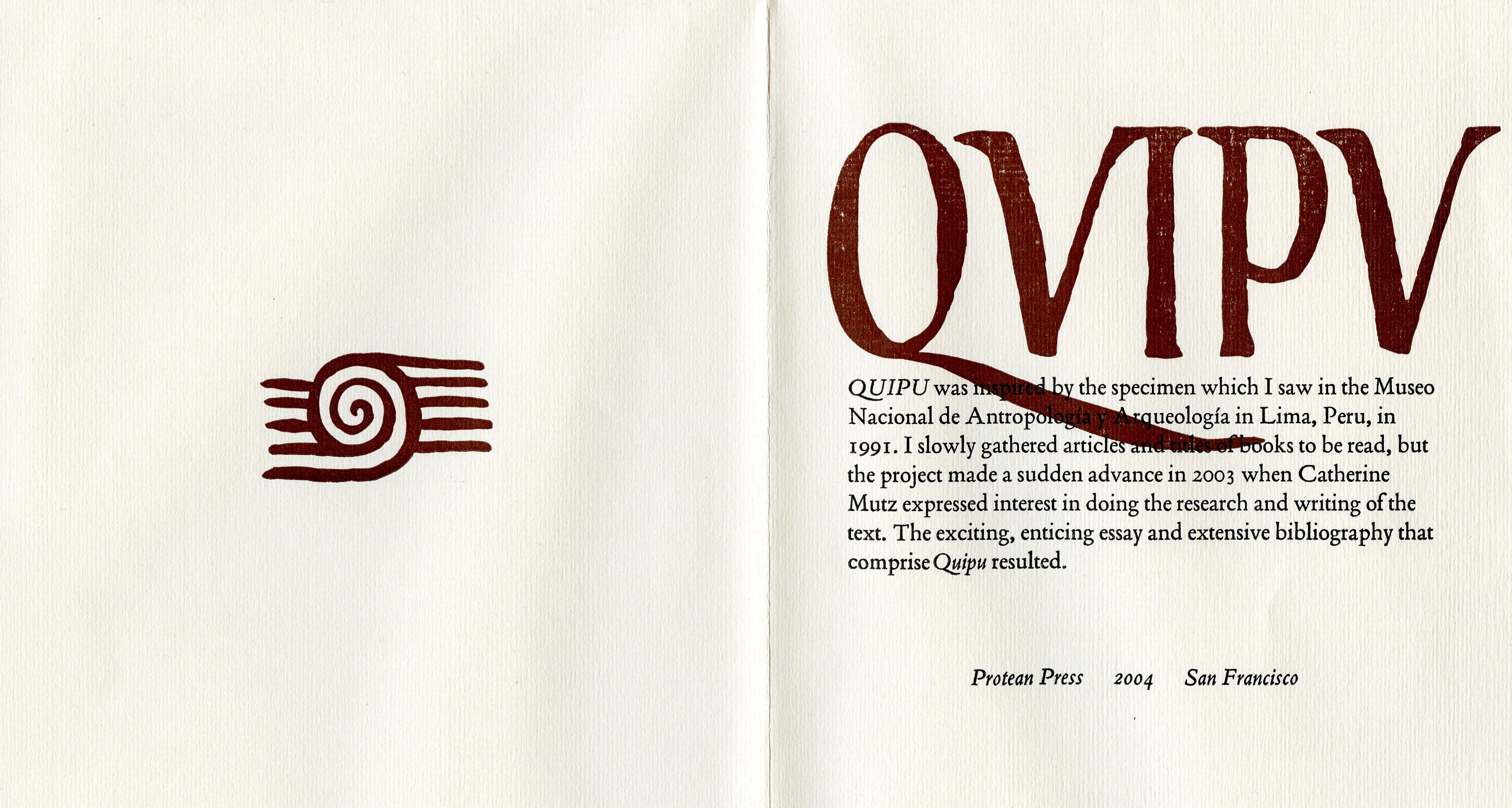
Adding calligraphy or other hand-drawn elements to a page of typography is always something to consider. Yes, a display capital is a possibility, but why not even a vector file made from your own hand-drawn element, as in the image below from a limited edition book by Protean Press on the Incan quipu of Peru? I patterned the letters on the work of 16th c. Incan historian Felipe Guaman Poma de Ayala (see final image below).
Chapter dividers, drop capitals, and incidental images add another level of content that supports the final work. You can design your own capitals, or minuscules, to add visual impact to your work.

I hope this gives you ideas for your own limited edition cards, booklets and promotional pieces. You never know where it will lead.
Have you used hand calligraphy in combination with typography?
Share images and stories if you want, and we can discuss in more detail.
Thank you all for reading and enjoying my posts. It’s great to be here with you.

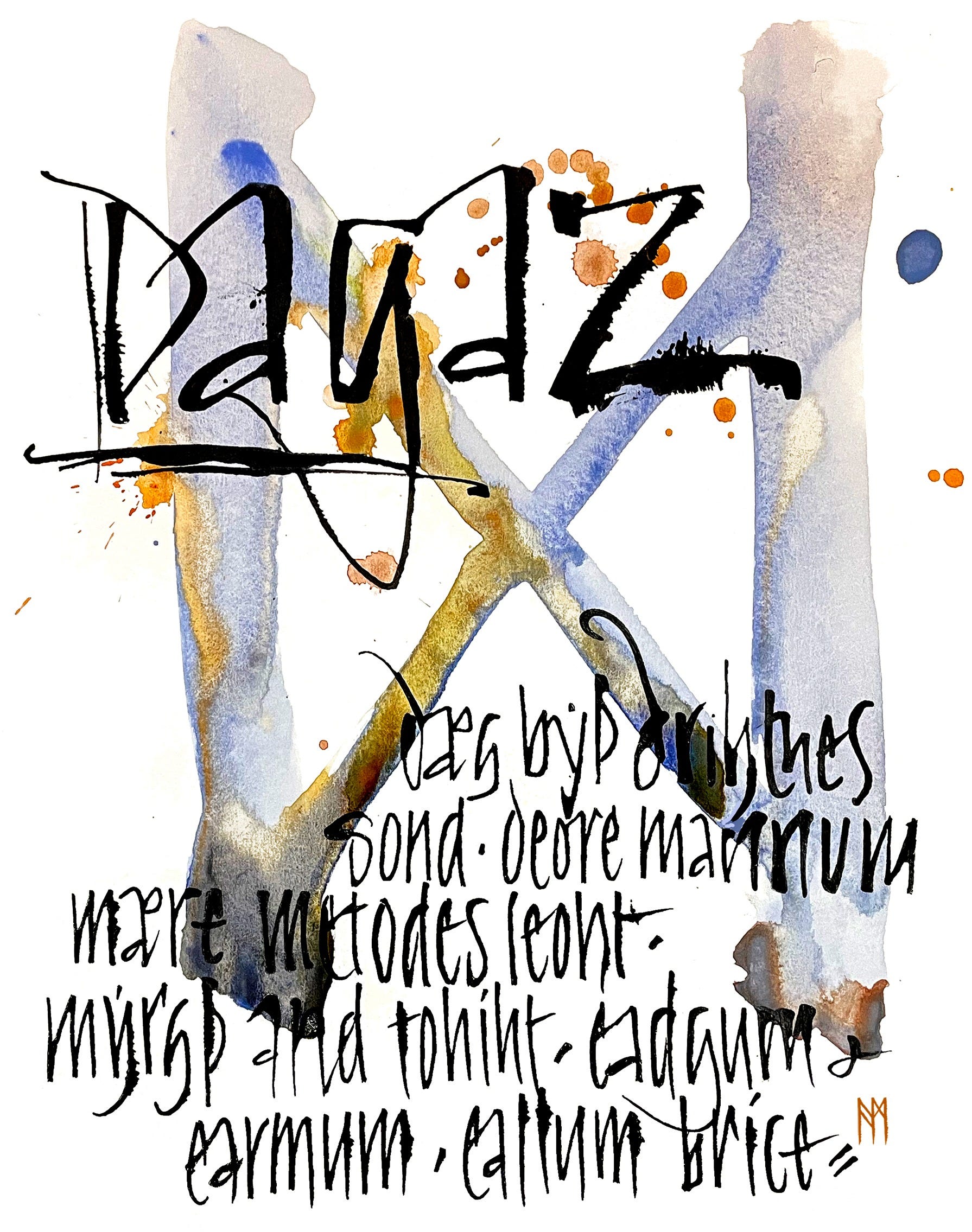
Winter courses at Stanford Continuing Studies: registration now open for Art 53 - Calligraphy Design and Norse Runes, beginning on January 29, 2025. As you can see by the above image, the exercises are multi-layered, painterly, gestural, literate, and expressive! More info is on my website. I hope you will join in! There are still a few spots left as we’re 2 weeks away.
NOTE TO ALL: This blogpost on Substack will always be free. I will never charge for the regular newsletters. Think of the “paid” area as more of a classroom or discussion area, where we can be a bit more interactive.
PAID SUBSCRIBERS: All paid subscriptions are now $75 annually or $7.50 monthly. I am eager to devote time to interactive projects and individual discussions on this basis. For you, it’s an ongoing investment in your research and graphic skills in the book arts, handwriting, and letterform/calligraphy. I will be posting exercises that you can follow and work with on your own and upload for feedback. It’s a floating classroom, and I hope you will find it helpful!
EDUCATIONAL DISCOUNT: I’m now offering a special 50% discount on the annual paid subscription for art instructors and those in the art education field.
A paid subscription gives you access to ongoing conversations on my chat feed, permanent access to all archives, and access to exercises and how-tos. Let’s continue to talk about art and keep it fed, nourished, and productive.