

The Chopstick Technique
To reveal the inner dance, nothing fancy is required.

Organic, sustainable, and simple!
Today I talk about writing with chopsticks, a technique practiced by scribes who enjoy the unique and natural character of stroke that is produced by transferring ink via wood or bamboo onto paper.
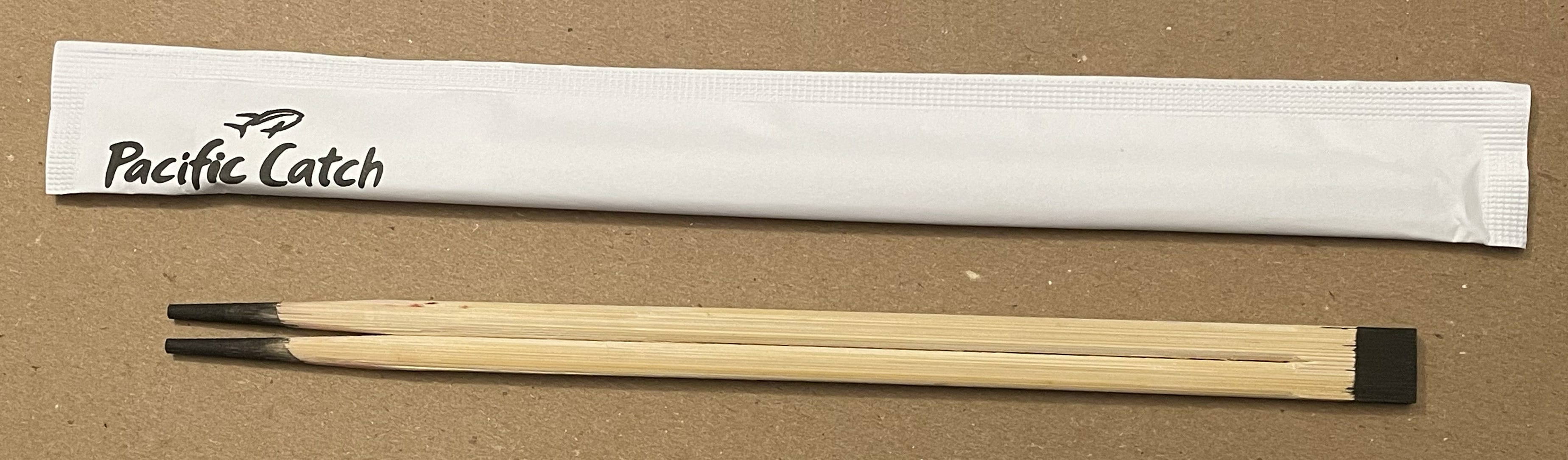
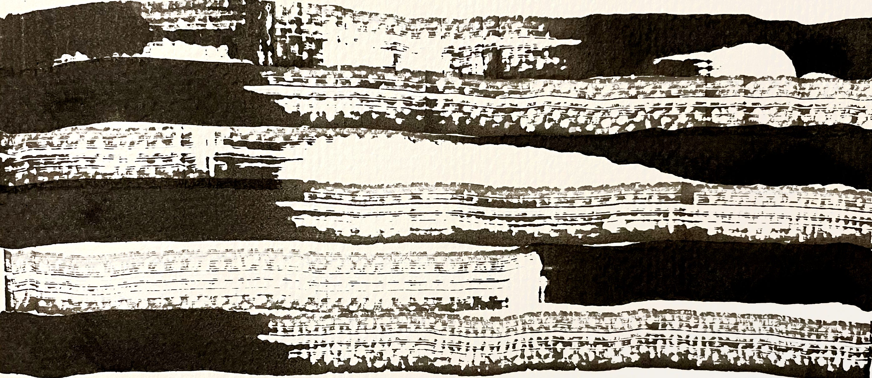
The humble chopstick piques the imagination and leads us into the more expansive realms of writing, with its ability to travel easily across the page, its larger size (square end = half inch wide, twice the size of a 6mm broad-edge metal nib), and its double-ended versatility providing both shape and line. For the beginner, the imprecise nature of the tool feels good, not at all intimidating. Unlike metal nibs, it doesn’t “catch” on the paper fibers. Its unevenness of stroke looks natural and is a sought-after quality. In the following image the dipped square end of the chopstick is drawn across a sheet of rough watercolor paper. Strokes are made in opposing directions, observing the balance of the whole. Handmade texture is useful for the designer and illustrator, to create vector files that can be manipulated digitally or otherwise. First make some test strokes and scan or photo them.
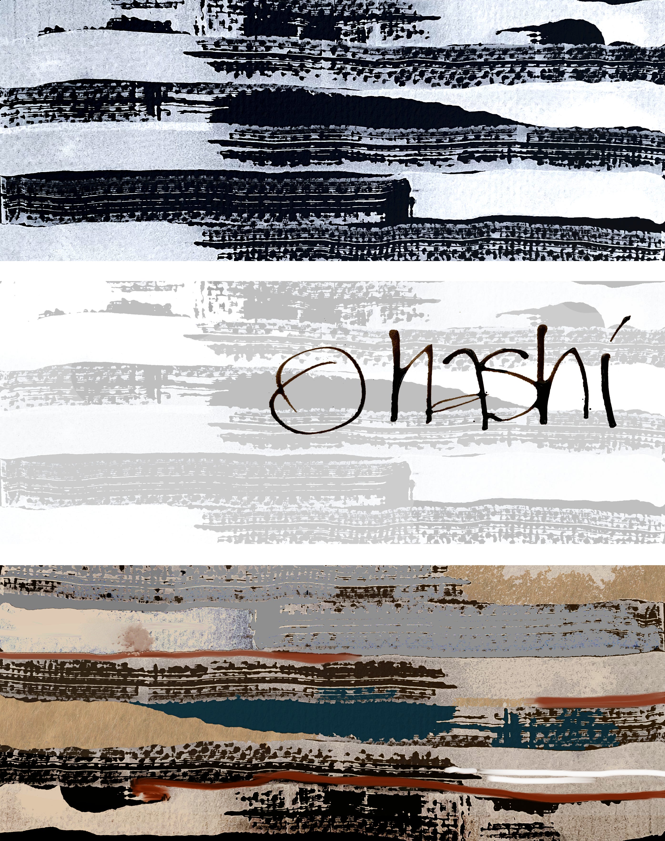
Use an image editor to make your changes. The three tests below show digital possibilities using an image editor. 1) simple image reversal; 2) image lightened, tinted, and overlaid with the honorific Japanese word for chopsticks (ohashi)written with the corner of the chopstick dipped in walnut ink; and 3) color play using digital filters, brush strokes, and selective color overlays, suggesting landscape. No need to purchase background textures! Make ‘em by hand.
In the next image are some of the possible chopstick marks from the blocky, joined end, top to bottom:
wide edge, flat end, one dip, 1/2-inch stroke
small edge, flat end, one dip, 3/16-inch stroke (wood grain is less absorbent)
flat end, corner (2 rows)
flat end, whole edge providing slight variations
flat end, rocking rhythm, alternating pressure while pulling stroke to the right
flat end shapes for square patterns and shapes
rotating quarter circles, square graphics, the last two creating negative shapes
You can make an alphabet and test your sense of invention. Make one heavy stroke with the flat end and tip onto the corner to continue drawing with a secondary thin, lightweight line.
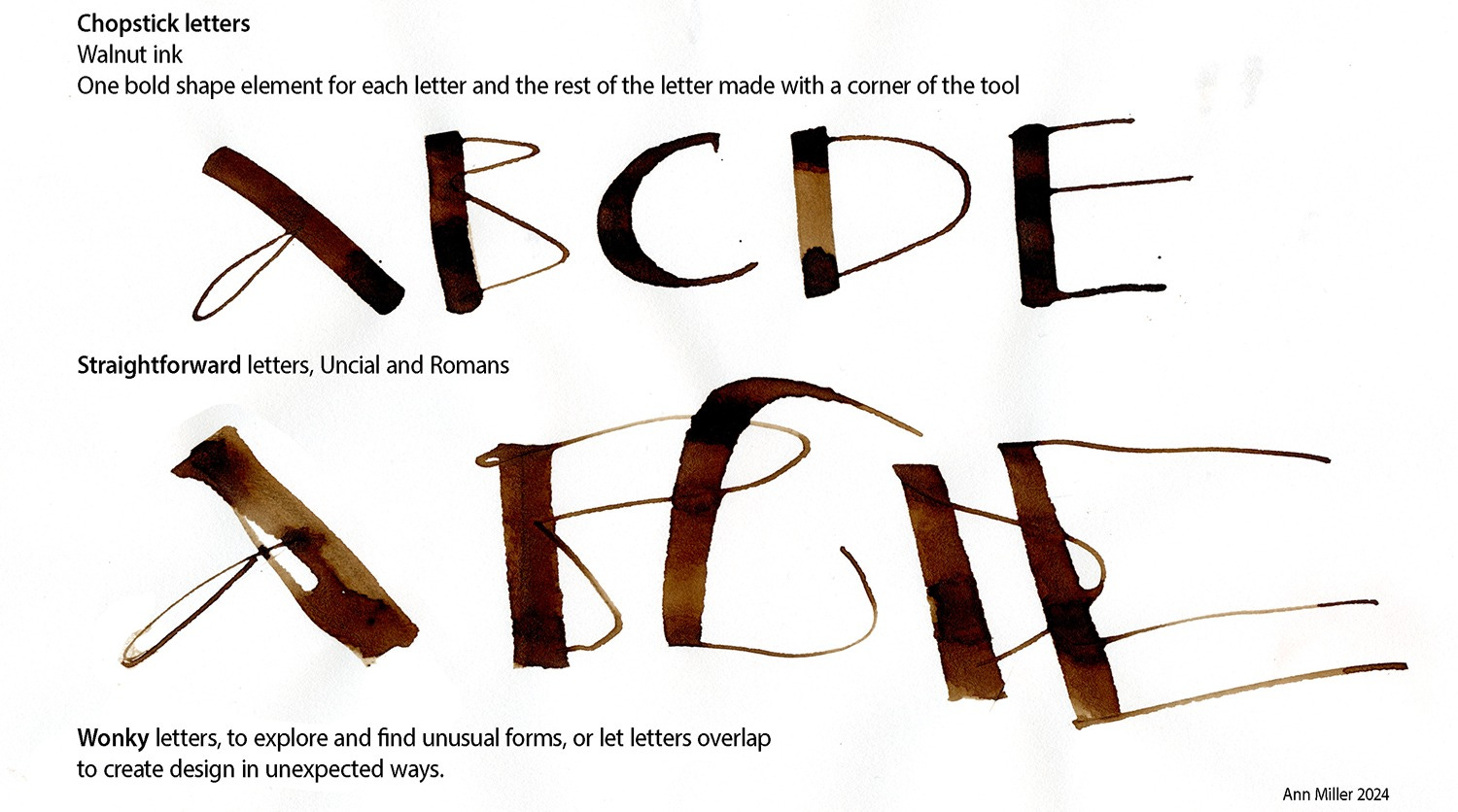
Make the stems strong and vertical and keep the letter bodies light and full of movement and similar in size. Each letter has both bold and lightweight elements.
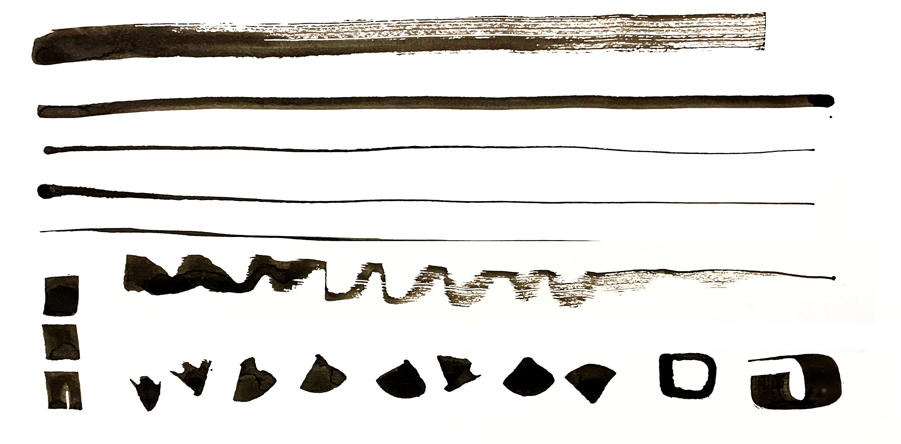
Next we take a look at the double-pointed end. This is a typical demo image for students Keeping both points on the page most of the time, especially for the main load-bearing stems, the letters emerge. Regular and invented letters will occur. Overlaps add challenge, increase sensitivity to placement and connection of forms, and greatly add to the interest of the page. Both ends can connect with the page, while a slight lift will allow only one tip to connect, reducing complexity and creating a “set” of single-stroke elements.
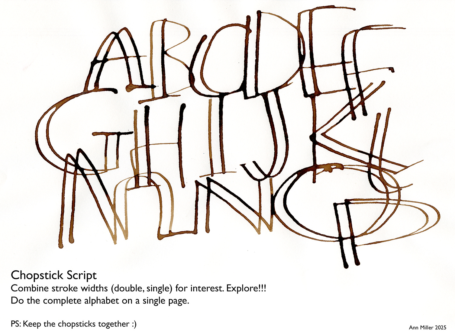
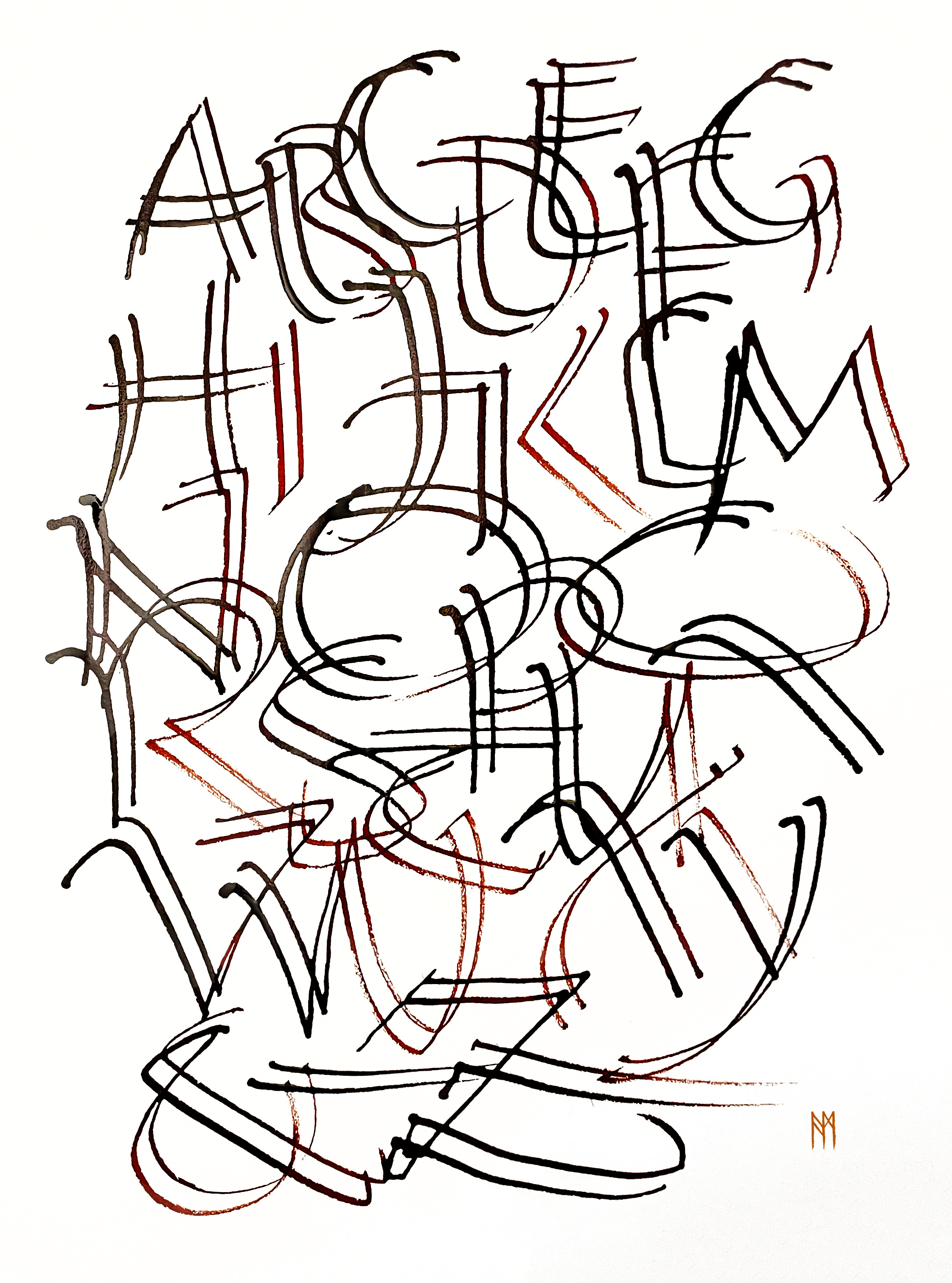
We build up to the point where we can write the entire alphabet on the page. Alternating positions up and down creates more opportunity for overlap. We focus on the flow of ink and the ideal speed required to keep the strokes unbroken and intact. The following demo in bister red ink shows interesting changes in color intensity as the ink becomes thin and wispy, a duotone effect.
Making letters with chopsticks promotes quick, flexible thinking. It is an excellent tool for working on the design aspects of letter formation and text art. A sense of gestalt is present. The visual impact of the free-flowing stroke is a relief from the deep study of calligraphic hands, that long and ongoing arc of learning how to create precisely-styled minuscules at an exact size. The target is an improved grasp of design in organizing the spatial placement of your letters. The limitations of the tool are freeing.
Secure a pair of chopsticks and some ink and you are ready to roll.
Thank you all for reading and enjoying my posts. It’s great to be here with you.
ANNOUNCEMENT
ART 53 - Upcoming class starts October 1! Register online now. For the full description and supplies list and to register, go to Art 53 - Calligraphy Design & Norse Runes at Stanford Continuing Studies. Eight Wednesday zoom sessions from October 1 to November 19, from 6pm - 7:50pm Pacific Time. This is a deep immersion into the traditional uses of many kinds of runes, their history, and the practice of transliterating their phonetics to your own language for the purpose of calligraphic design work. The simple geometric structures are easy to grasp and very forgiving for the beginner, making this class an excellent way to get to know the rudiments of text art design while playing with diverse tools and media.
Read more at pennib.com/teaching and register while spaces are still available.
NOTE TO ALL: This blogpost on Substack will always be free. Upgrade to Paid for interactive activities, individual comments and discussion, and content-rich articles. Your contribution is always immensely appreciated, and helps keep things coming your way. All images copyrighted by Ann Miller unless otherwise noted.
PAID SUBSCRIBERS: All paid subscriptions are now $75 annually or $7.50 monthly. I am eager to devote time to interactive projects and individual discussions on this basis. For you, it’s an ongoing investment in growing your graphic skills and supporting your performance in the areas of design, book arts, handwriting, letterformation, calligraphy, and fine art.
EDUCATIONAL DISCOUNT: I’m now offering a special 50% discount on the annual paid subscription for art instructors [your school.edu] and those in the art education field.