


The Beckoning Litho Stone
Early work on limestone creates a permanent longing.

The sounds, smells, and processes of the lithograph room, once experienced, remain with you, forever infused.
When I was working toward my degrees in the art department at Stanford, they had just begun to offer lithography printmaking. Nathan Oliveira had realized his dream of establishing a lithography studio in the art department, and he was the instructor. We had a large hand-operated wrought iron 19th c. lithography press. I signed up for the class a half-dozen times over the next three years. My days were spent going from the oil painting room, to life drawing, and to the print room. Sometimes we’d take the stones to the life drawing room, or draw from our sketches directly onto the stone.
One day after class, I made a quick drawing on paper of Nate, who was beginning his own drawing on a large limestone block.

We had limestone blocks of all sizes. Sometimes they were still bearing artwork from vintage bank certificates and intricately bordered stock shares. We ground them down to a pristine surface with the levigator, water, and carborundum particles of graduated sizes, to remove the previous artwork and assure a smooth crystalline surface.

Complex steps followed, beginning with the drawing. The lithograph process is based on the opposition of water and oil. Litho media include the grease pencil and waxy crayons of varying hardness for drawing directly on the stone, and liquid tusche, which is used like ink, applied with brush or dip pen such as the Speedball C-5. The artwork is generally additive in nature, building in layers and gaining depth and rich textures similar to working in watercolor. In general, major corrections are not considered unless starting over with a fresh stone, but with experience the nuances of the process allow for organic evolution, with physical and chemical alterations done spontaneously along the way.
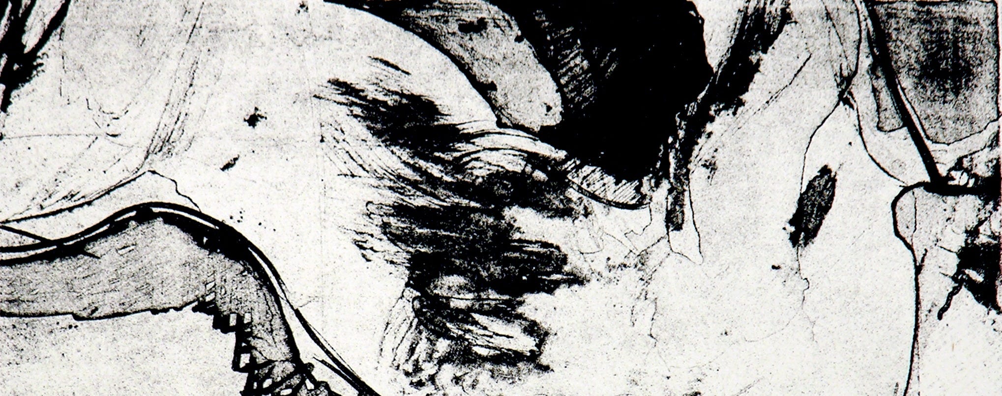
Note the delicacy of textures in this lithograph that exploits the particulate nature of the tusche. The temperature in the studio affects how the wash dries, evenly or in stages, leaving characteristic striations and granular textures that are seen here.

Once the drawing is done, powdered rosin is sometimes applied to protect the delicate areas of artwork, then the nitric acid/gum arabic mixture is brushed onto the stone, chemically causing a physical change in the stone. Here are two descriptions of the process:
The nitric acid reacts with the grease (oleic acid) to create oleomagnate of lime. The image literally becomes part of the stone. In the process, the acid sensitizes the dark areas so they accept ink and reject water, actually changing the structure of the limestone crystals, and desensitizes the light areas so they reject ink and accept water. Both the sensitization and desensitization happen in one step. — from an article by Marshall Brain
In an article by an apprentice printer at Tamarind, he explains:
During the etch, the drawing is brushed with a solution of water, gum arabic, and diluted nitric acid. Through chemistry, the acid interacts with the limestone surface and the oils on the drawing to produce fatty acid salts. These salts bind to the stone surface, and they are what holds the ink during printing. In short, the etch creates a chemical impression of the artist’s drawing, and this impression stays even after the drawing itself is rinsed off.
After a few more steps the stone is placed on the press, sponged with water, and ink is rolled into the image, adhering only to the image area which is receptive to the greasy ink. Check out this well-illustrated online description of every step of the process. Another good place to learn more is The Tamarind Book of Lithography.
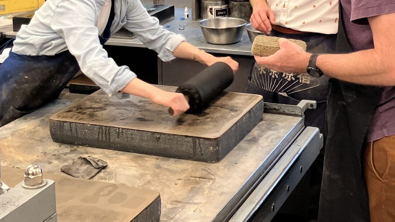
A special “damp box” is used for parent sheets of fine handmade rag papers that rest between moistened blotters, ensuring correct dampness for receiving the oil-based ink as the print bed passes under the pressure bar.
The tip of a razor blade can cut through a layer of tusche, adding instances of white, contours, stippling, or crosshatching patterns within a dark area. Some control over dark areas can be managed during the application of the acid mixture, using longer exposure to lighten certain areas, or rinsing and reapplying the tusche. You’re in it up to your elbows.
The bird emblem was my first experimental subject, basically a test plate. I used litho crayon and washes. The tusche dries with bubbled or ridged patterns and shows brush marks in a different way. The stone is quite wet. I used a razor blade to scratch a few lines, both freehand and with a straight-edge for definition.
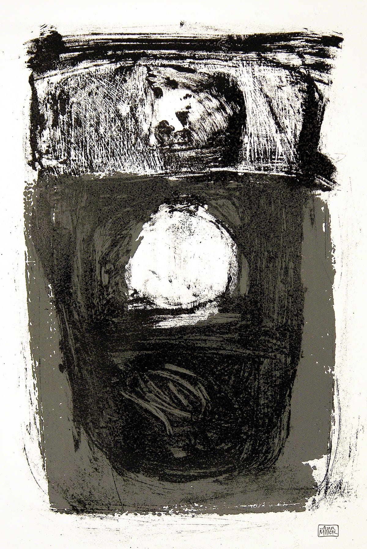
I also made an edition I called Nightwatch, an abstract landscape/figure image that explored more brushwork textures and treatments resulting from washing and reapplying the tusche.
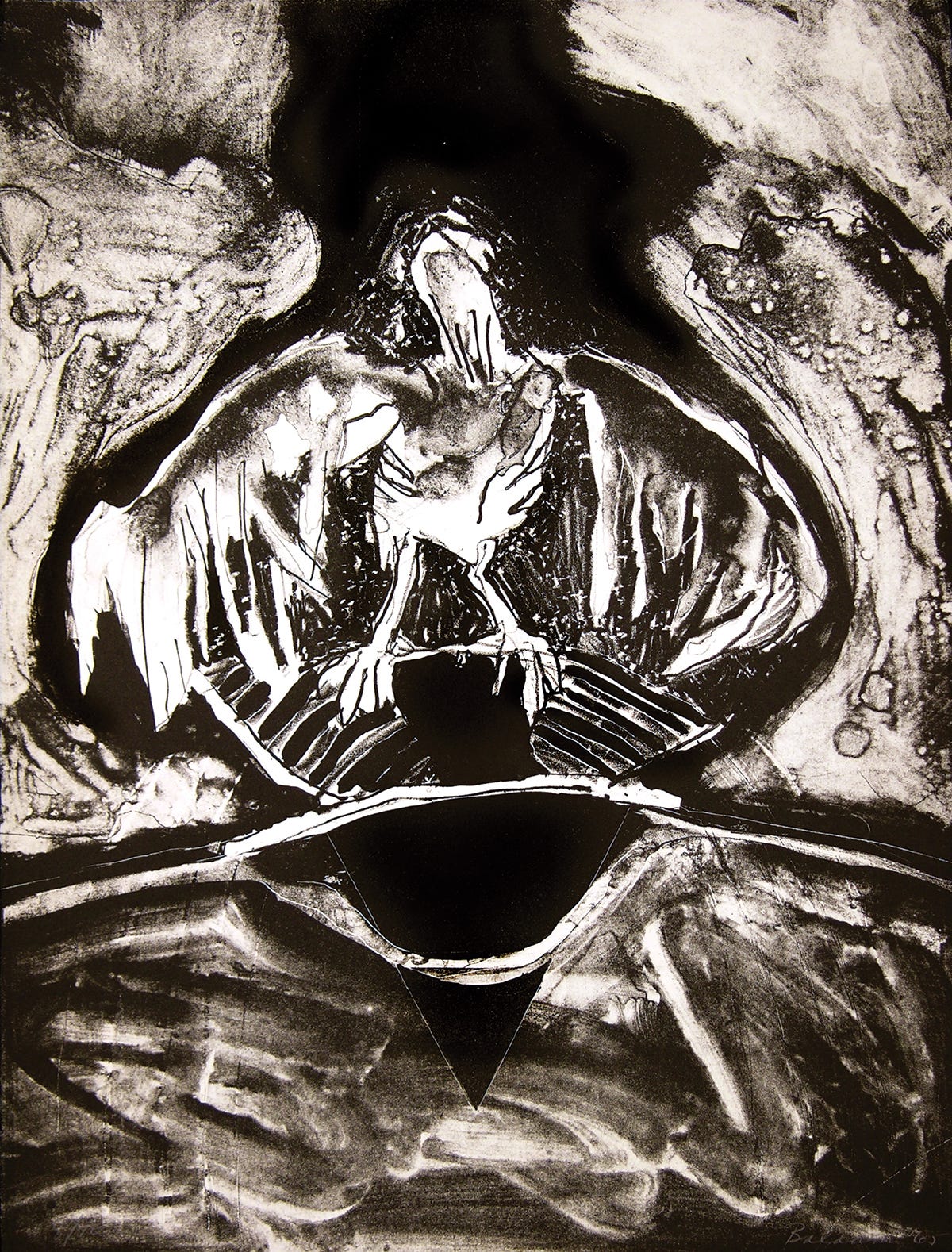
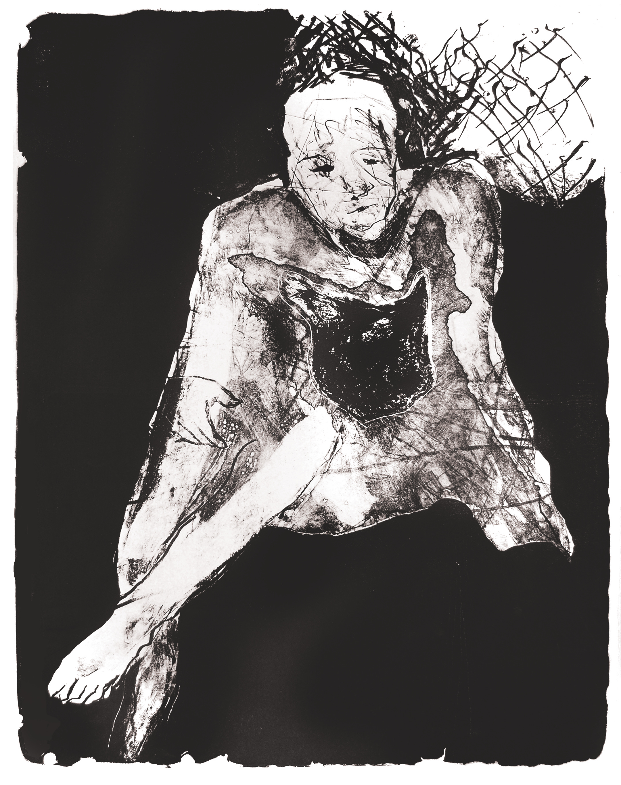
A figure drawing from life class showed the model sitting in front of a mirror. The black tusche covered parts of the drawing that weren’t working well, and the rough stippling in the lower section was done with a sharp blade and hit with a stronger nitric solution to pull out the white. This proof shows some ink gathered at the left edge of the print, which requires correction. This unwanted artifact is removed by hand before the final edition is pulled. A metal rasp is used to file off the edges of the stone to a smooth bevel, and any ink remaining after the final rolling is wiped clean.

I also explored combining techniques, using a grey silkscreen layer under the highly textured lithograph image.
An unfinished lithograph, drawn from the model and partially developed, is strange to see still in its unfinished form. Once the tusche background is applied, blocking out areas that are not working, it can be changed and reopened, given time. But when the semester is over, that’s it.
In my early days of exploring what the medium can do I was influenced by the Bay Area Figurative painters of the ‘60s and ‘70s, exploring composition and texture. They are not refined, but hopefully show what can be done with this process.
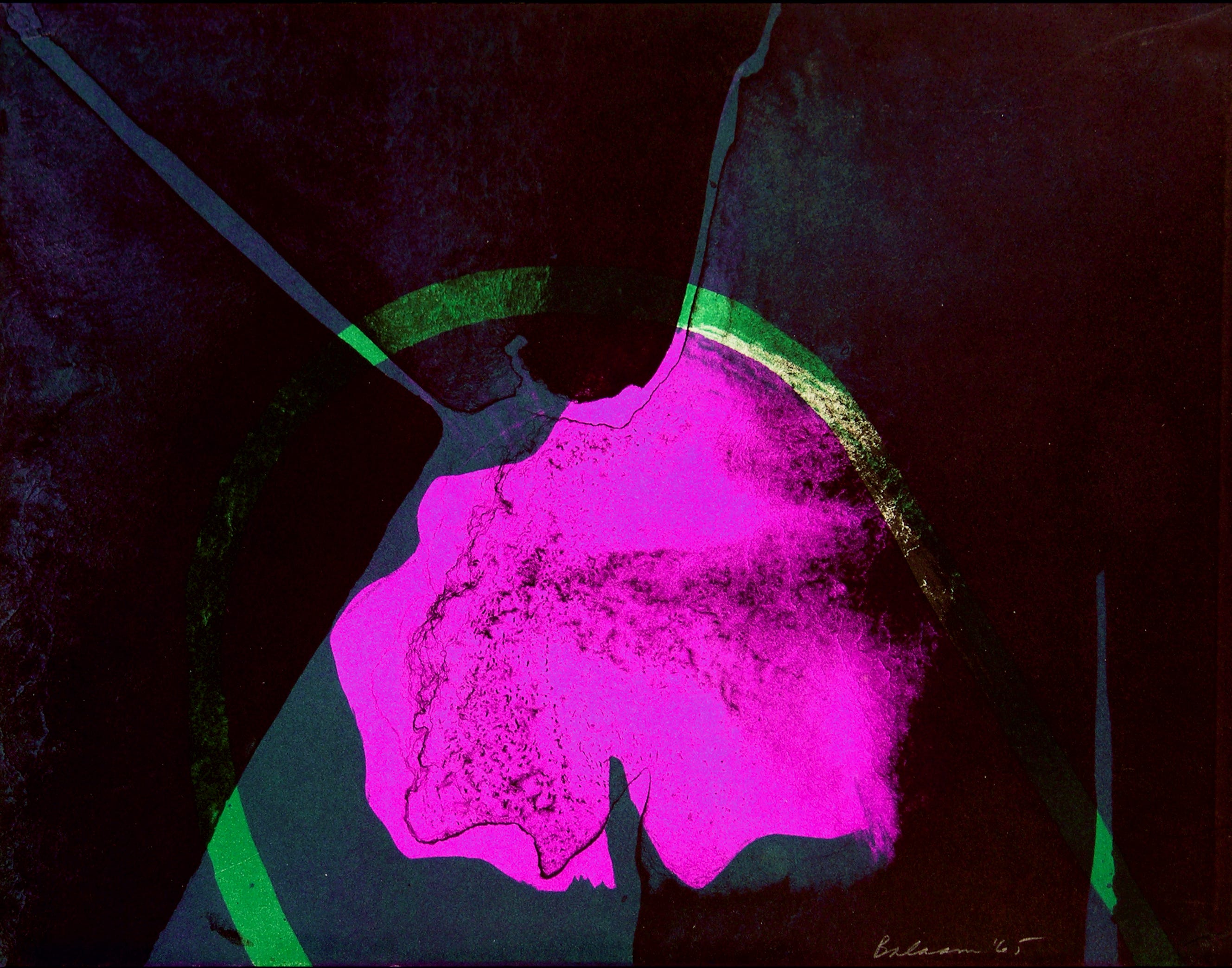
Exploring the multiple color print, I wanted to make a flower image. I applied the magenta, the green, and the black layers in three separate passes, grinding down the stone between colors and working the registration as closely as I could. I was surprised and happy with the result.
This printing process is high on my pleasure list! And schools today have modern electric presses operated with buttons. I still like the action of the pressure bar and the old hand-cranked press bed. It was quite a workout.

Printmaking is a wonderful path. Silk screen is nice, but a bit toxic, and the subtleties of the collagraph, another subject for discussion, are good to explore if you get a chance. But lithography gets in your blood. There are less expensive and time-consuming but very creative ways to print using the resistance of grease and water. Just search for “kitchen lithography” and you’ll get some ideas! I may do an article on it at some point! As always, let me know if you have any questions.
Thank you all for reading and enjoying my posts. It’s great to be here with you.
NOTE TO ALL: This blogpost on Substack will always be free. Upgrade to Paid for interactive activities, individual comments and discussion, and content-rich articles. Your contribution is always immensely appreciated, and helps keep things coming your way. All images copyrighted by Ann Miller unless otherwise noted.
PAID SUBSCRIBERS: All paid subscriptions are now $75 annually or $7.50 monthly. I am eager to devote time to interactive projects and individual discussions on this basis. For you, it’s an ongoing investment in growing your graphic skills and supporting your performance in the areas of book arts, handwriting, letterformation, and calligraphy.
EDUCATIONAL DISCOUNT: I’m now offering a special 50% discount on the annual paid subscription for art instructors [your school.edu] and those in the art education field.
ART 50 - Calligraphy and Letterform class at Stanford Continuing Studies—my overview of the history, methods, models, and practice of handlettering—opens on July 9, and the first session is on July 16, 2025. Visit the Stanford Registration Page to download the Syllabus and Supplies List and register while spaces are available. All levels of experience are welcome, to enjoy an in-depth review of the basics of calligraphy (and beyond).
Hi Ann, I'm dropping a note to say that I just re-registered for your Stanford class. It looked a week ago like I was going to be overwhelmed with some other projects and I know from past experience that when I get overwhelmed I don't go and watch videos, but thankfully some of that has been reallocated and I am so interested in what you're doing. Maybe this is why I've been collecting calligraphy and font books for years... I need to explore it. So I'm back in and very much looking forward to the class!