Notan is the basis of all design.
Two equal parts forming a unified whole is a simple theory. Today I’ll share what I know and how I’ve used this ancient and amazing principle.
History
Notan is familiar to us in the ancient Eastern symbol of Yang and Yin, consisting of mirror images, one white and one black, revolving around a point of equilibrium. These opposites complement and fulfill each other to create a whole. They do not conflict. It’s light and shadow, mountain and valley, two aspects of one entity.
The principle of Notan was first noted by Lao Tse over 2000 years ago in this poem:
We put thirty spokes together and call it a wheel, but it is on the space where there is nothing that the usefulness of the wheel depends.
We turn clay to make vessel, but it is on the space where there is nothing that the usefulness of the vessel depends.
We pierce doors and windows to make a house, and it is on these spaces where there is nothing that the usefulness of the house depends.
Therefore just as we take advantage of what is, we should recognize the usefulness of what is not.Arthur Waley translation - The Way and its Power, Houghton Mifflin, 1935
Practice
Design teachers talk about using positive/negative space, but often take student understanding for granted, since it takes specific exercises and personal experience to grasp the practicality of it. Often there is not enough time to do the subject justice. As artists we learn what Notan is, and we can define it, but how to embody it effectively in our own work is a task. I learned about Notan when preparing to teach classes in my local community college district. I was fortunate to have found the book Notan: The Dark-Light Principle of Design by Dorr Bothwell and Marlys Frey. It was the first book singularly devoted to the subject and I went through their exercises meticulously. Pick up this book and follow the six lessons.
Studying this principle is not just about eye/hand coordination or arranging elements on the page. It’s about shaping the elements with no space “left over”. It’s about discovering a certain harmonic that happens when perfect balance is reached. The following image from the book illustrates this point, showing the vibrant interaction of four identically cut white shapes placed carefully on a black ground at equal intervals. As you study this image, you should notice that the black centers seem “blacker” and the white centers “whiter” than the regular black and white, delivering four distinct values as well as a sense of brilliance and visual vibration due to the effect of afterimage. Knowing that this effect is possible keeps the artist engaged, knowing when a design is “working” and when it isn’t.
A true Notan “exchange” happens when you can look at an image and see the light area as the positive element, but also be able to refocus and see the black area as the positive element. It’s an either-or situation. Nothing is left to chance or guesswork.
Using Notan
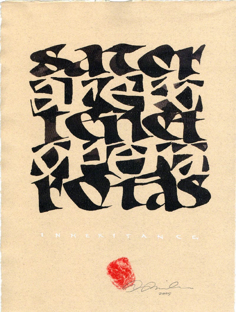
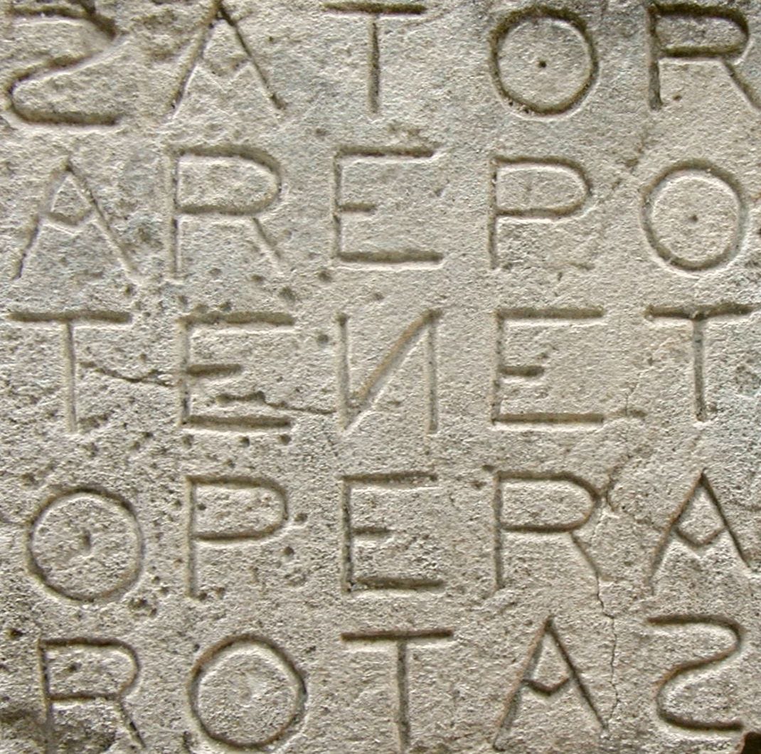
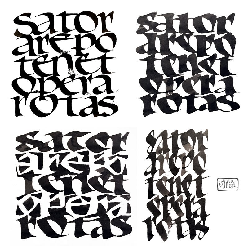
I had been doing a number of paintings and designs based on the historical Sator Square carvings such as this one. I decided to use the historical SATOR-AREPO-TENET-OPERA-ROTAS five-line word square to demonstrate the principle of Notan for my workshop on Jaki Svaren’s Osteon or Bone script at SF Center for the Book in 2015.
Bone script is written with a large broad-edged pen (such as the Automatic #5), emphasizing the shape of the spaces within and between the closely packed letterforms. Its stems are wide at head and foot and more slender in the center, like bones, allowing shapes to form between the letters.
Heavy-weight letters such as Neuland and Blackletter are also a natural for working with figure/ground relationships.
In the final challenge given to my students, the first, third, and fifth lines were to be written with black letters. The second and fourth lines were to be written using the same pen but making the strokes conform to the negative spaces around the letters. Sometimes the black positive letters outline part of a white letter and sometimes they blend with the background shape. One rule was that the letters/shapes could not be drawn with multiple strokes or sketched in. They had to be shapes executed by manipulation: rotating, sliding, and pivoting the broad-edged tool. Note the fan shapes of the counters of the a and e, for instance. This exercise requires scrutiny, looking ahead to visualize the shape that may be both ground and figure. Ideally the network will hold together visually. A few light pencil guides can keep you on track as you work toward a balanced panel of 50 percent dark, 50 percent light. To do this perfectly, with clean junctures and clear shapes (and no fudged areas), would require a succession of tracings and careful refinements!

Balance is something we all understand, whether we can do it well or not. Ask any gymnast, skater, dancer, or hiker on the edge of a precipice. Moving requires careful balance. Success, and sometimes life itself, depends on it. We study positive/negative relationships in art and design, luckily without immediate threat to life and limb. Our attention is focused on the perfect sense of visual balance, all parts in harmony, achieving a desired end.
YOU ARE INVITED…
…to the Opening Reception of the 50th Anniversary KALLIGRAPHIA Exhibit of the members of the Friends of Calligraphy this Saturday 6/7/2025. Download PDF.
I hope to see you there!
Thank you all for reading and enjoying my posts. It’s great to be here with you.
NOTE TO ALL: This blogpost on Substack will always be free. Upgrade to Paid for interactive activities, individual comments and discussion, and content-rich articles. Your contribution is always immensely appreciated, and helps keep things coming your way. All images copyrighted by Ann Miller unless otherwise noted.
PAID SUBSCRIBERS: All paid subscriptions are now $75 annually or $7.50 monthly. I am eager to devote time to interactive projects and individual discussions on this basis. For you, it’s an ongoing investment in growing your graphic skills and supporting your performance in the areas of book arts, handwriting, letterformation, and calligraphy.
EDUCATIONAL DISCOUNT: I’m now offering a special 50% discount on the annual paid subscription for art instructors [your school.edu] and those in the art education field.
A paid subscription gives you access to ongoing conversations on my chat feed, asking questions, permanent access to exercises and how-tos and all archives. Let’s continue to talk about art and keep it fed, nourished, and productive.


