

Ruling Up for Writing
There's no shortcut for facing the day, nor for blackening the page.

Get organized.
A job well done begins with a method, a sequence of small acts.
Today it’s about the first hurdle of laying out a page for calligraphy. Instant and easy it is not. We resist, unsure, fearing it will not be correct. We need to feel our way into the page by assessing where to write and what to leave blank, making a thousand little decisions along the way. The more guesswork we remove from the writing process, the better. It’s important not to begrudge the time it takes to rule up, as it saves time and frustration in the end. There are no shortcuts and someone else is not going to arrive.
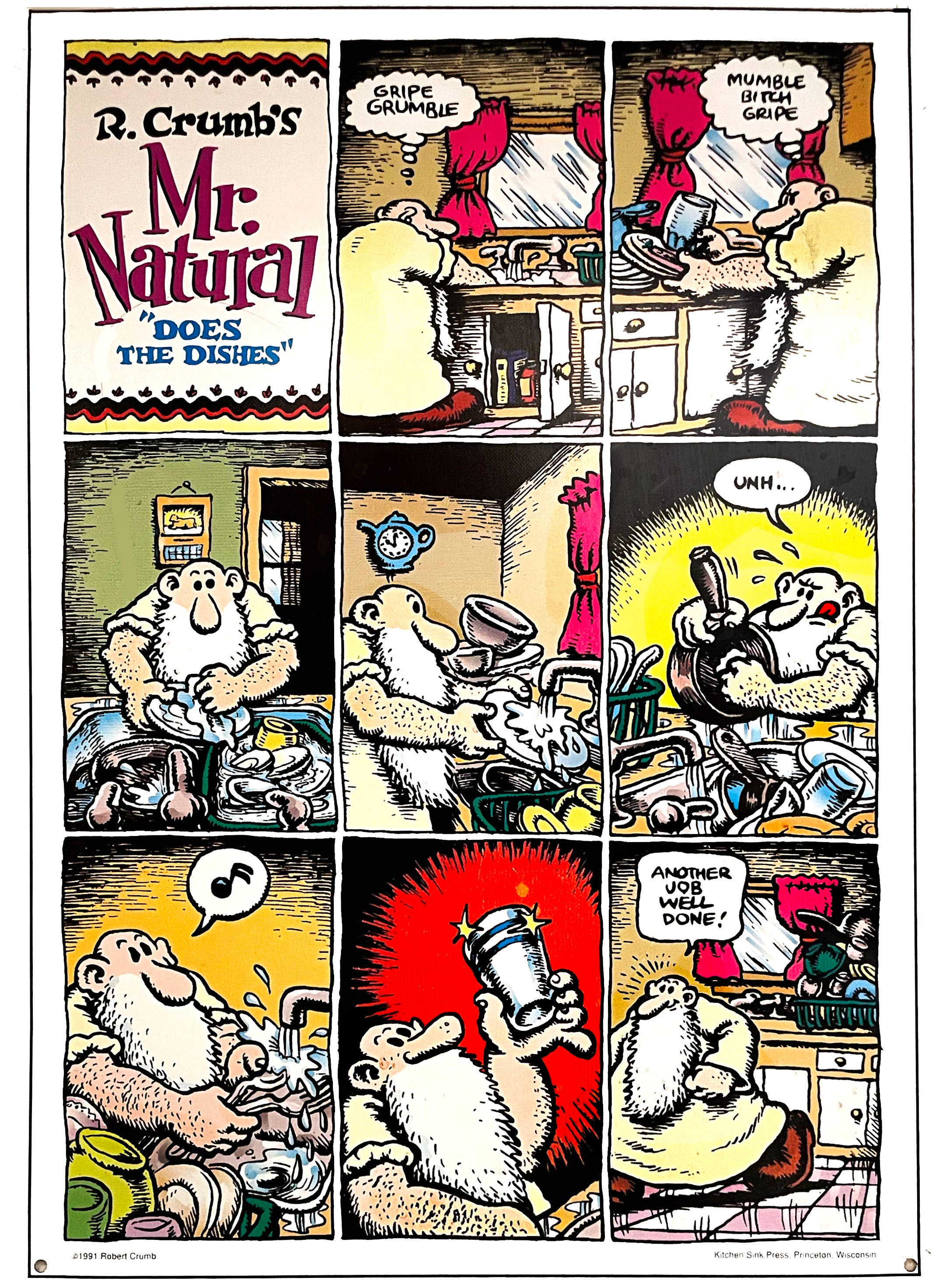
This cartoon by R. Crumb is printed on metal and hangs on the wall above our kitchen sink. It sums up the process of having to do a task, going from gripes to pride.
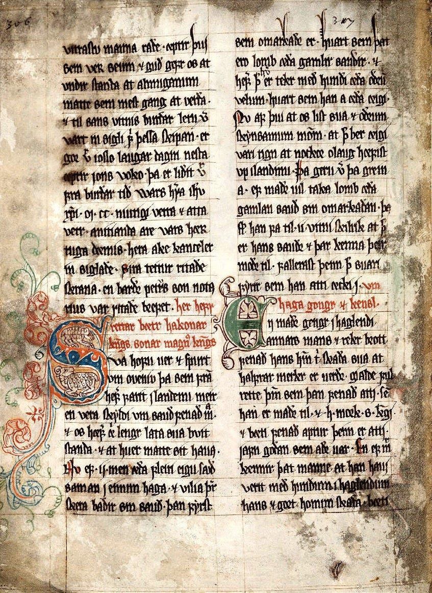
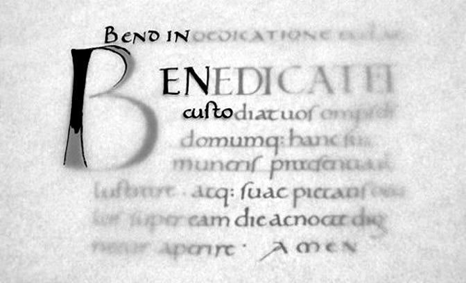
Some tasks seem burdensome, far too laborious to even consider, preventing forward movement on the creative actions we immediately want to jump into. For the beginner the prep work may seem pointless; they just want to copy a fancy Blackletter majuscule or a word in modern script. But patience is key. And we must eventually be able to hang our letters in rows to create those rhythmically woven stripes of text. In medieval manuscripts, inscribed rules delineated columns, gutters, and margins in this 13th c. Faroese manuscript known as the Sheep Letter. The calligrapher focused on floating the lettering within the spaces using a compressed Proto-Gothic script. Ornament occurs on the top edge, a nice design choice, and colorful Lombardic capitals and red text provided colorful graphic relief.
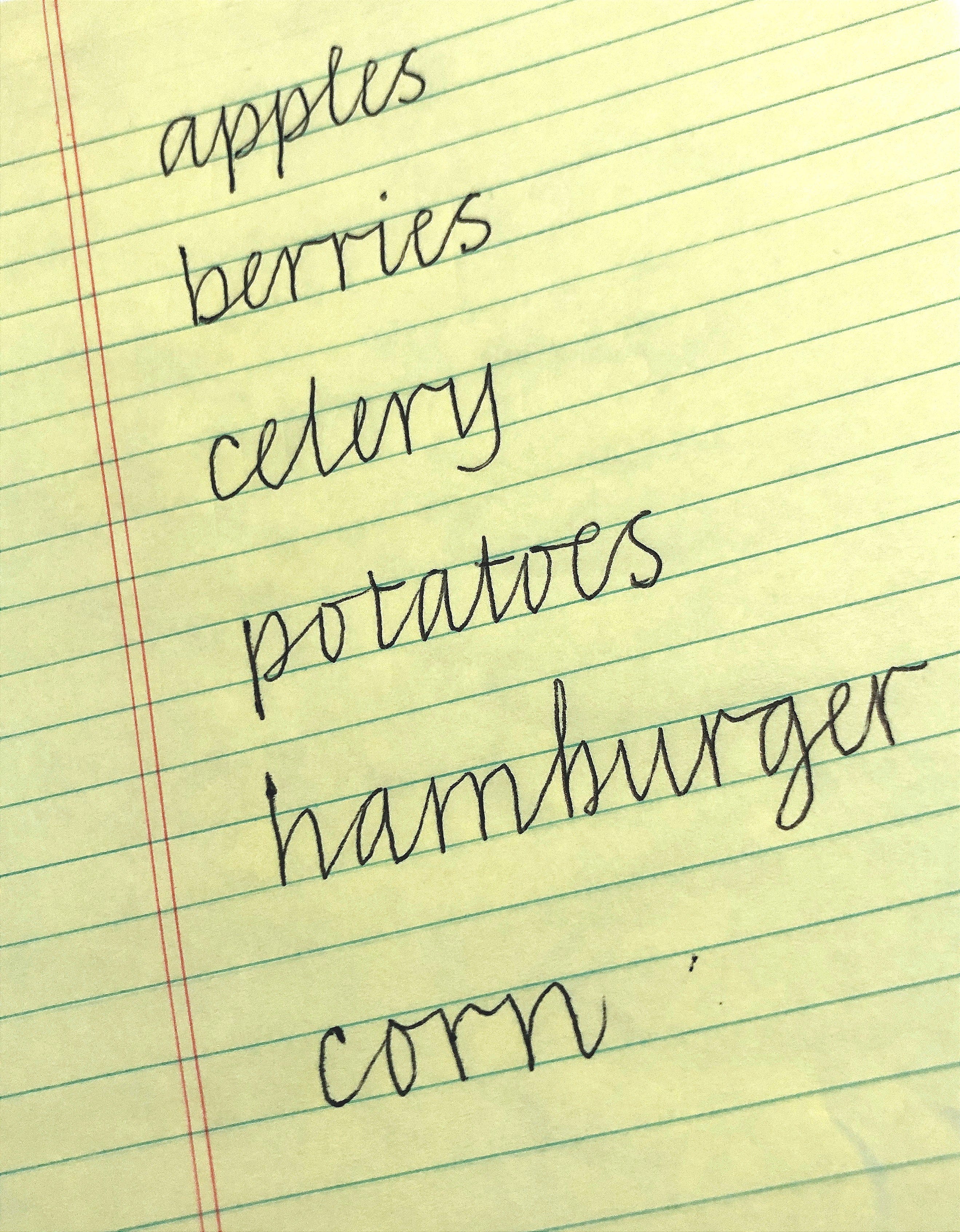
Calligraphers put thought into visible form. We are captivated by words that resonate, hoping they may have a life of their own for someone out there. We want to share our insights and get some feedback, so we write! If you haven’t ruled up a page for writing, this process will give you a new measure of control over your results. Even your shopping lists will look amazing when using a simple, formal script.
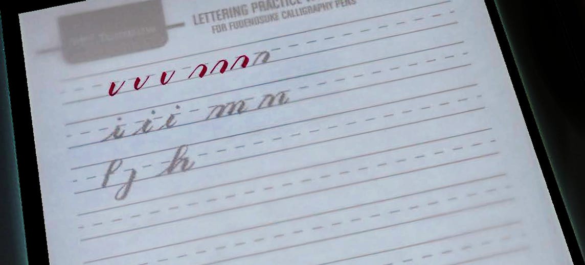
Many scribes use a lightbox to practice lettering, using a page of pre-ruled lines and a sheet of tracing paper on top for writing. The Tombow company offers free downloads of guidelines for using their tools, in this case the Fudenosuke brush marker. Other templates are available for the Brause or other broad-edged nibs, with the line intervals gauged in point sizes. However, these prepared guides are not nuanced in design nor created for original custom work. But they are fine for certain routine jobs, such as addressing formal envelopes.
Formal study of a historical exemplar often begins with a copy of the model placed on a light box and the text copied onto tracing paper. Guidelines are penciled onto the manuscript copy to reinforce alignment. Because we are so accustomed to digital lettering, it’s eye-opening to see how irregular some of the ancient manuscripts are, and we learn about them by examining them up close and attempting to replicate the lettering.
Eventually we must visit the original manuscripts in person, to understand how the letters were laid down. We feel the scribe from 1500 CE talking to us in our present moment, with real immediacy. Our own written words may someday reach another, far down the line. There are many manuscripts online, such as through the British Library, that can be enlarged greatly online for academic study. Highly recommend.
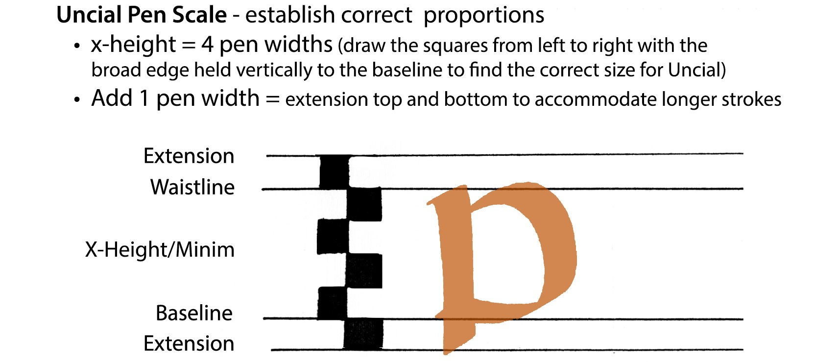
For our own study of any script, we begin with a pen scale. My teaching aid below for the introductory class shows the simple structure for letters written in Uncial, a bilinear script with some short extensions for letters such as p and d. The pen scale is used to mark off the lines for ruling down the page, within the set margins and inside the allotted image area. The pen scale is flexible, depending on the size of the nib you will be using.
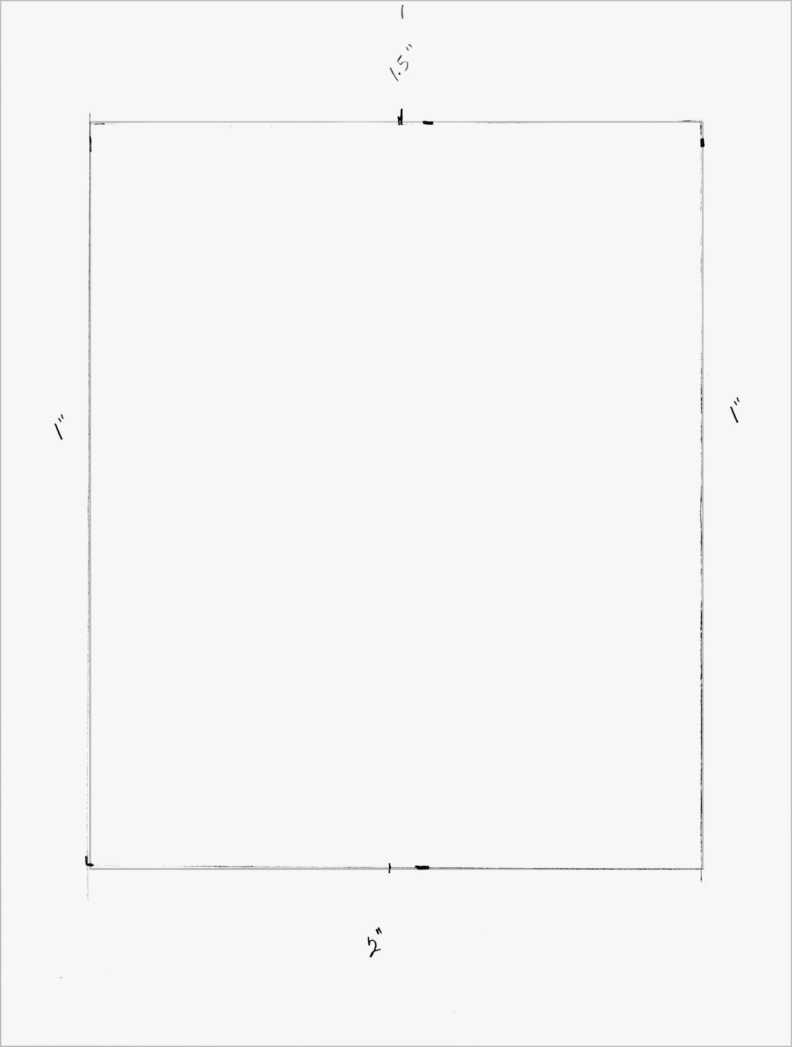
The standard layout is the simplest way to start. Think of the page as divided into two parts, the margin and the image area. We write in the image area on ruled lines made with the pen scale for the size and style of writing we want. The page design possibilities are infinite. Some are patterned on historical manuscripts, and others are influenced by contemporary concepts, which often include bleeding the design off the page and writing at a variety of angles and impositions.
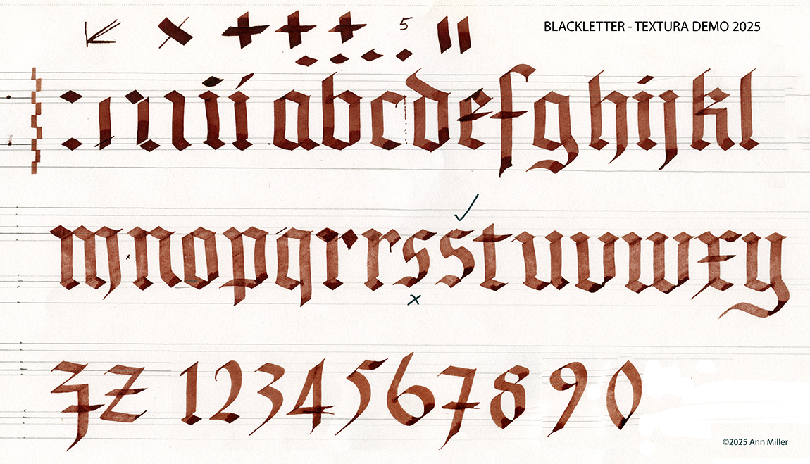
The practice page is set up using the pen scale, paying attention to precise pen widths for height and width of letters. Each alphabet is studied in minute detail.
Precise measurements eliminate the guesswork of where to put the text, allowing the scribe to focus on the form, flow, rhythm, color, texture, and character of the lettering as the page comes into being.
Ruling up is the creative beginning. It’s the most important personal time, pivotal to the outcome, delivering the scribe through each step of development to the last touchpoint of the pen. Go slowly, minding each step, and the results will fall into place.
Thank you all for reading and enjoying my posts. It’s great to be here with you.
ONLINE SUMMER 2026!
ART 232: The Design of Light and Dark: Text Art and Notan will cover optics, figure/ground theories and compositional methods in art, design, and letterform. I’m looking forward intensely to plunge into this area with you.

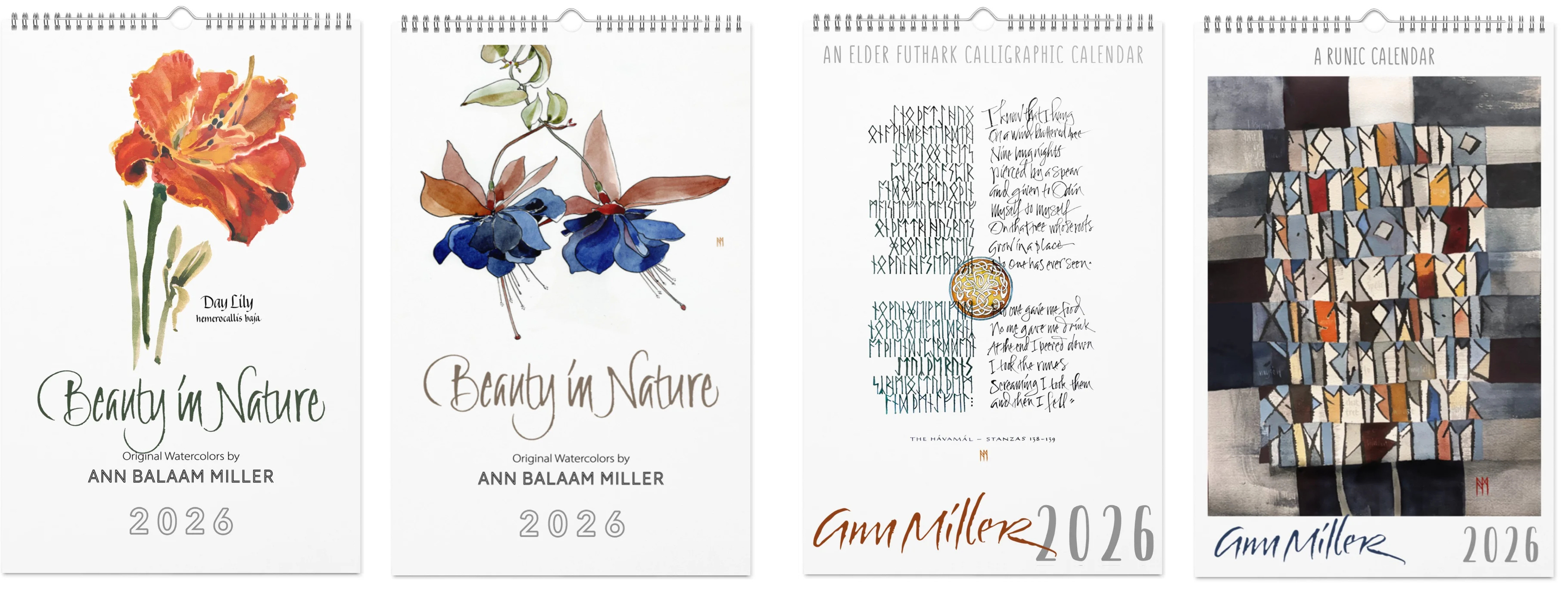
PRODUCTS
In my shop there are four art calendars for 2026 (it’s never too late!) and a few other items (mouse pads, mugs, pillows, scarves jigsaw puzzles, and more). Email me for info or assistance.
This blogpost on Substack will always be available free. The “paid” area is more interactive, with exercises and activities, discussion, and individual one-on-one conversation and critiques, like an online tutoring session. Your contribution is always appreciated, and helps keep my writing coming your way.
PAID SUBSCRIBERS: All paid subscriptions are now $75 annually or $7.50 monthly. I am eager to devote time to interactive projects and individual discussions on this basis. Invest in improving your graphic skills, design perception, and performance in the visual arts, handwriting, letterformation, and calligraphy.
EDUCATIONAL DISCOUNT: I offer a 50% discount on the annual paid subscription for art instructors and those in the art education field.
A paid subscription gives you access to ongoing conversations on my chat feed, permanent access to all archives, and access to exercises and how-tos. Let’s continue to talk about art and keep it fed, nourished, and productive.
Thank you for offering all the detailed information about lettering, spacing, and all the other lessons we need to learn to improve our writing.