

Getting the proper slant on things…
Forgive the pun, but I’ve been teaching for a while now, and in any given classroom an average of about 10 percent of students are left-handed. In a calligraphy class, this can pose a few issues for the student, since directions for lefties go beyond those for right-handers. There are many “angles” that affect the letterformation.
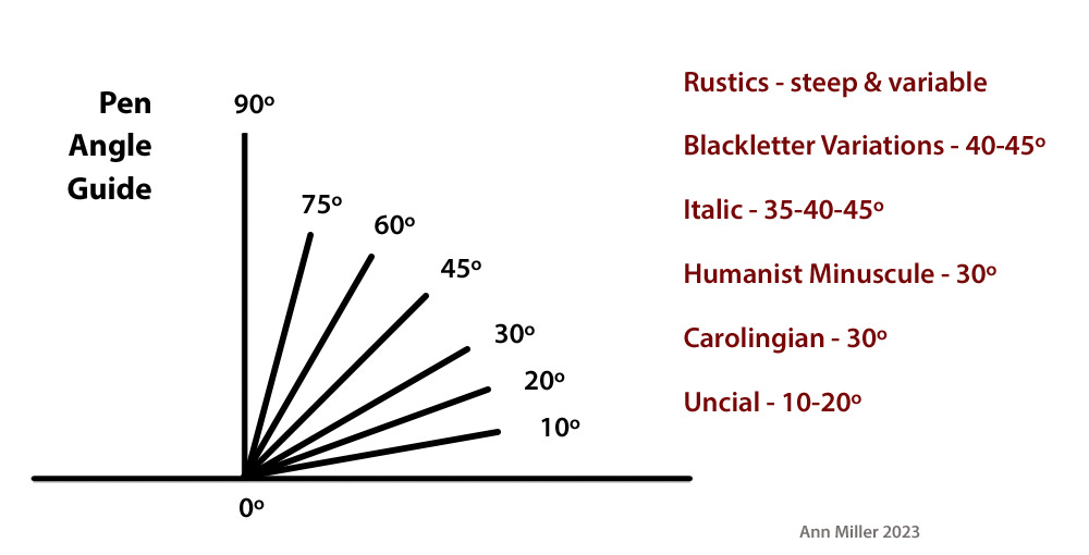
Pen Angle. Not everyone who signs up for a beginning calligraphy workshop is equally proficient at geometry, so achieving the pen angle required for a specific broad-edged pen script is not always easy or obvious. Some dexterity is also involved.
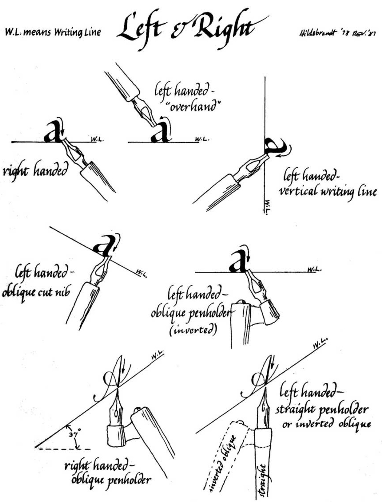
How to hold the pen in relation to the writing line is outlined by Bill Hildebrandt. Many how-to books on calligraphy were handwritten before the Age of Computers.
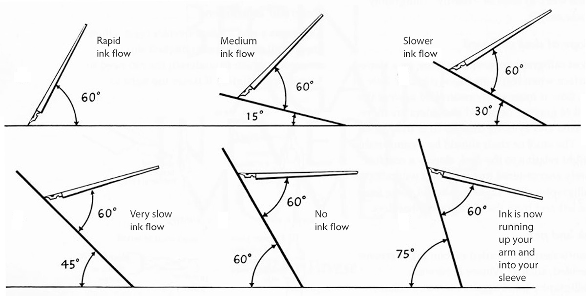
Board Angle. There is also the penhold (the angle of the body of the pen in relation to the board) that governs the speed of ink flow. While the angle of the pen to the board remains at 60º, different board slants facilitate control over the flow of ink. A steeper angle will help the flow of more concentrated sumi or more viscous inks and gouache mixtures. A shallower angle will slow the flow of watercolors or the thinner, diluted inks.
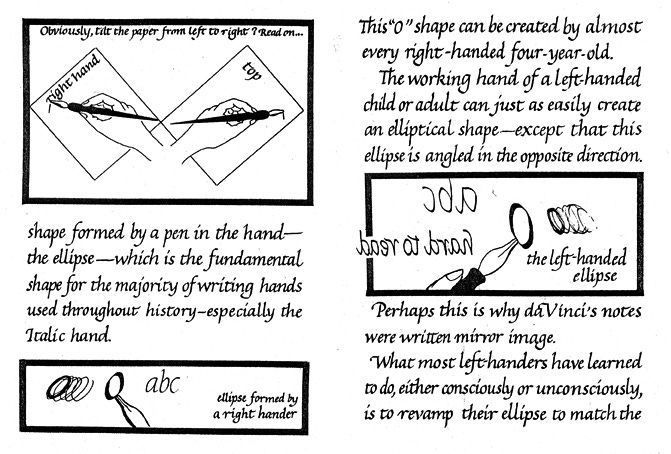
Paper Angle. There is an excellent 38-page booklet by Betsy Rivers-Kennedy, Insights into Left-Handed Calligraphy for students and teachers. It is out of print but I do have a copy. This excerpted page describes the basic problem of left-handed scribes trying to write a script designed for the right-handed majority. Left-handed calligraphers must solve the formation of the letter “O” before moving on to the rest of the alphabet, and most broad-edged pens are not designed to make this an easy task.
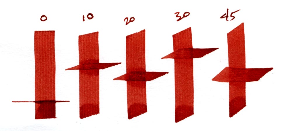
Axis Angle. The axis of the letter governs whether its stems are straight (90º) or slanted (0-89º) in relation to the baseline. If the pen angle is at 30º, for instance, and the axis is perpendicular to the baseline, the stem of the letter will be about twice as thick as the crossbar. But if the pen angle remains at 30º, and the axis changes to 5-8º (as for the Italic letter), the stem will become narrower and slightly lighter in weight. This nuance in important in increasing your freehand writing skill, whether you’re a rightie or leftie. We all have to know the angles, acute or obtuse!
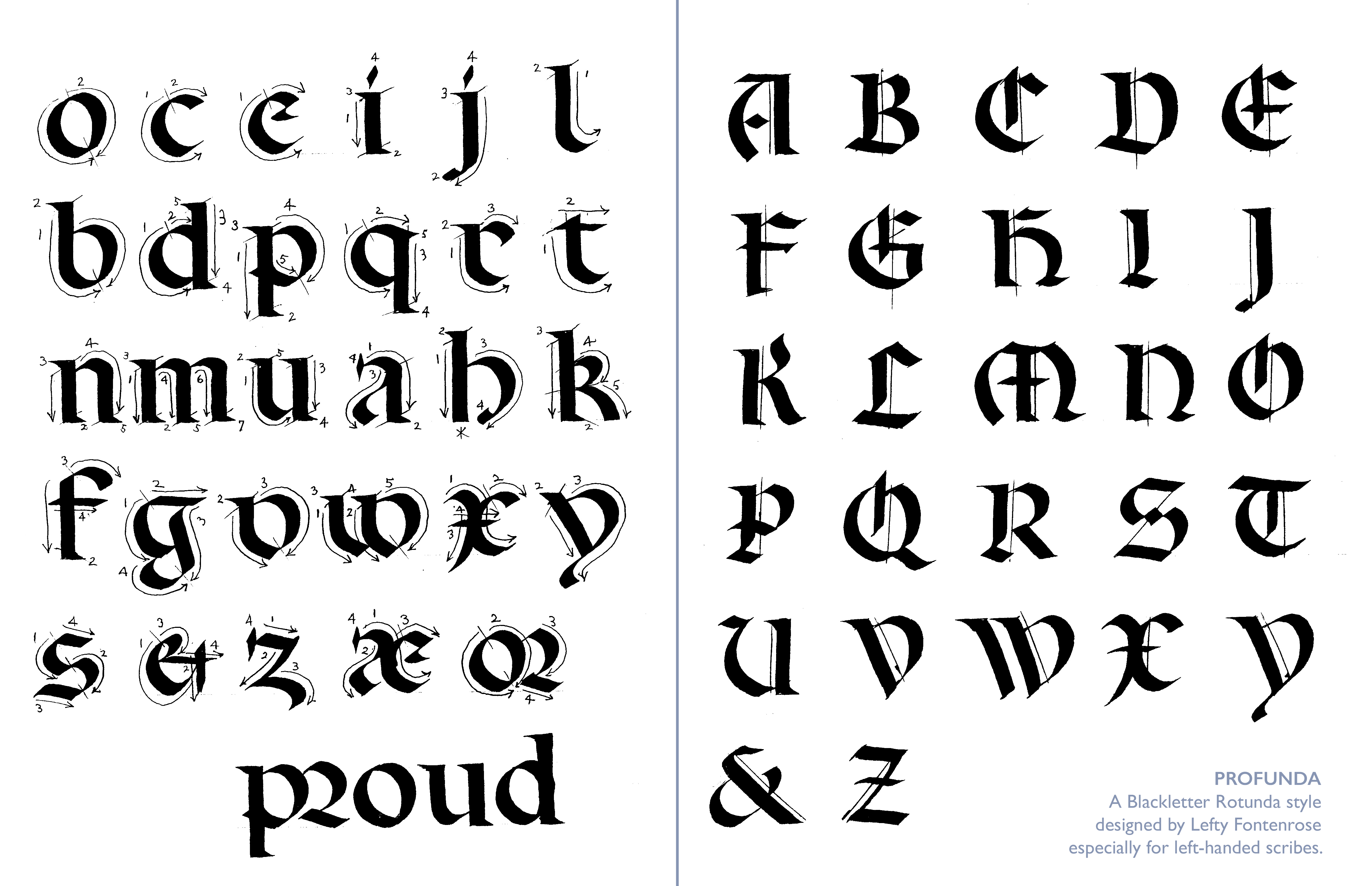
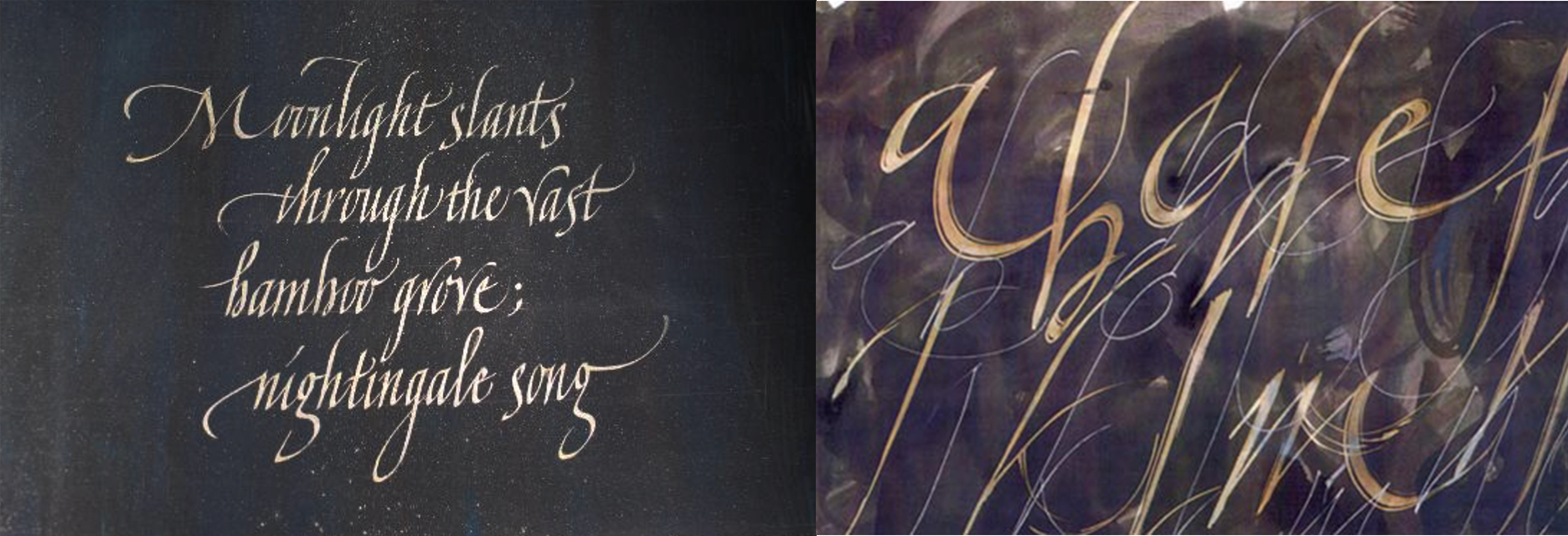
I have to mention Lefty Fontenrose, a friend, beloved member of the calligraphy community, and an accomplished left-handed calligrapher who loved teaching. He shared his writing spirit and massive sense of humor with members of The Friends of Calligraphy during one of their Trivial Pursuits events some 20 years ago that I was fortunate to attend. Lefty developed and taught his own version of Blackletter Rotunda, which he called “Profunda”. He shared his model in a handout and instructed us in making the specially formed serifs on the letter stems. Certain details are very appealing, like that “a” in line 3, and the clever formation of the minuscule “e”!
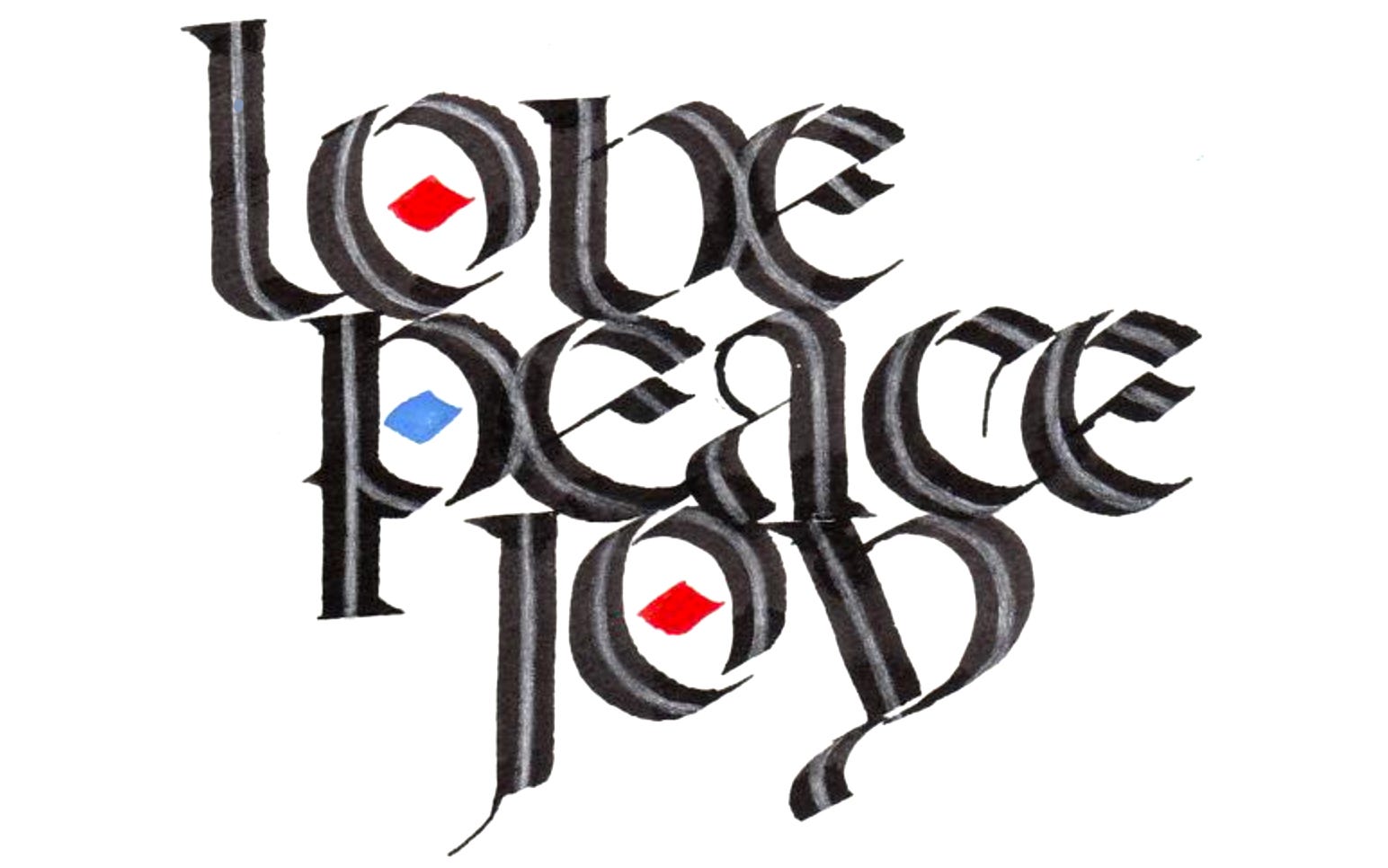
Lefty’s holiday card put his lettering design into action.
Among left-handed calligraphers, Gaynor Goffe also stands out for her command of letterform and creative text art with broad-edged and pointed pens. She has a distinctive flowing Italic hand and has inspired many to thrive in the lettering field.
Let me know if you have questions regarding left-handed issues! I have resources that I can share with all paid subscribers, including ongoing Q&A.
Thank you all for reading and enjoying my posts. It’s great to be here with you.
Upcoming class. Register now. Add to your current skills by registering for my class, Art 53 - Calligraphy Design & Norse Runes, at Stanford Continuing Studies. Read more at pennib.com/teaching.
NOTE TO ALL: This blogpost on Substack will always be free. The “paid” area is more interactive, with activities, discussion, and conversation. Your contribution is always appreciated, and helps keep things coming your way.
PAID SUBSCRIBERS: All paid subscriptions are now $75 annually or $7.50 monthly. I am eager to devote time to interactive projects and individual discussions on this basis. For you, it’s an ongoing investment in your graphic skills and performance in the book arts, handwriting, letterformation, and calligraphy.
EDUCATIONAL DISCOUNT: I’m now offering a special 50% discount on the annual paid subscription for art instructors and those in the art education field.
A paid subscription gives you access to ongoing conversations on my chat feed, permanent access to all archives, and access to exercises and how-tos. Let’s continue to talk about art and keep it fed, nourished, and productive.