

Haiga
Thoughts on combining poetry and visual imagery in a single work.
First of all, I want to thank everyone who came my studio over the last two weekends! Thanks especially to my students who visited, and to those who found artwork to take home.
Art that combines image and word has a name.
In Japanese, the word is haiga. It is a combination of the syllable “hai” from haiku poetry, and “ga” meaning image. It makes sense. As language developed, we have always combined these two aspects of visual art, the writing and the drawing.
[Haiga] is, by definition, a combination of visual and verbal elements which work in ensemble to create an aesthetic experience quite distinct from either element taken by itself. —Jim Kacian, Looking and Seeing: How Haiga Works, 2002
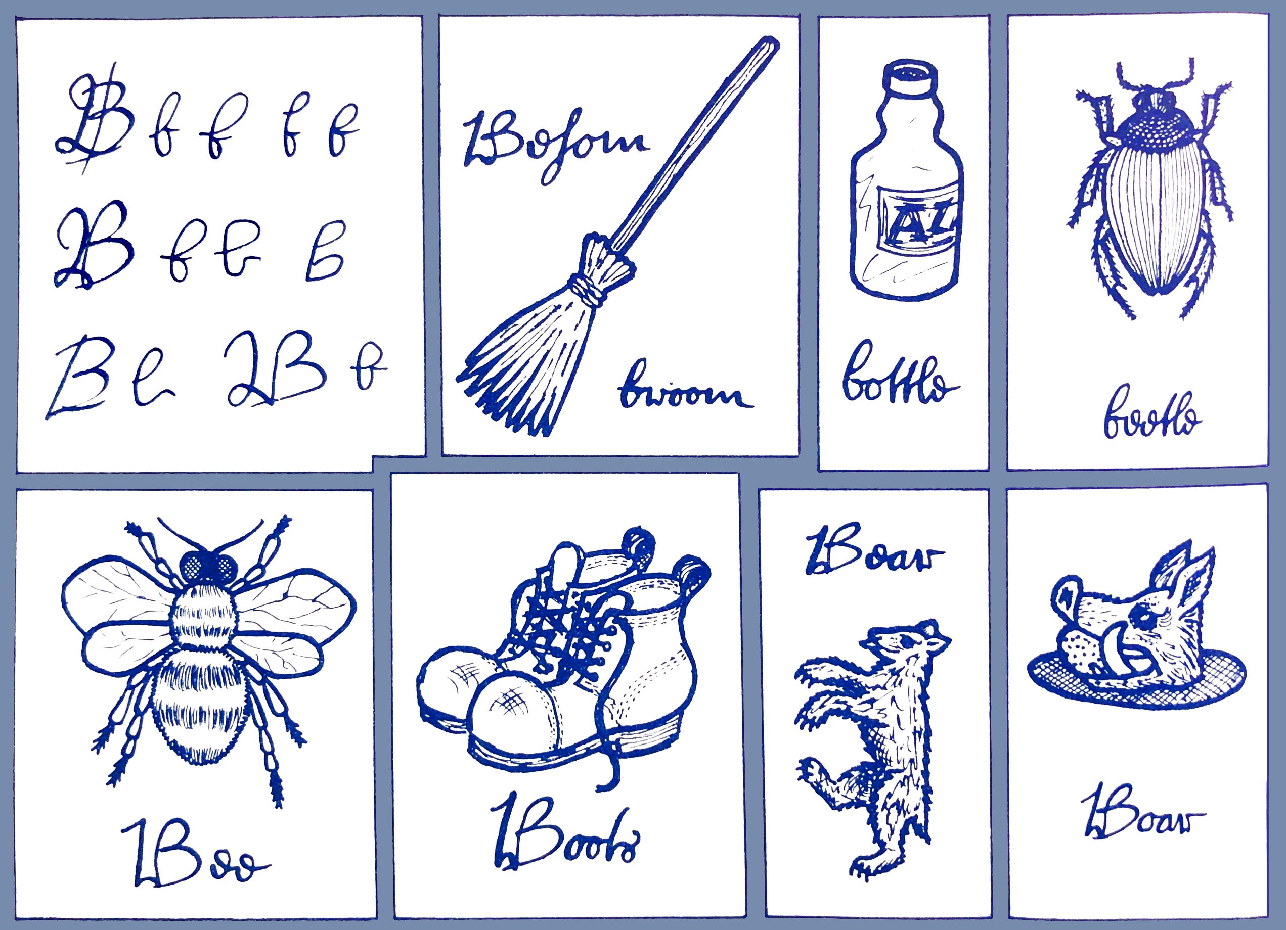
Writing sends the message. Drawing reveals the subject. In a children’s first ABC book, we often see the letter, the word, and the picture that all relate to the same thing (the letter B, the word bee, and a drawing of a bee). The following image is from a book meant for students of the 16th-17th century Elizabethan script known as the Secretary Hand. This wonderful book is available online, and is quite popular among calligraphers and those of us who need to decipher old European documents and family histories.
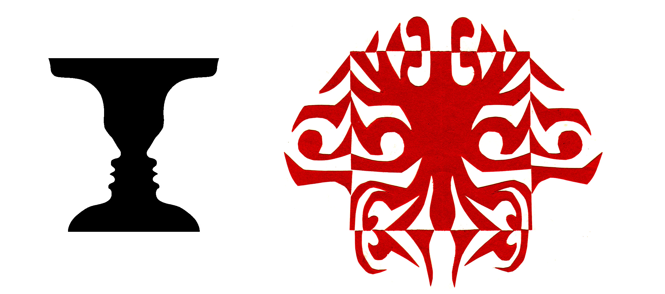
As time goes on, experience floods us with connections, nuances, and relationships between dissimilar things. We are affected and impressed, and often want to share some amazing or odd reality we’ve noticed. As a result, we find art with a letterform that seems to come out of nowhere next to a word that was remembered or overheard along with an image that has no relationship to the other two. And yet, the three dissimilar things can be brought together, perhaps through irony, humor, or empathy, to create a synthesis, a new reality that leads us to a greater level of impact, insight, and awareness. Putting the image and text together forces the viewer to experience the wholeness of the visual message. This is the power of haiga, a bonding of text and image that achieves closure, or the resolution of a third reality that is greater than the sum of its parts.
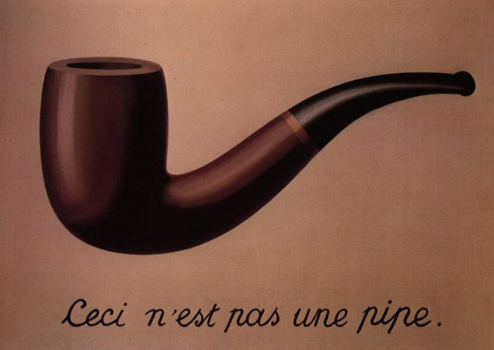
Note this famous and familiar work that combines image and text. The artist points to himself as the creator of the image, which is clearly not a pipe, but an illustration of a pipe. The title of the painting also contributes to the artist’s meaning, which provokes the viewer’s curiosity by providing the cautionary word “treachery”.
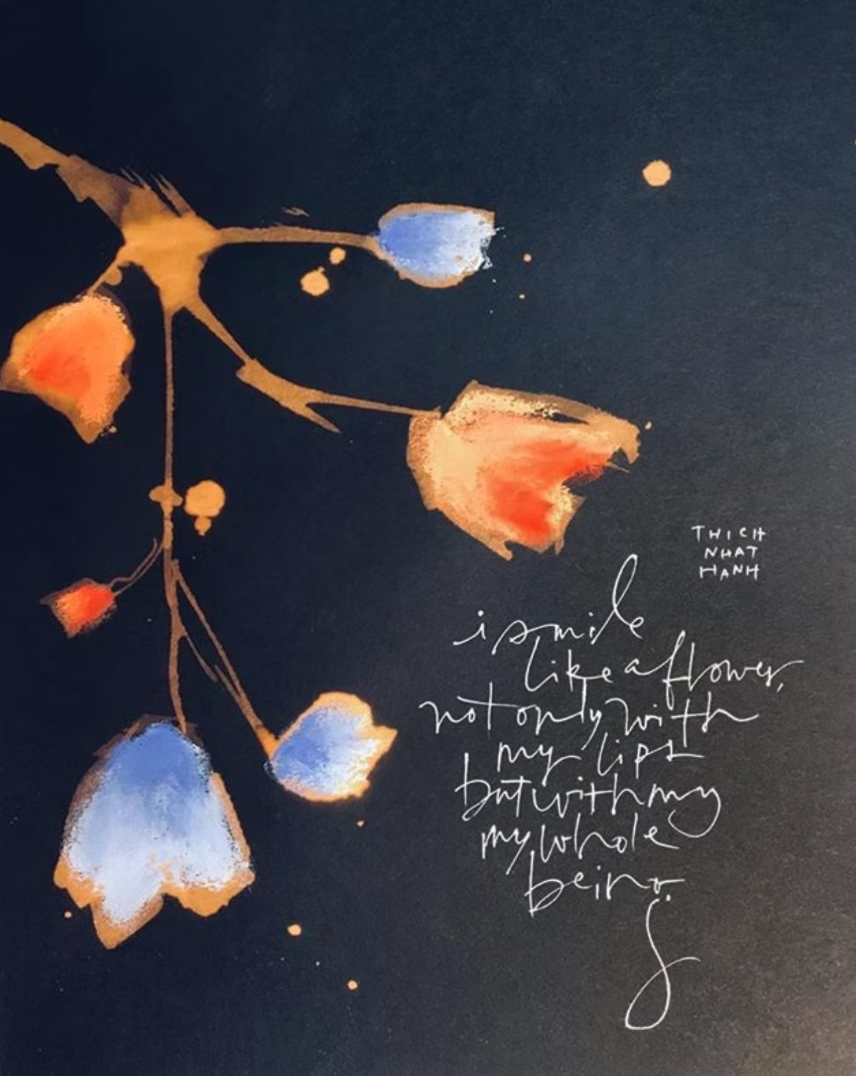
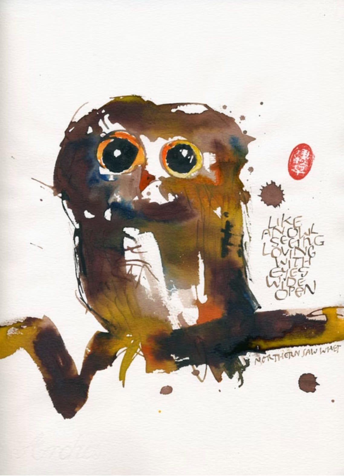
Contemporary artist and calligrapher Mike Gold combines images and text. He is attuned to the Japanese aesthetic and experimental in his approach to shape and line. With a long career in lettering design and a love of nature and poetry, his use of the haiga form is natural. Here are two of his works.
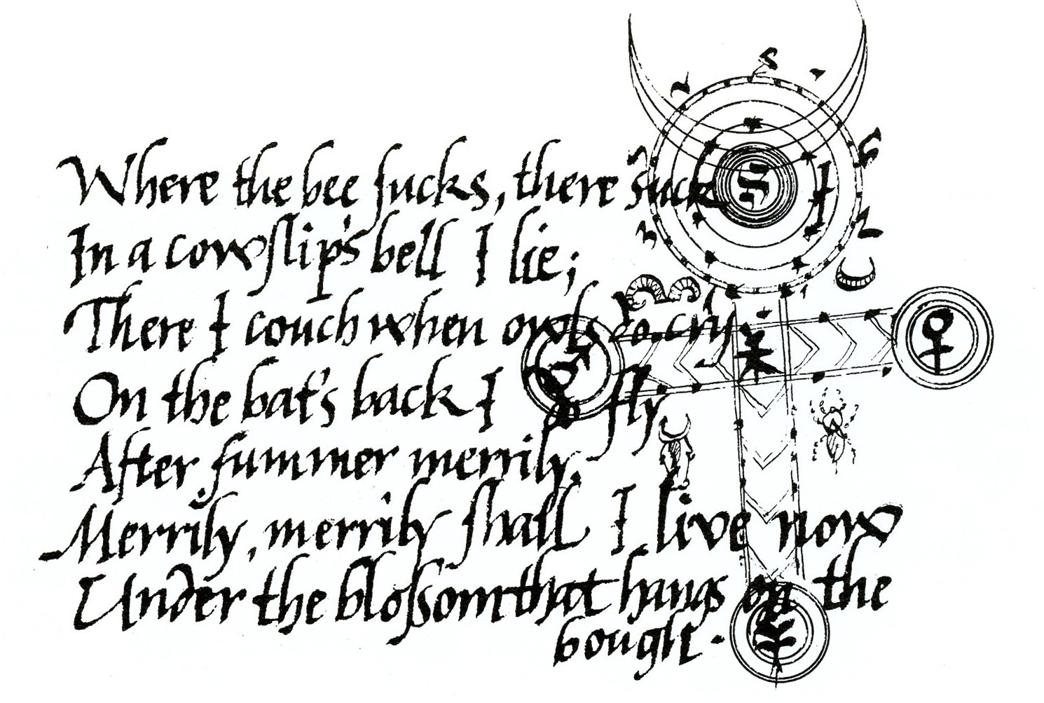
The haiga can be complex. In this stylized writing of Ariel’s song from Shakespeare’s The Tempest, Brody Neuenschwander created a detailed graphic of alchemical and planetary symbols to anchor and resonate with the text, in keeping with the 16th c. environment of the Renaissance.
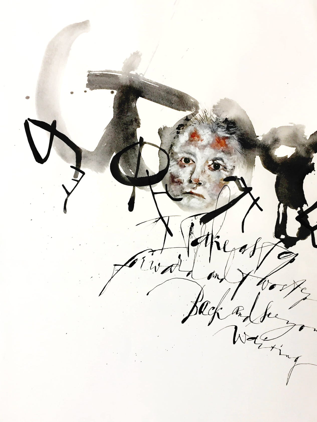
The haiga can be a portrait. Brody uses every bit of contemporary feeling in this self portrait with the thoughtful and evocative text “I take a step forward and two steps back and see you waiting.” Do we sense an aura of dismay, or puzzlement?
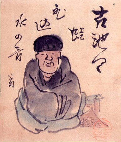
This traditional portrait is of Matsuo Bashō by Yokoi Kinkoku, c. 1820. The calligraphy presents one of Bashō's most famous haiku poems: Furu ike ya / kawazu tobikomu / mizu no oto (An old pond / a frog jumps in / the sound of water). The original “no fear” meme, perhaps! The haiga form forces us to realize that the two elements, the poet’s image and his words, convey a sense of time, like a video clip. You can see the poet with his mouth open, as though speaking, the text floating in the air above. It has a strong sense of animation!
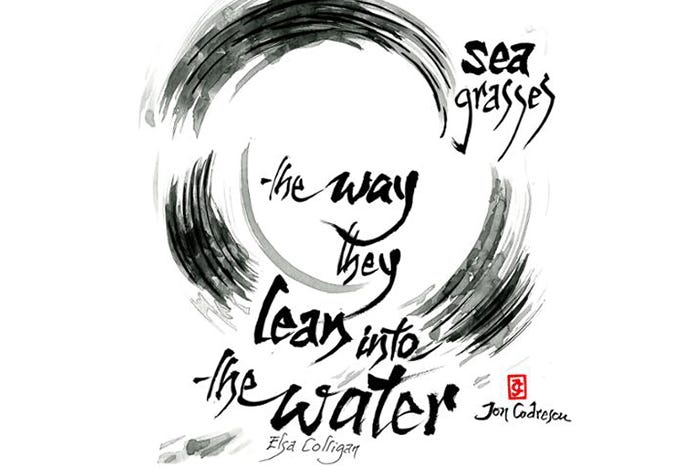
And in this haiga, Romanian artist Ion Codrescu blends his calligraphy and painted image.
Imagine. Even in music, a song has vocalized words and auditory images communicated through sound, becoming a complete expressive entity just like the haiga. The “silent” fine arts of drawing, painting, and sculpture also combine the illustration and the message into one harmonious whole. We learn how to listen and how to see, not only to get the full message but also, with reflection, to become the full message.
So, when you’re doodling with pen in hand, think about making a little image, and associating even one word with it. It could become a memorable spot in your day, adding an outstanding gestalt moment to your regular linear swim.
Thank you all for reading and enjoying my posts. It’s great to be here with you.
REGISTER NOW FOR MY NEW ONLINE CLASS!
ART 232: The Design of Light and Dark: Text Art and Notan
It’s at Stanford Continuing Studies, and it begins on Thursday, July 16 with a zoom session from 6:00-7:50pm. Anyone can register. Canvas opens a week prior to class for orientation, a pre-class assignment, and a general heads-up. This 6-week class covers optics, figure/ground theories, Gestalt, and related compositional methods in studio art, design, and letterform. We’ll make art!
Getting Inky will always be available free. If you want more interaction, exercises and activities, discussion, individual one-on-one conversation and critiques, like a mini-class, please send in a contribution of any amount (use tea link) or subscribe!
PAID SUBSCRIBERS: All paid subscriptions are now $75 annually or $7.50 monthly. I am eager to devote time to interactive projects and individual discussions on this basis. Invest in improving your graphic skills, design perception, and performance in the visual arts, handwriting, letterformation, and calligraphy.
EDUCATIONAL DISCOUNT: You receive a 50% discount on the annual paid subscription, available to art instructors and those in the art education field.
I love combining words and art. Originally, when I first started my art career (ions ago!), that was, and still is, my primary mission as an artist/writer. In fact, my design business (prior to HMA Publishing) was called: Messageart Design. I still use that moniker for design clients. My books and card art are under HMA Publishing. The HMA part stands for the first initials of my three grandsons (Haakon, Marius, Anders). Some day, they'll appreciate that...