


Exercising with Runes
Student work from my recent text art and design class.

Talk about outcomes!
Today I’m sharing the wonderful works of students from my class, Art 53 - Calligraphy Design & Norse Runes at Stanford Continuing Studies, offered online once or twice a year.
Why did I put this class together? Here are a few reasons.
to explore runic writing systems in depth, for well-informed use in art
to use runes to focus on the basic principles and elements of design
to teach lettering methods through innately simple signs
to strengthen the link between phonetics and the act of writing
to erase misconceptions surrounding the original intent and meaning of runes
to challenge the student with a new form of expression
to promote the use of unfamiliar and diverse tools, materials, and methods
A glimpse at what my students have accomplished over the last eight weeks.
The class begins by studying the 24 characters of Elder Futhark, the writing system used from the 1st c. through the 7th or 8th c. CE, learning their cultural and literary history, their forms, names, and phonetic equivalents.
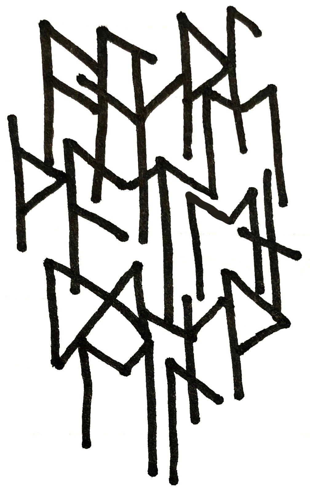
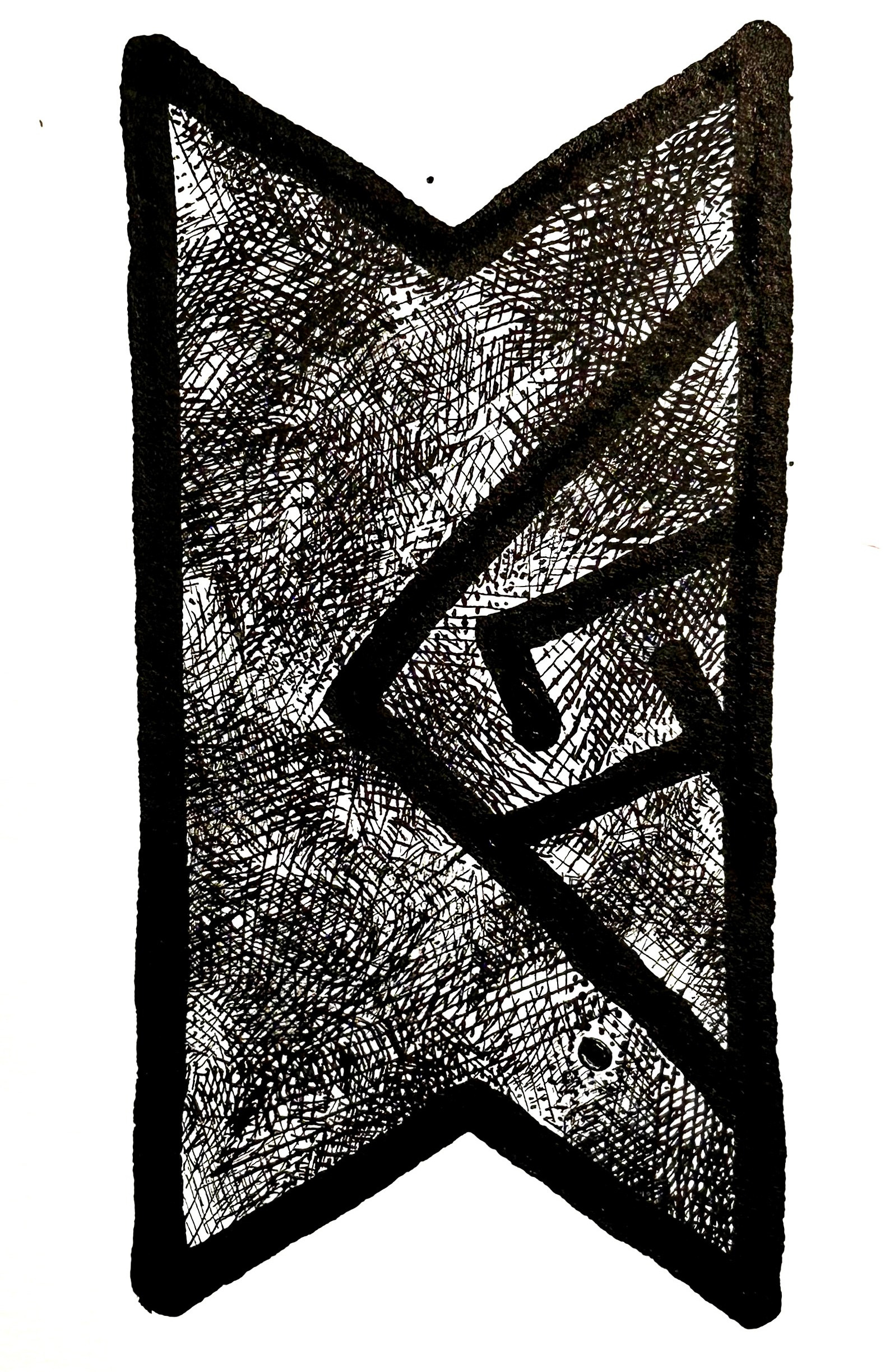
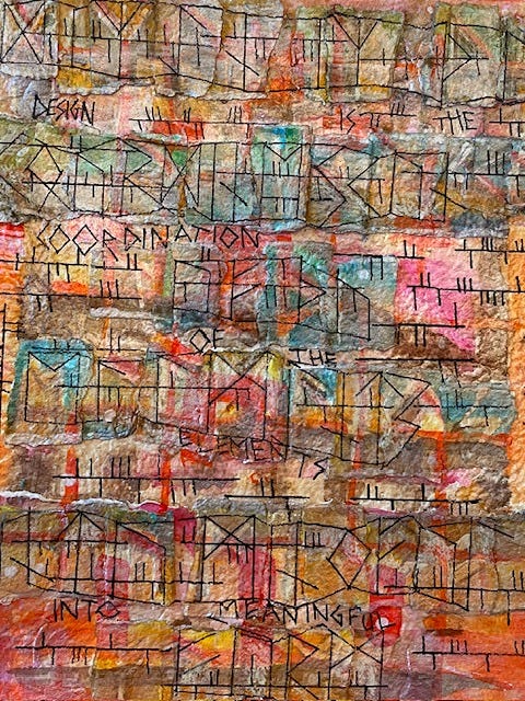
One of the first exercises is to write a phrase using a connected group of signs in which all elements are attached to each other by touching or overlapping, with an eye to creating interesting enclosed white shapes that are neither too small (cramped or clogged) nor too large (rambling or amorphous). The new student explores pen and ink, line quality, balance and positive/negative space, often learning formal design terms for the first time.
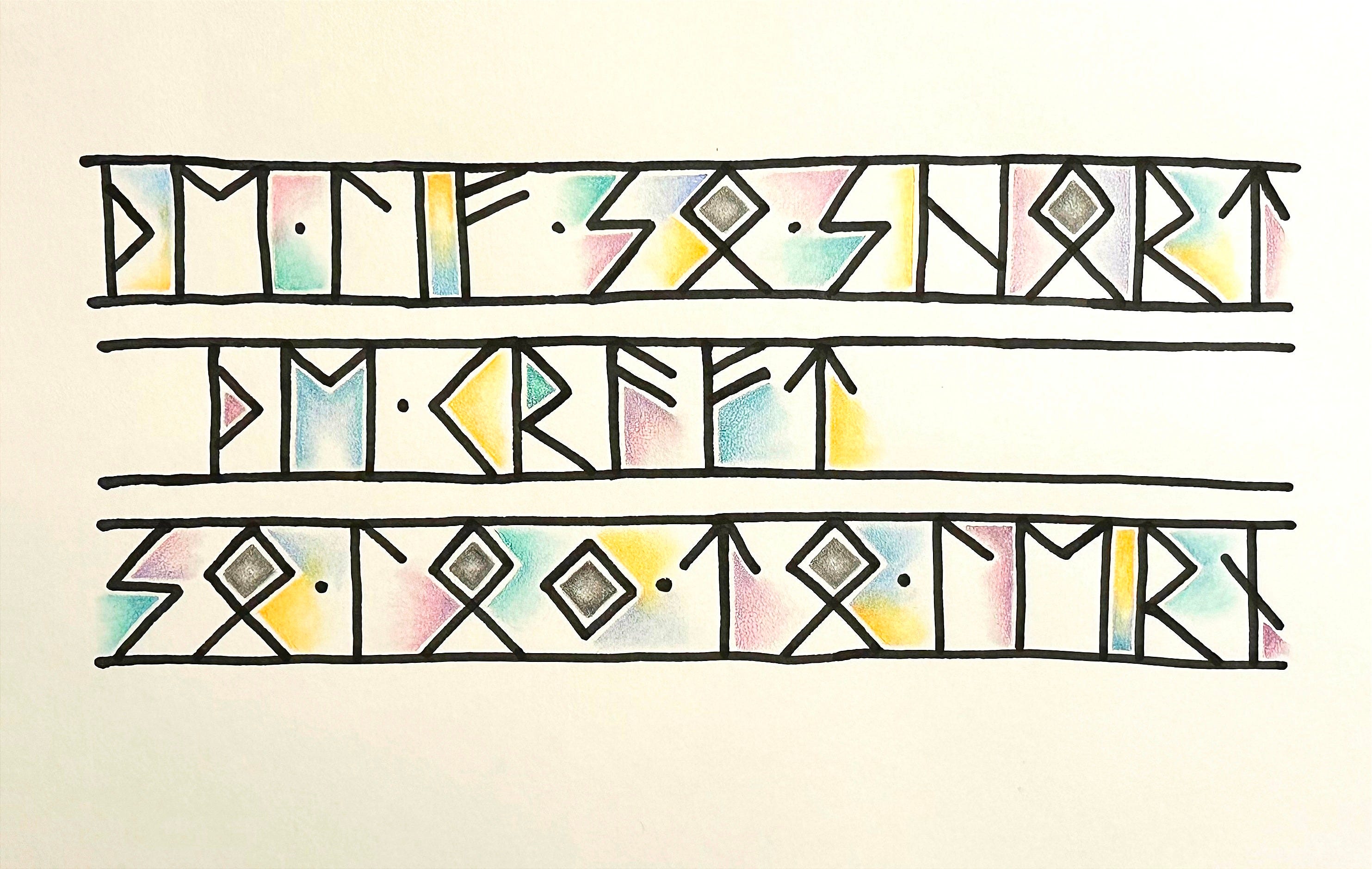
In the next exercise, a student added color, pattern, texture, line weight, and a variety of terminal treatments to the mix. With only a week’s progress, the visual becomes more musical, and it’s easier to work with the elements of design—shape, color, space, form, line, value, and texture when applied to the simple geometric runic forms.
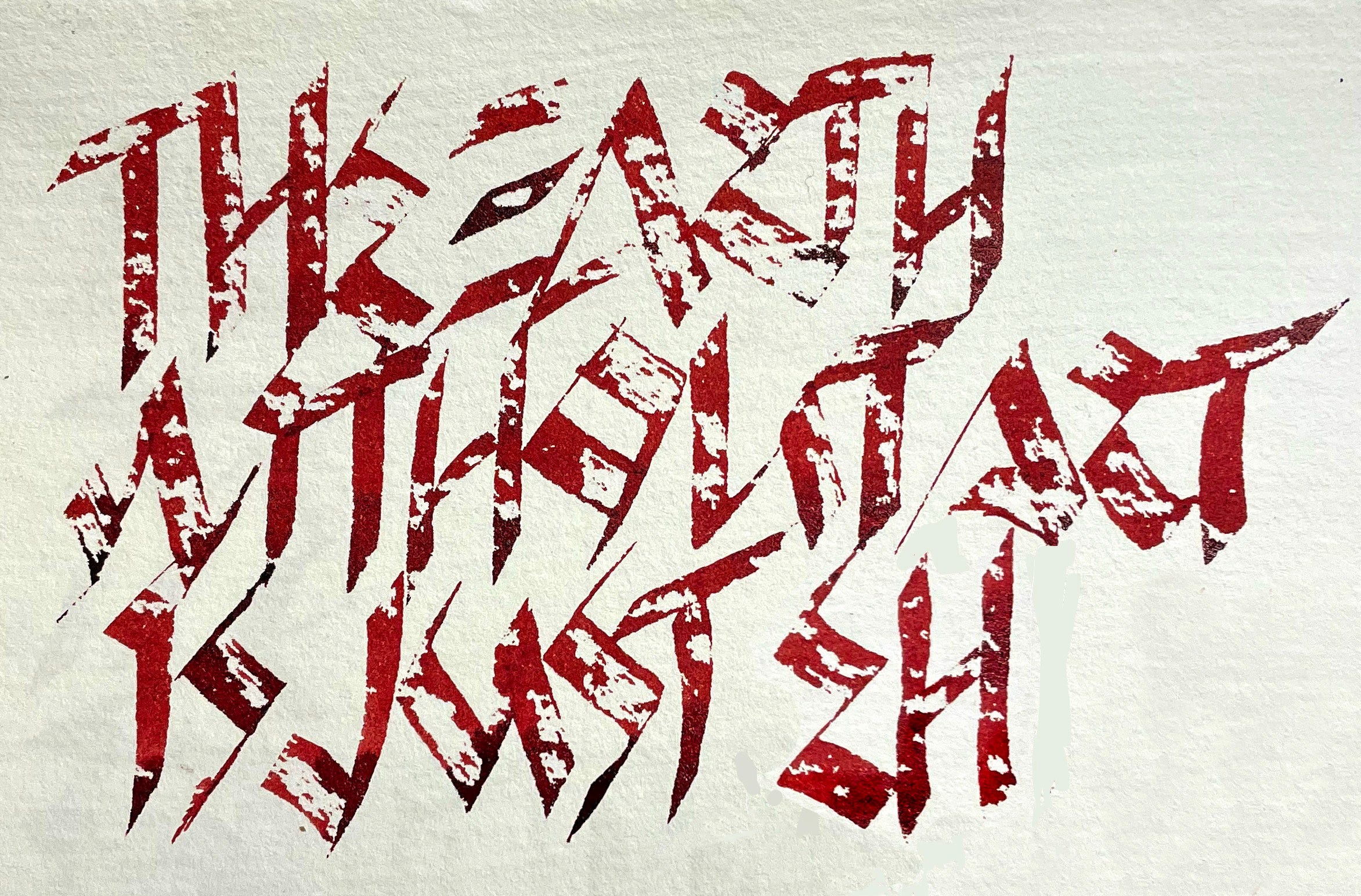
The aim is to be able to write fluently using runes as the script, and to create interest in the page, its content, and the expression of the artist. Runes are perfect for this, since they are traditionally drawn between two lines. They can be separated by interline space, as shown in the student’s work below, or can share a single guideline. Augmentation with shade and color helps elevate awareness of shape, distribution and triangulation of hues for design balance, and overall harmony of treatment.
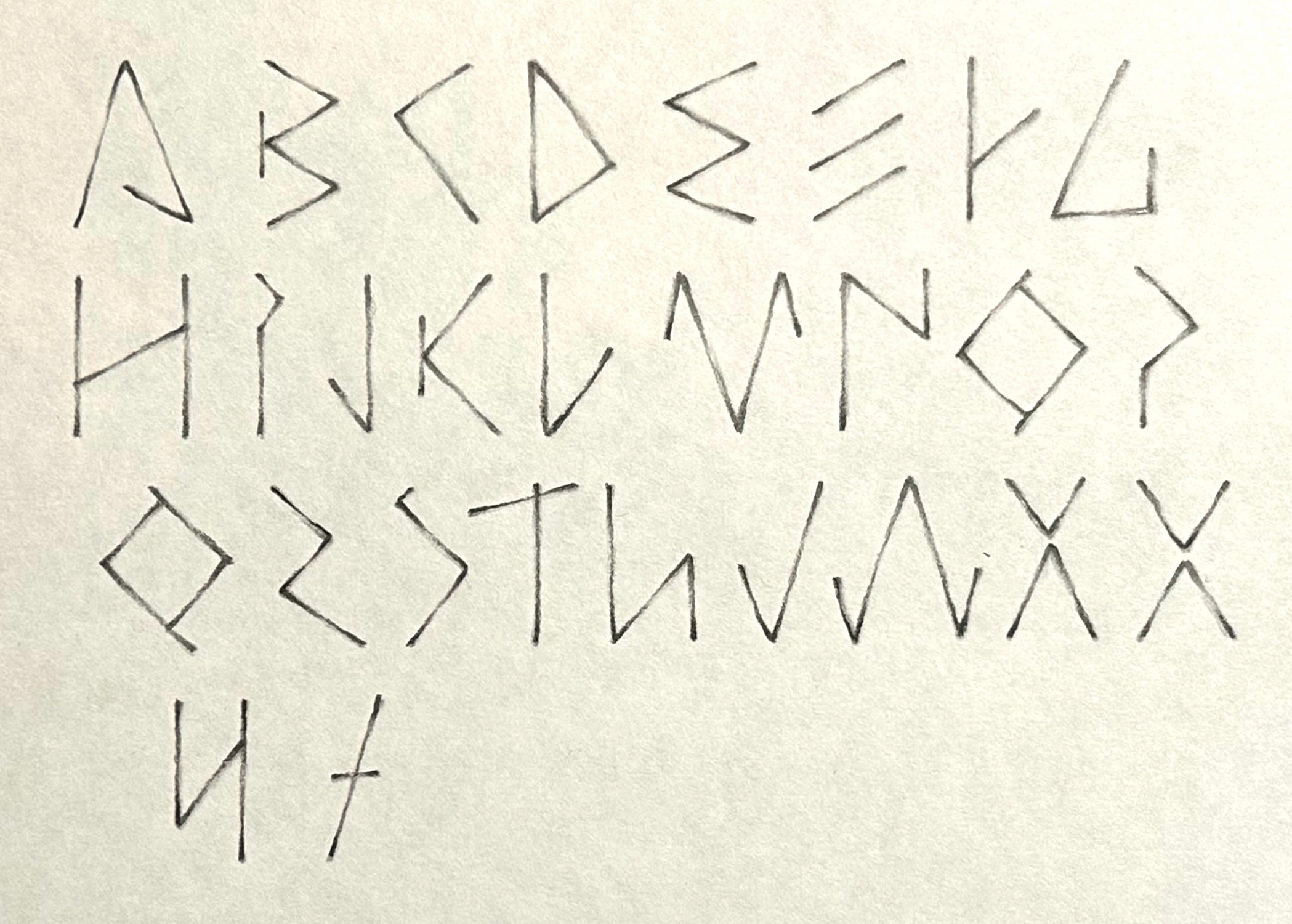
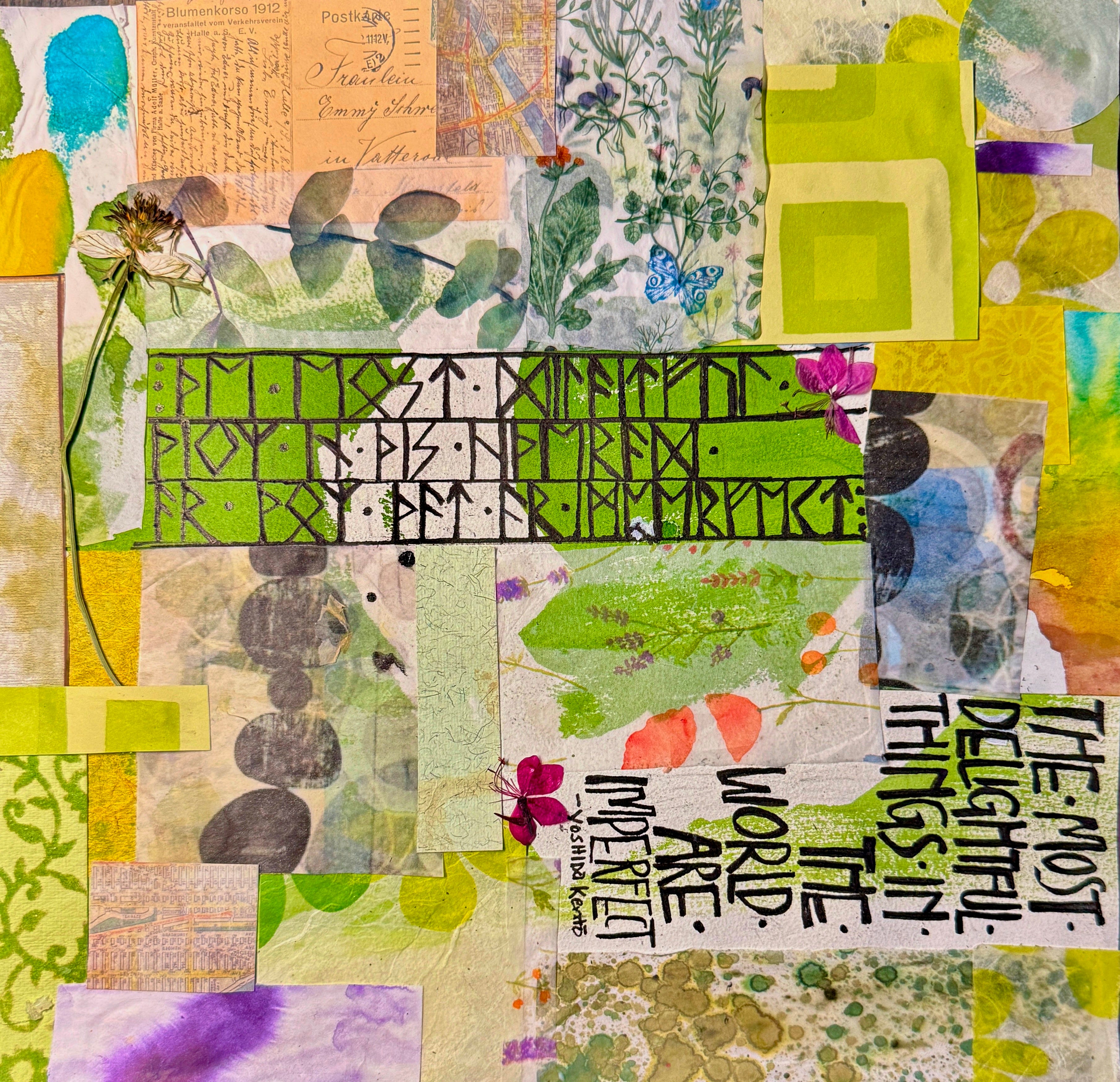
Complementary to runes, we also create an alphabet of rune-like letters. These provide a way of staying within style while remaining legible! Each student developed a rune-like alphabet for use in upcoming projects. We discussed a variety of terminal and serif forms as well as pressure and release. A skeleton grid similar to the one for Roman Capitals helps maintain proportions.
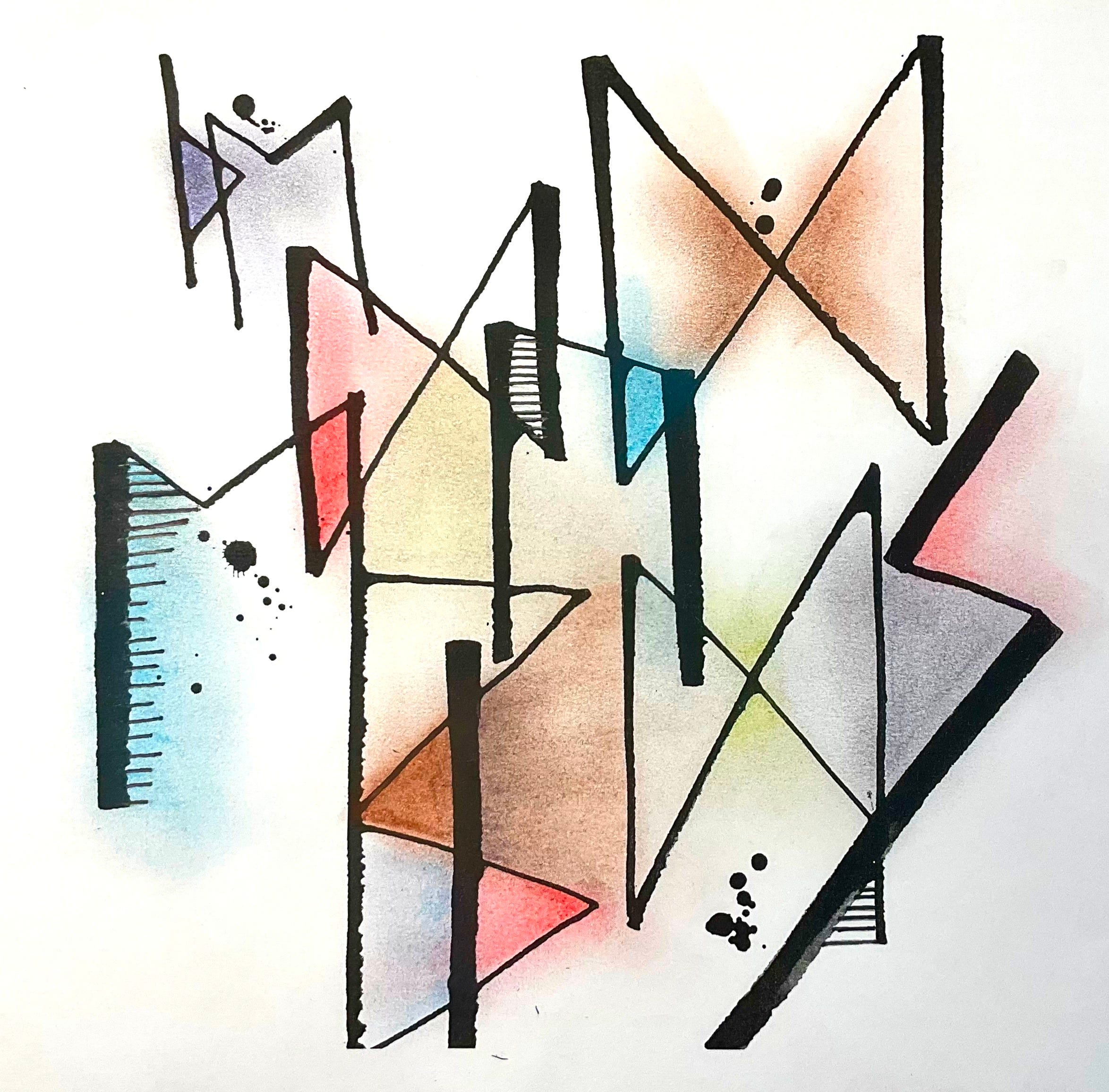
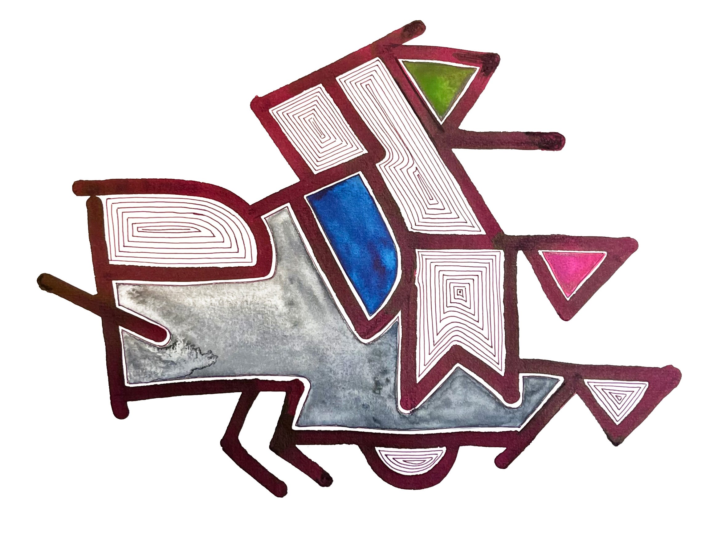
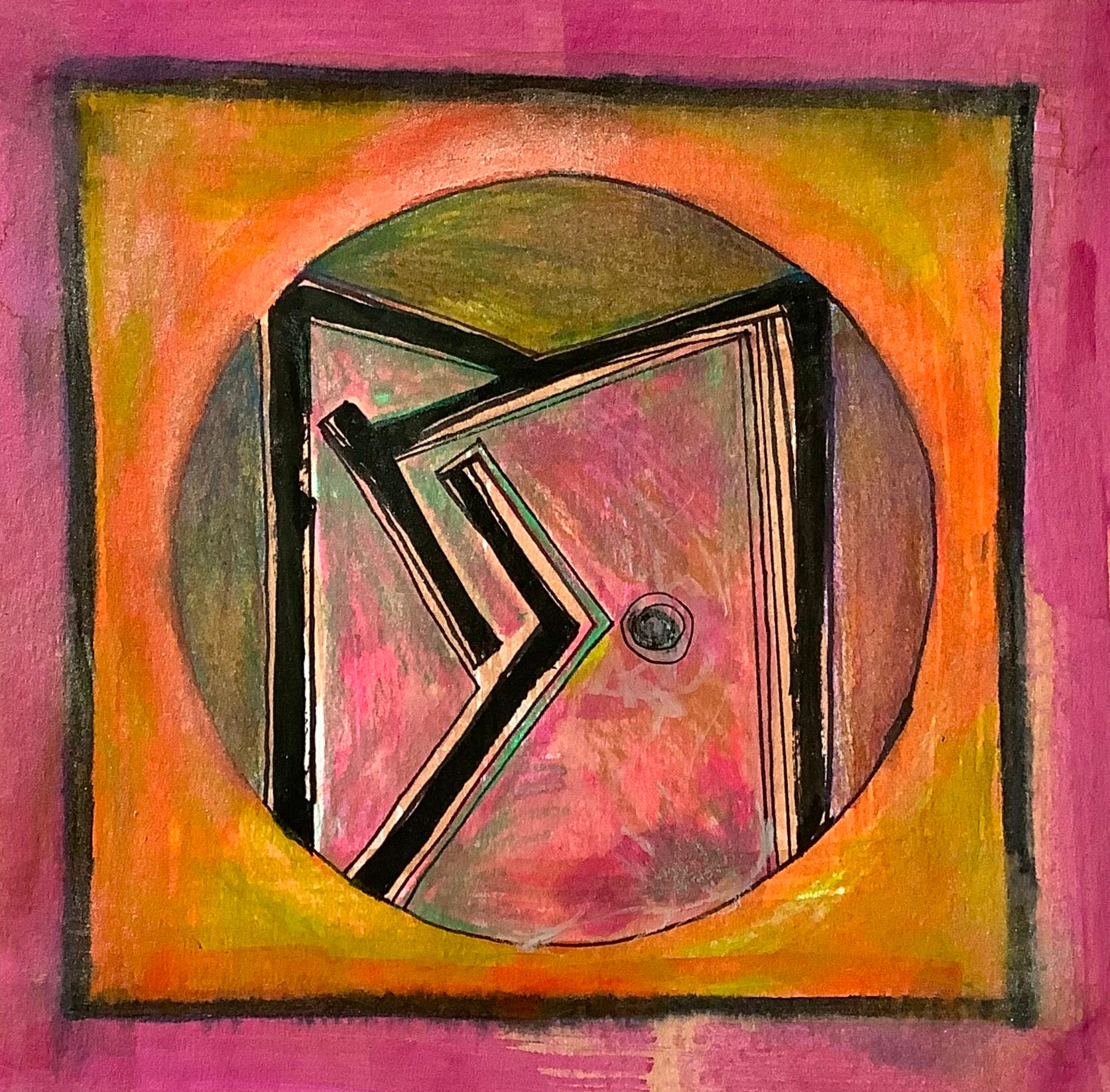
Elder Futhark provides another portal for discovery with an asymmetrical, unplanned approach. The student works with a phrase using connected runes, color, and pattern, placed one at a time on the page, working out from the center. Equidistant, concentric, topographical shape progressions boost the student’s awareness of the design potential of enclosed shapes vs. using an amorphous “background” area. Directional forces of the runes are strong, and require specific attention for harmonies to build and integrate. The color fills require careful management of watercolor or gouache in tight spaces. We try to keep the inline white border clean and well-defined. This exercise inevitably produces an image with an amusing sense of character, which could certainly be exploited in cartooning.
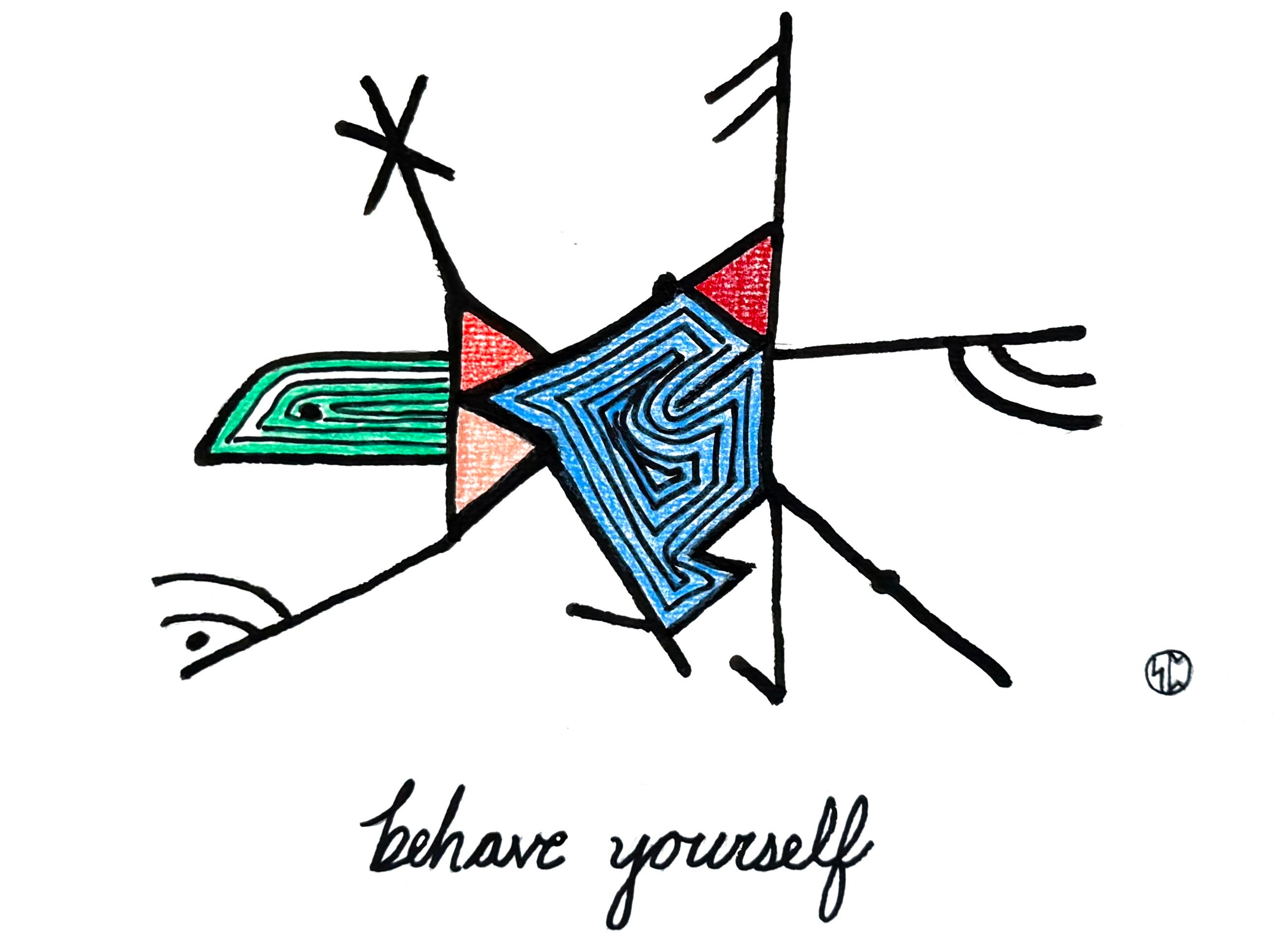
A second student image shows a further grasp of the illustrative effect!
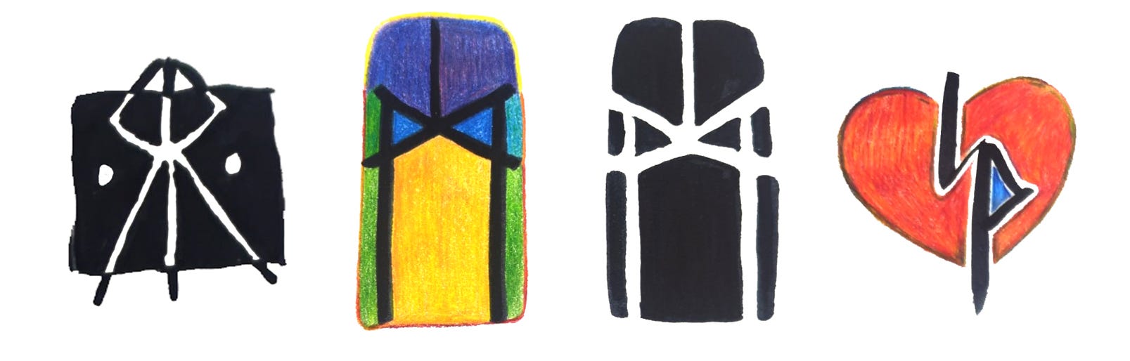
Making your own runic monogram is a logical way to engage in your self-branding while discussing all the design problems that crop up. It’s one of our earliest design exercises, and gives the student a small emblem for their signature identity. Fitting two or three runes into a compact space takes a wealth of rough drafts to approach the integration of elements.
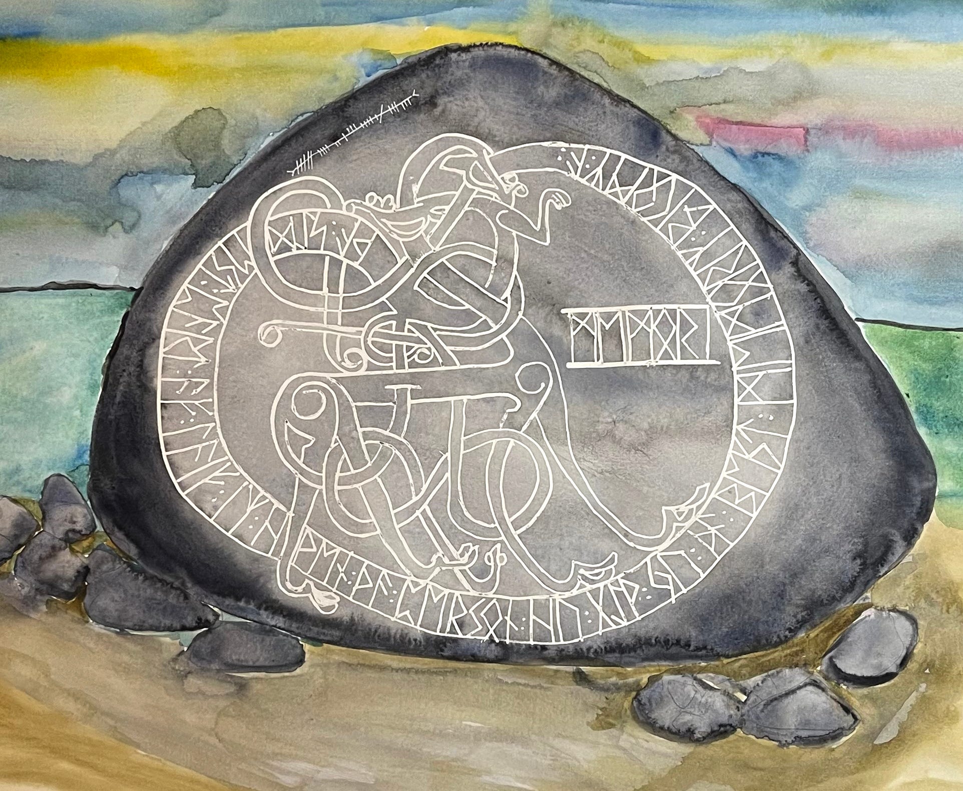
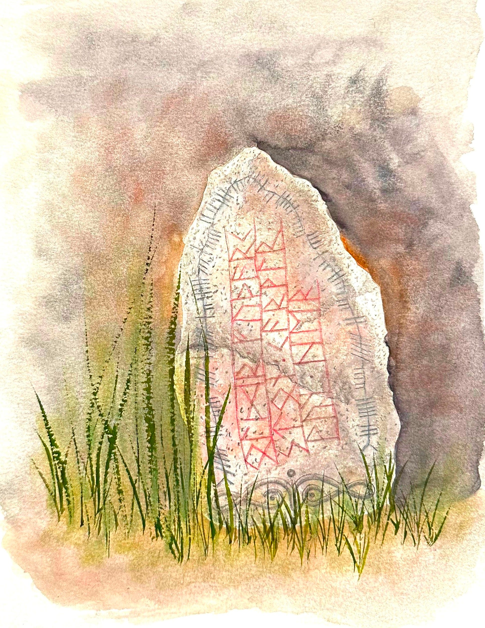
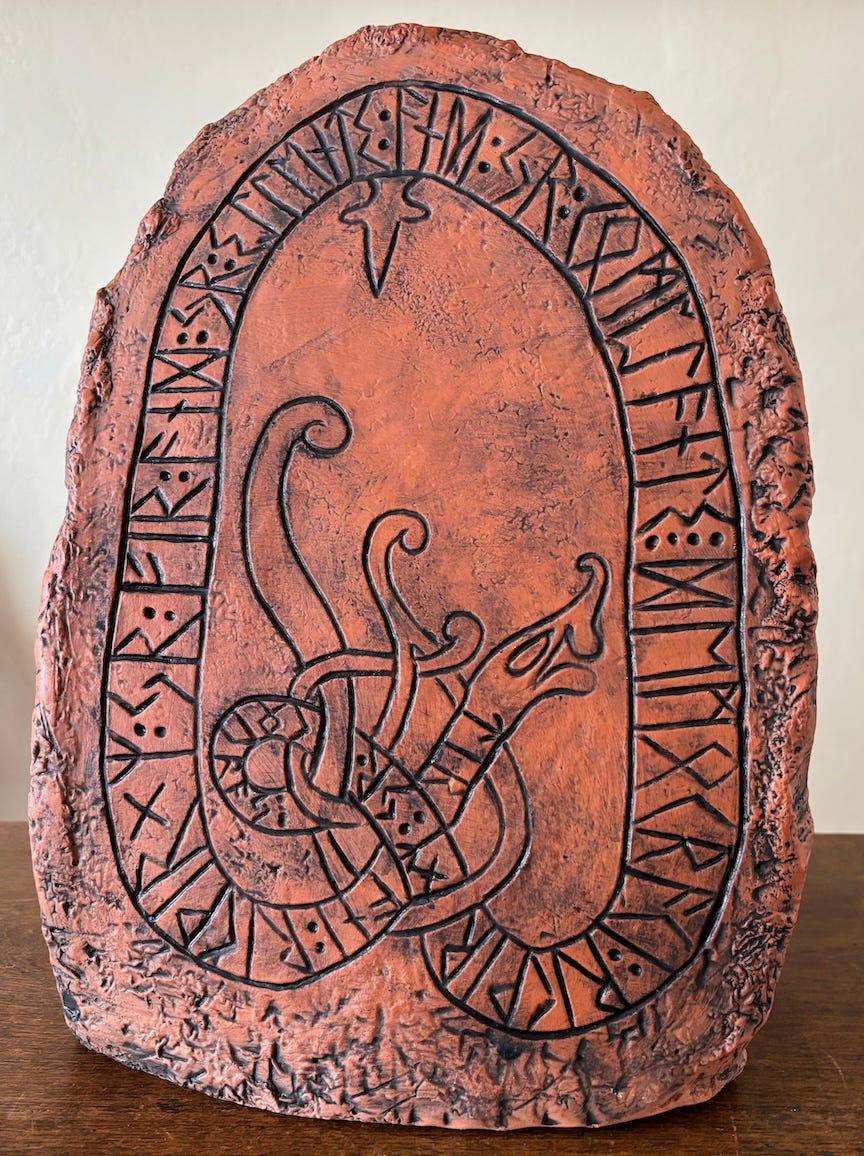
By the fourth week everyone is comfortable enough with Elder Futhark to tackle a runestone drawing! The class was diverse, with many newcomers to illustration and others who have been in the arts field for a while.
One student is a well-known ceramist and opted to make her runestone in clay. The design is really interesting, inspired by our study of historical runestones.


We also tackled collage designed using runic elements and other found and created elements that promoted thinking about translucency and abutments, hierarchies, color balance, and movement.
Throughout the class we work with many different kinds of tools, resist media, and papers. Students use their new folded pens, ruling pens, and brushes on different surfaces, from rough watercolor paper to rice paper. The results are informative and satisfying, and open new avenues for artwork.
We take a close look at all runic writing systems, becoming familiar with Ogham, Elder and Younger Futhark, Futhorc, Anglo-Saxon and Medieval runes, and even Scandinavian Short Twig and Staveless runes. We use them for variety and contrast in multilingual broadsides and other art pieces. I will share these in a future post, as final work is still coming in!
With thanks and appreciation for the hardworking and inspired students in this class, who show up with such enthusiasm!
Thank you all for reading and enjoying my posts. It’s great to be here with you.
NOTE TO ALL: This blogpost on Substack will always be free. The “paid” area is more interactive, with activities, discussion, and conversation. Your contribution is always appreciated, and helps keep things coming your way.
PAID SUBSCRIBERS: All paid subscriptions are now $75 annually or $7.50 monthly. I am eager to devote time to interactive projects and individual discussions on this basis. For you, it’s an ongoing investment in your graphic skills and performance in the book arts, handwriting, letterformation, and calligraphy.
EDUCATIONAL DISCOUNT: I’m now offering a special 50% discount on the annual paid subscription for art instructors and those in the art education field.
A paid subscription gives you access to ongoing conversations on my chat feed, permanent access to all archives, and access to exercises and how-tos. Let’s continue to talk about art and keep it fed, nourished, and productive.
Dear Ann, Congratulations on inspiring such beautiful historic work, as well as modern creative interpretations.
As a techno-historian, I would like to make an observation on a salient visual feature of the Runic script. Do you know why Runes have no horizontal strokes, only diagonal and vertical ones? (If you mentioned it in your post, I apologize for missing it!)
The main *surviving* medium on which we find Runic inscriptions are runestones and metal objects, such as jewelry and weapons. But the major medium for *writing* and *developing* the script was slats of soft wood like pine or birch, engraved with a dagger, *not* pen and ink.
These woods have a very assertive grain; cutting *across* the grain at right angles or diagonals is relatively easy. But if one’s going dagger cuts *along* the grain, one could easily split your slat; one must take a special care with all of these. I am sure that splitting one’s writing tablet happened so danged often, that they soon learned to avoid horizontal strokes entirely.
(The scripts of North India —Sanskrit, Devanagari, Bengali, Tibetan, etc.—, inked on paper with a broad nib, developed a very assertive horizontal “headline“ (with their nibs cut and held in such a way to create a *negative* 45° pen-angle!). But scribes in the South wrote on the leaves of the talipot palm, and, like the Vikings, preferred to scratch into the surface rather than write in ink. (After scribing on these leaves, they darkened the letterforms with a kind of scrimshaw technique: smearing the page with soot, then wiping off the surface, leaving the scratched lettering blackened.
Like pine, talipot leaves have a strong horizontal grain, which would easily split along that insistent grain. I believe that is why Southern Indian scribes twisted those “headlines” into curls or knobs, in, say, Singhalese or Malayalam, to avoid splitting their leaves…).
I am always charmed by simple explanations for stuff like that. It satisfies my need for Occam’s Razor.
These are great and the leather one is quite impressive. Bravo!