

Calligraphy on Mats
Adding calligraphy to a matboard provides information and enhances the artwork.

Working with your framer
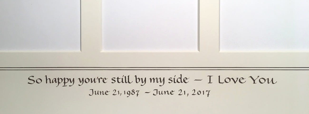
Commemoration, titles, descriptions, messages
Whatever can be framed, can be labeled for posterity. We like to identify the people in a photo, add the title of a print, or indicate the place and date of a special event. It helps to define the image. Who is it, when, where, how, and why is it important? A label provides detail that adds information, style, and mood to the image, for the benefit of posterity. It is ultimately a collaboration between the client, the framer, and the scribe.
There are many styles you can use for your writing!
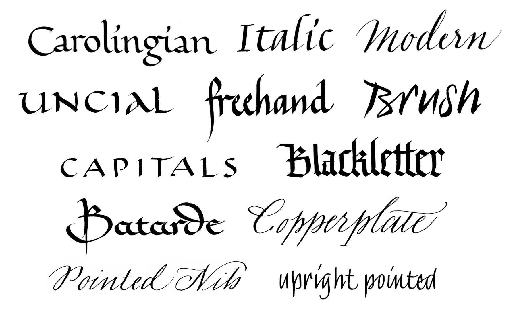
There are some things to consider when providing mat calligraphy, whether you get the job straight from your client or through a framer.
Vet the mat
The type and quality of the matboard has a definite impact on the outcome. There are a number of archival choices when you visit the framer, but not all of these are optimal for all calligraphy. Test your inks, nibs, and lettering styles on a variety of boards, as there are many variables that affect the outcome. You get one chance to do it right, so the pressure is on.
Ask your framer for some scraps to test using your own media and tools and do the prep work! If the mat is pure cotton, textured, or fibrous—even if it is archival and of the highest museum quality—it may not cooperate with your media or pen nib. A too-sharply pointed pen nib, for instance, may catch a fiber, sending ink off in every direction and causing a bit of chaos.
A too-soft mat might absorb too much of the ink and bleed out with a blurred or fuzzy edge, preventing a nice crisp stroke. Once a mat is ruined, a second one needs to be cut, and at whose expense?
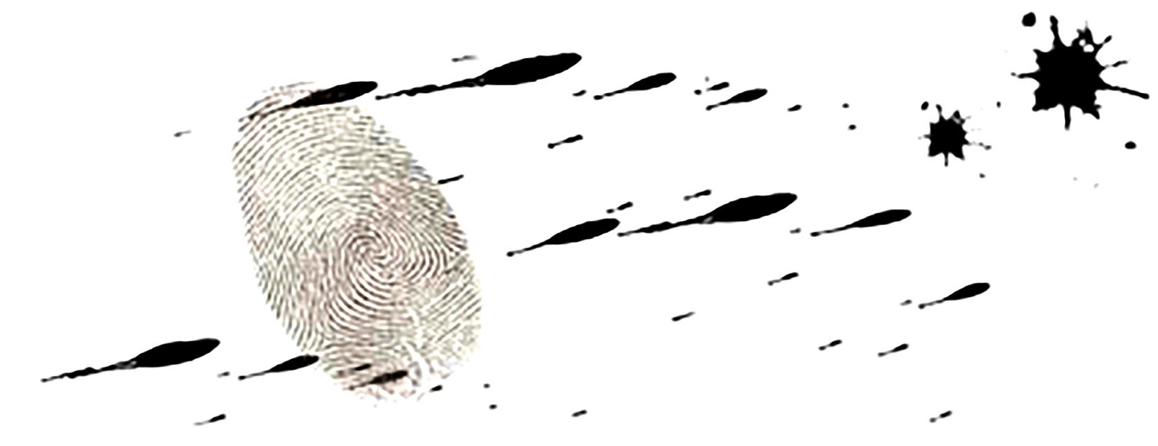
Care must be taken to keep fingerprints and other debris from hitting the mat. Use a guard sheet to keep the visible working area as small as is practicable. Half gloves are an option.
Test the ink
Archival, non-fading ink is needed for longevity. A good sumi, stick ink or bottled, will work well. An acrylic ink such as Ziller’s Soot Black is also good, and is also waterproof. For custom color mixes, gouache works well, especially if you use the most lightfast hues. Many pigments, especially in the red to violet zone and most dye-based inks, are not lightfast. Some colors take a very long time to dry, and some never quite dry, depending on the chemistry of the pigment and type of solvent or agent. I’ve had to restore official documents and wedding certificates that were signed in black marker that had faded to pale yellow over the years. If the mat will be exposed to direct sunlight it’s best to use acrylic ink.
Know your nib
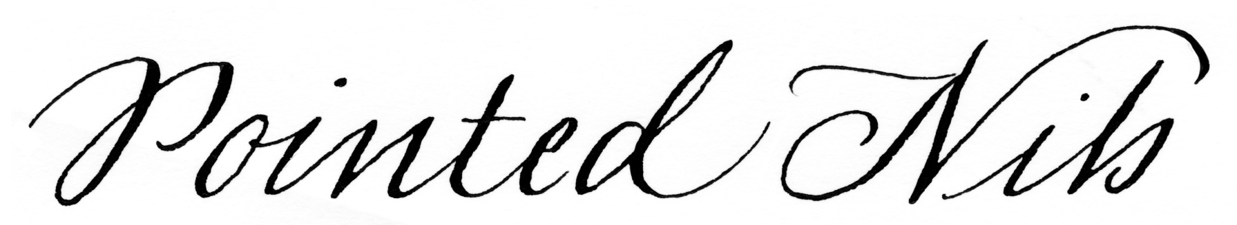
The nib needs to be a good partner for the mat. If the client wants a fine Copperplate style, you will need to make sure the mat will work with your pointed pen nib.
If the image to be framed suggests a bold style, make sure that the amount of ink applied to the mat is not excessive. The larger or wider the nib, the more eagerly the ink flows out. Avoid overfilling the reservoir. Tap the top of the nib on a lint-free cloth to remove excess. Fix a few inches of masking tape or blue tape to your board and make a short stroke to start the flow. This avoids a typically thick or dark first stroke.
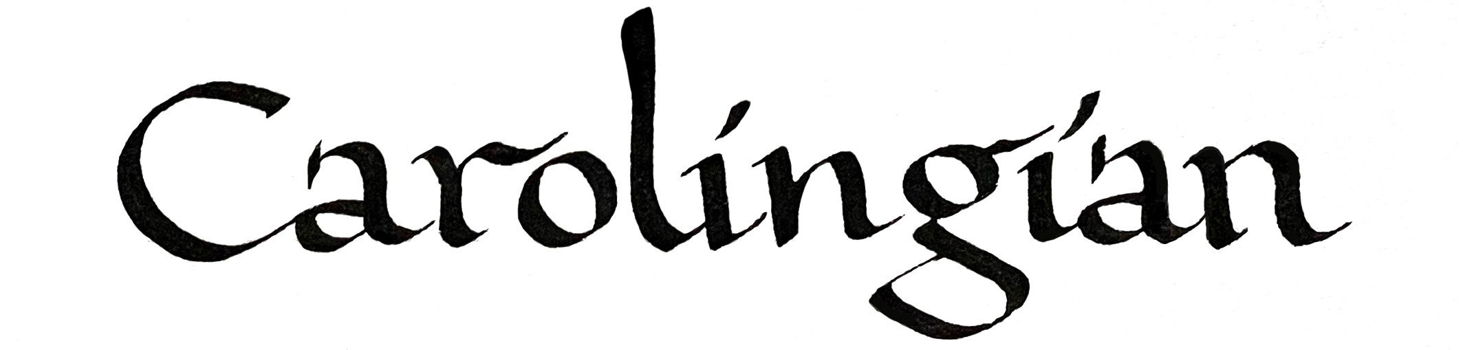
Style choice
The style of writing should be appropriate to the subject of the artwork or photo. Do your best to interpret the historical era and feeling. A tight rough draft sent to the client is the next step followed by a final draft if necessary. Very light rules with a .03mm lead will be needed for precision.
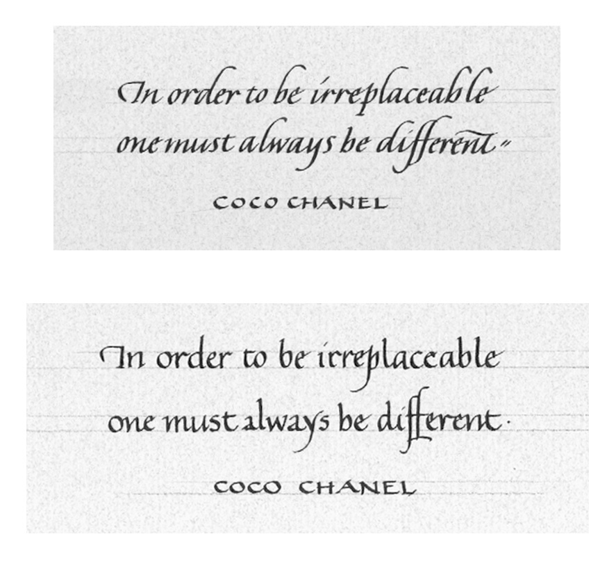
The final draft is not “extra” work. It solidifies the form and rhythm so you can focus exactly on what you will be doing with each letter and word in the final version. It puts YOU at ease and gives one more chance for the client to proof it.
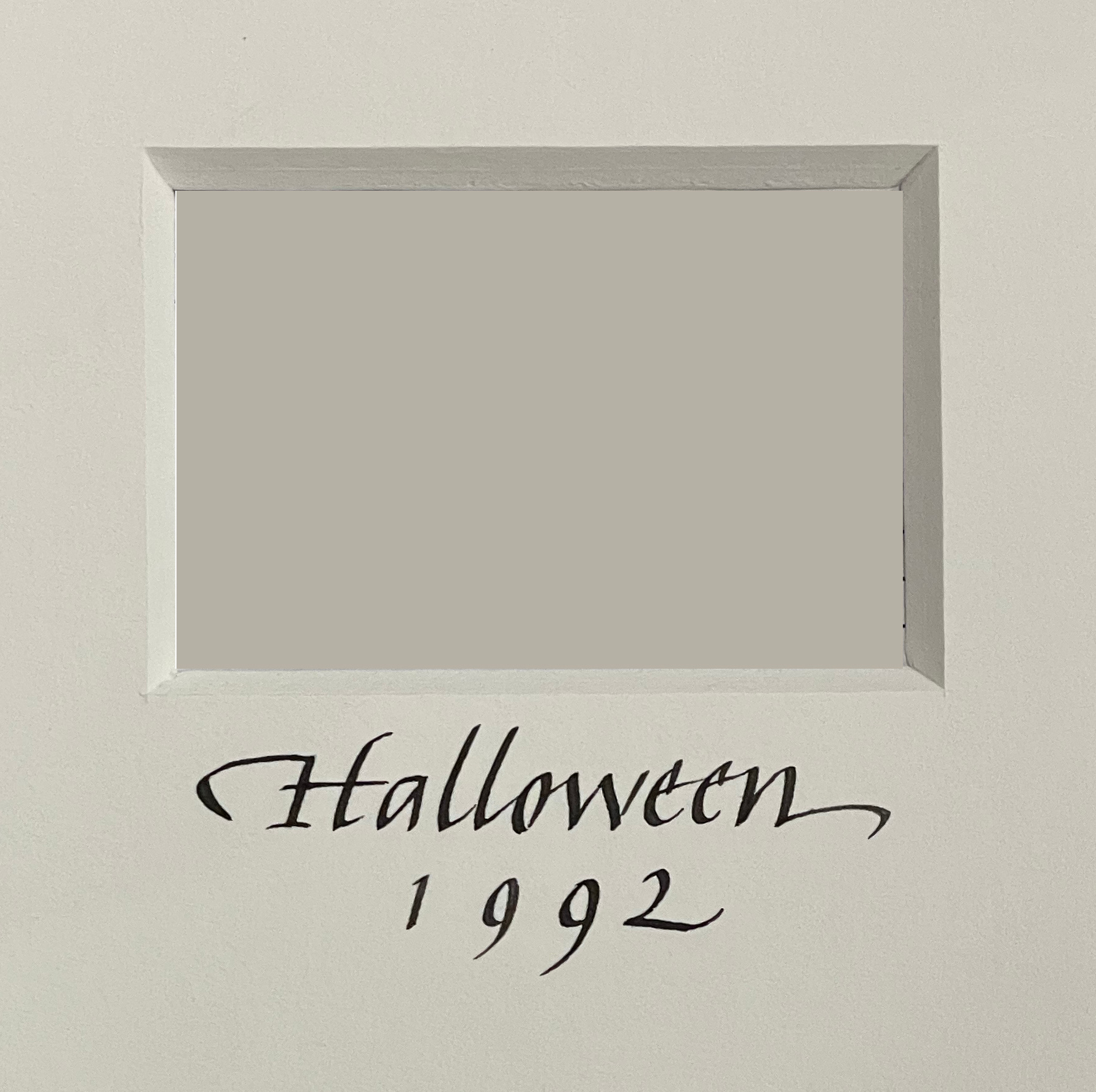
Some mats are very personal. For the example below, my client wanted to display three photographs documenting her husband’s motorcycle accidents over thirty years. I used a simplified double French rule around the openings. Check out the traditional method here. Be tidy and be ready to measure correctly!
You can make your own interval tool for aligning French rules at the corners as described below:
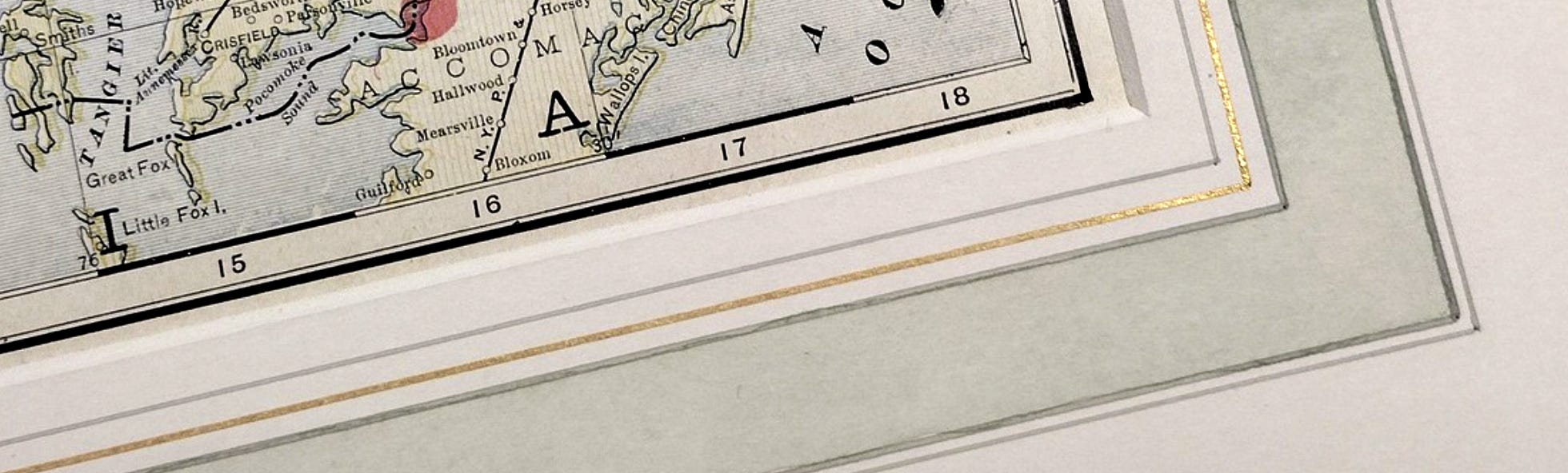
Decorations around works of art on paper started with Vasari in the Italian Renaissance. In the past, the corners were pricked and borders ruled with iron gall ink. You can make a guide with a strip of matboard, 2-3" wide, which has been cut on a bevel from side to side at a 45º angle. The intervals for the lines are marked on the bevel and the strip is laid along the edge of the mat opening. Corner points can be marked at each angle of the window, with light graphite or a pin-prick, just enough to be visible. Inking the lines with acrylic has the advantage of being waterproof, allowing for the later addition of color wash between the rules. Gouache is formulated to go on evenly with the brush, making it an ideal medium for the color panels.
The traditional French mat formula
A set of interval measurements was defined by Giorgio Vasari in the 16th c.
The first line is ¼ inch from the opening of the mat all the way around. The second line is 3/8 inch from the first line. Draw a line 5/8 of an inch outward from the second line. Draw the fourth line 1/16 inch from that line. Finally, draw the last line ½ inch from the previous one.
In the example below the artist has altered the intervals a bit, but kept the style and spirit of the French mat!
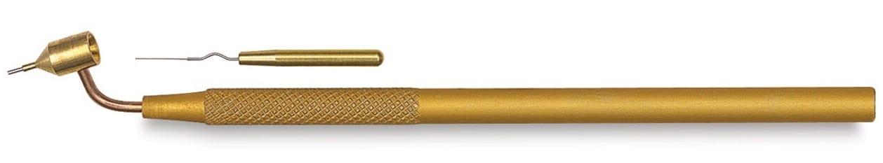
The Kemper fluid writer tool is used to achieve consistent, clean rules, especially with pigmented color. Mix your color—acrylic gouache, watercolor, or ink—and load it with a small brush into the well. The needle is used to start the flow and for later tool cleaning. Holding the tool with the well in a vertical position, test the line quality separately, then rule your borders against an inking ruler, aligning at the corners.
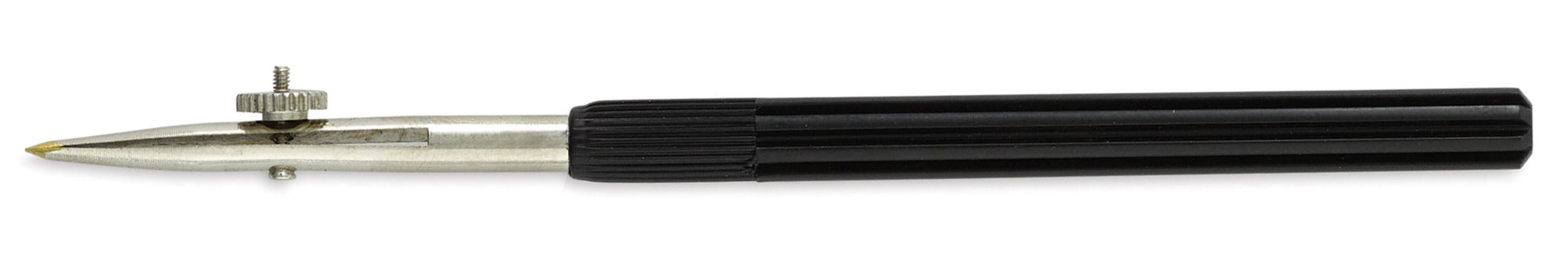
For even more precise rules of varying widths, especially those smaller than .25mm, use a fine quality draughtsman’s ruling pen.
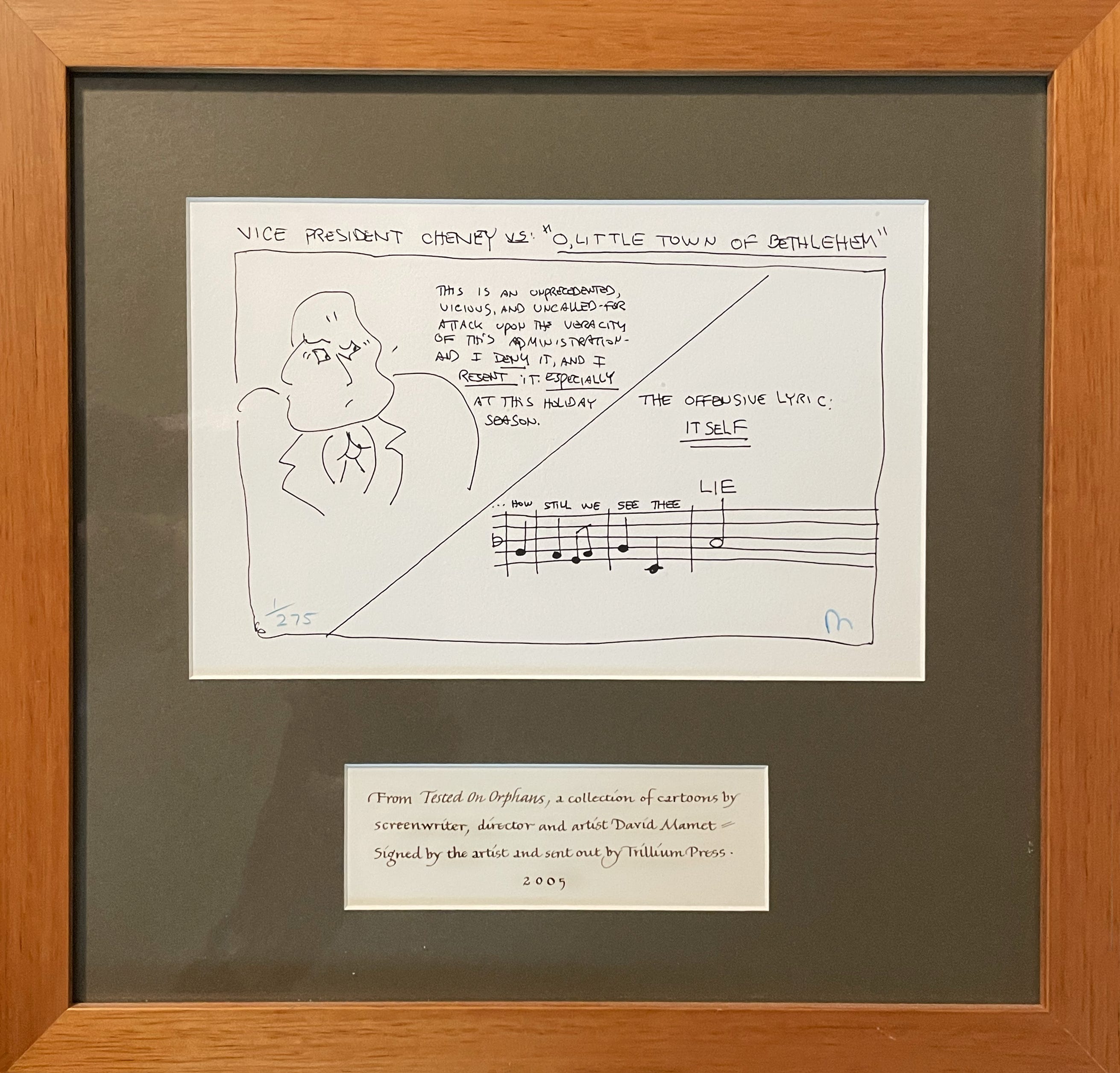
Finally, there are ways around the task. You can write on a separate sheet and cut a small opening for your text. For instance, I eyeballed the lettering when writing this description for a small print of a drawing by David Mamet, just to hang in the house. No ruler was harmed in this process!
When it comes to labeling your framed treasures, take a few steps toward making it more enjoyable!
Next week: The subject will be our annual Silicon Valley Open Studios in San Mateo, May 11-12 from 11-5pm!
Thank you all for reading and enjoying my posts. It’s great to be here with you.
NOTE TO ALL: This blogpost on Substack will always be free. Upgrade to Paid for interactive activities, individual comments and discussion, and content-rich articles. Your contribution is always immensely appreciated, and helps keep things coming your way. All images copyrighted by Ann Miller unless otherwise noted.
PAID SUBSCRIBERS: All paid subscriptions are now $75 annually or $7.50 monthly. I am eager to devote time to interactive projects and individual discussions on this basis. For you, it’s an ongoing investment in growing your graphic skills and supporting your performance in the areas of book arts, handwriting, letterformation, and calligraphy.
EDUCATIONAL DISCOUNT: I’m now offering a special 50% discount on the annual paid subscription for art instructors and those in the art education field.
A paid subscription gives you access to ongoing conversations on my chat feed, permanent access to all archives, and access to exercises and how-tos. Let’s continue to talk about art and keep it fed, nourished, and productive.