


Antoni Tàpies and Calligraphy
The art of Antoni Tàpies connects us with our deepest roots.

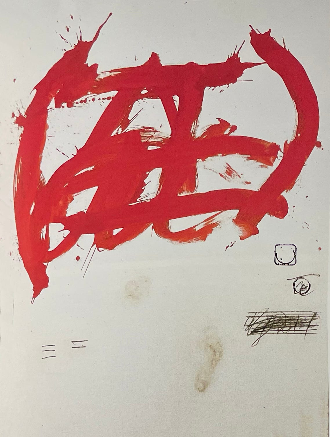
One large letterform at a time?
At first my subject for this week was going to be limited to how renowned Catalan artist Antoni Tàpies (1923-2012) used letterform in his work. But the subject is huge, so I will cover some of the aspects of his work that I love, how it feels to experience it. His life work is rewarding, and deserves a deep study.
Tàpies accepted the challenge of living as a visual artist, translating into enduring materials a synthesis of his experience and observation. He wrote with his full body and mind onto the largest available surfaces. He wrote in metaphor and symbol, creating new objects from disparate, unusual, and groundbreakingly contradictory elements; his art stood for itself. It didn’t represent, mimic, or attempt to describe anything other. His direct marks and geologic surfaces revealed, perhaps forensically, his hand and body motions, handprints and footprints. He embraced the reality of common objects, combining them in a fusion of thought and action, and infusing them with his natural understanding of the constellations of literature and the full span of history, along with a deep respect for Eastern thought.
The highest wisdom adopts the humblest of bodies. - Antoni Tàpies
His family were well-established in Barcelona. His political awareness came from his father, a Catalan lawyer and activist, and his understanding of book arts, publishing, and religious thought arrived through his matriarchal heritage. From these deep roots he fashioned his own visual language.
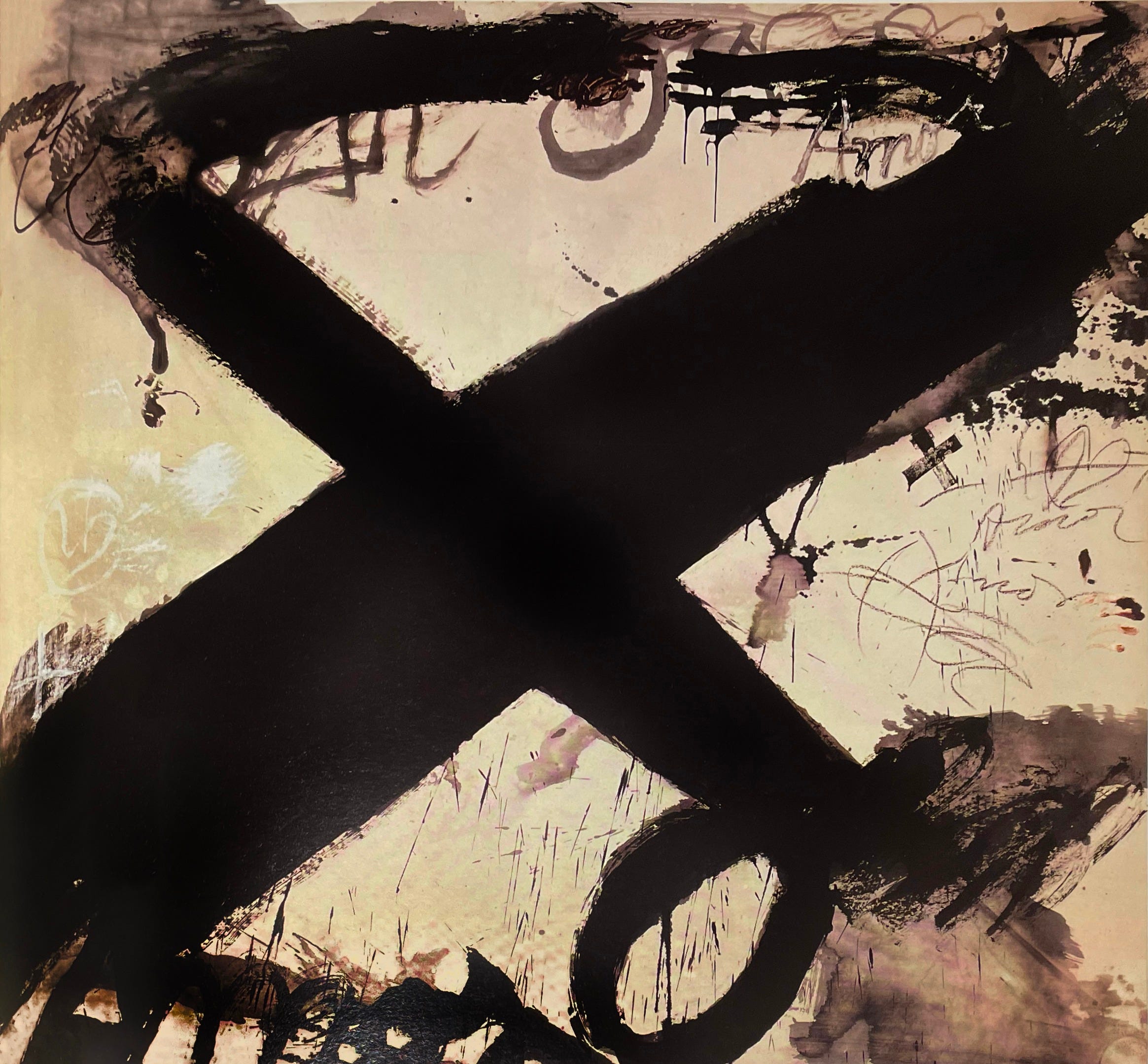
Letterform and Symbol
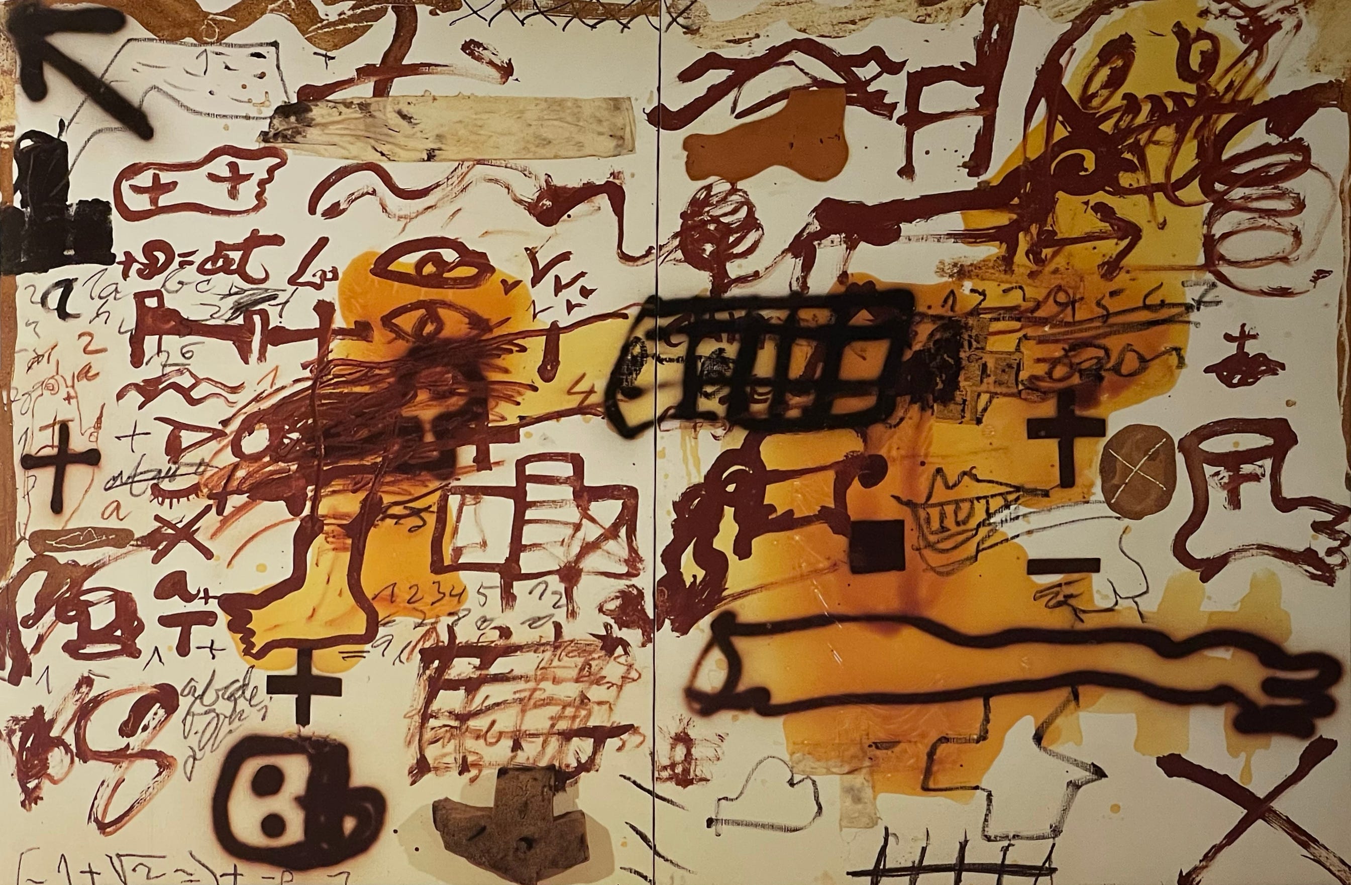
"The images of the cross and crosses, of opposing lines and planes, of the intersections of opposing forces, etc., in many cultures are considered a fundamental symbolic representation of the world". - Antoni Tàpies
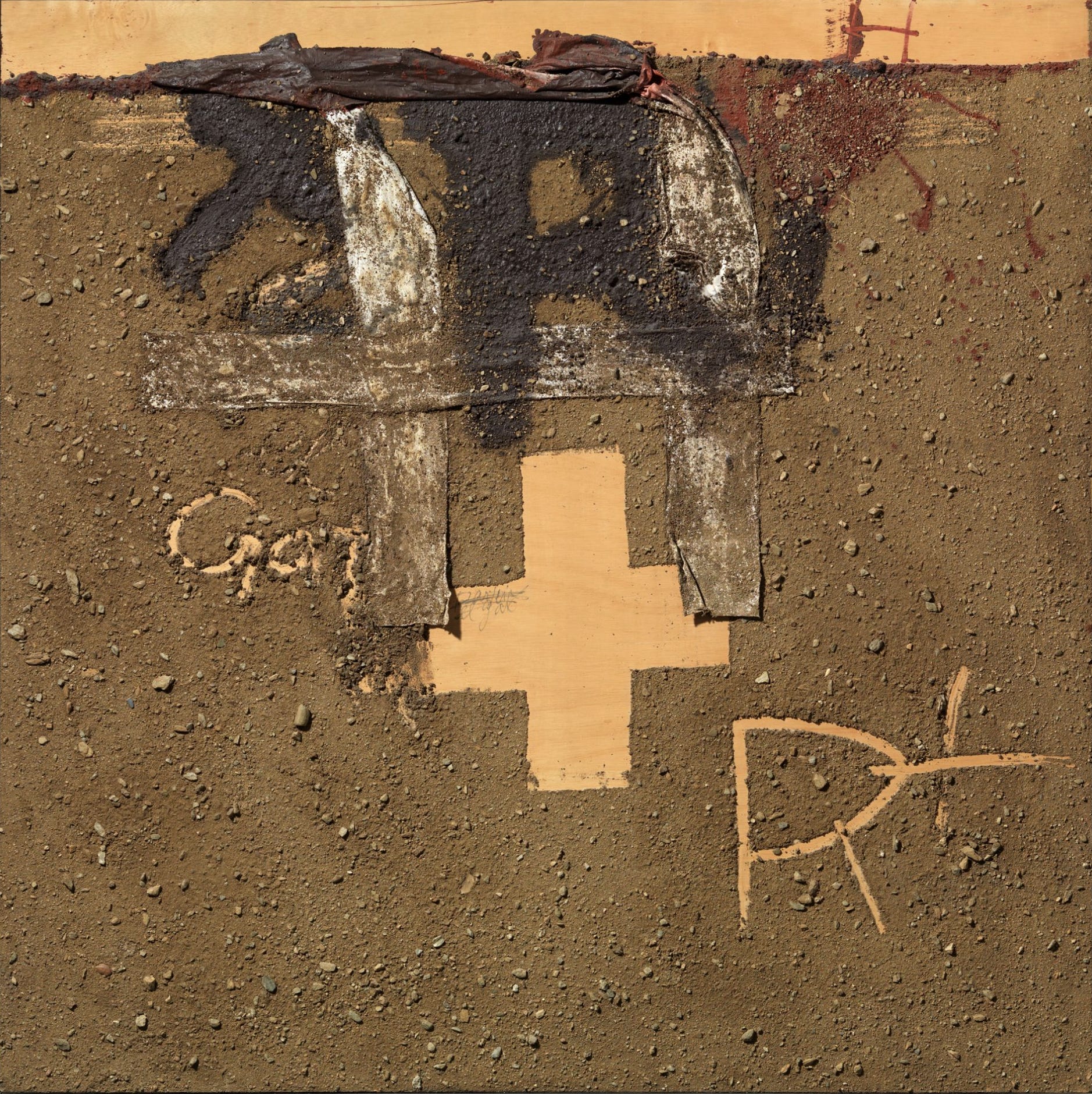
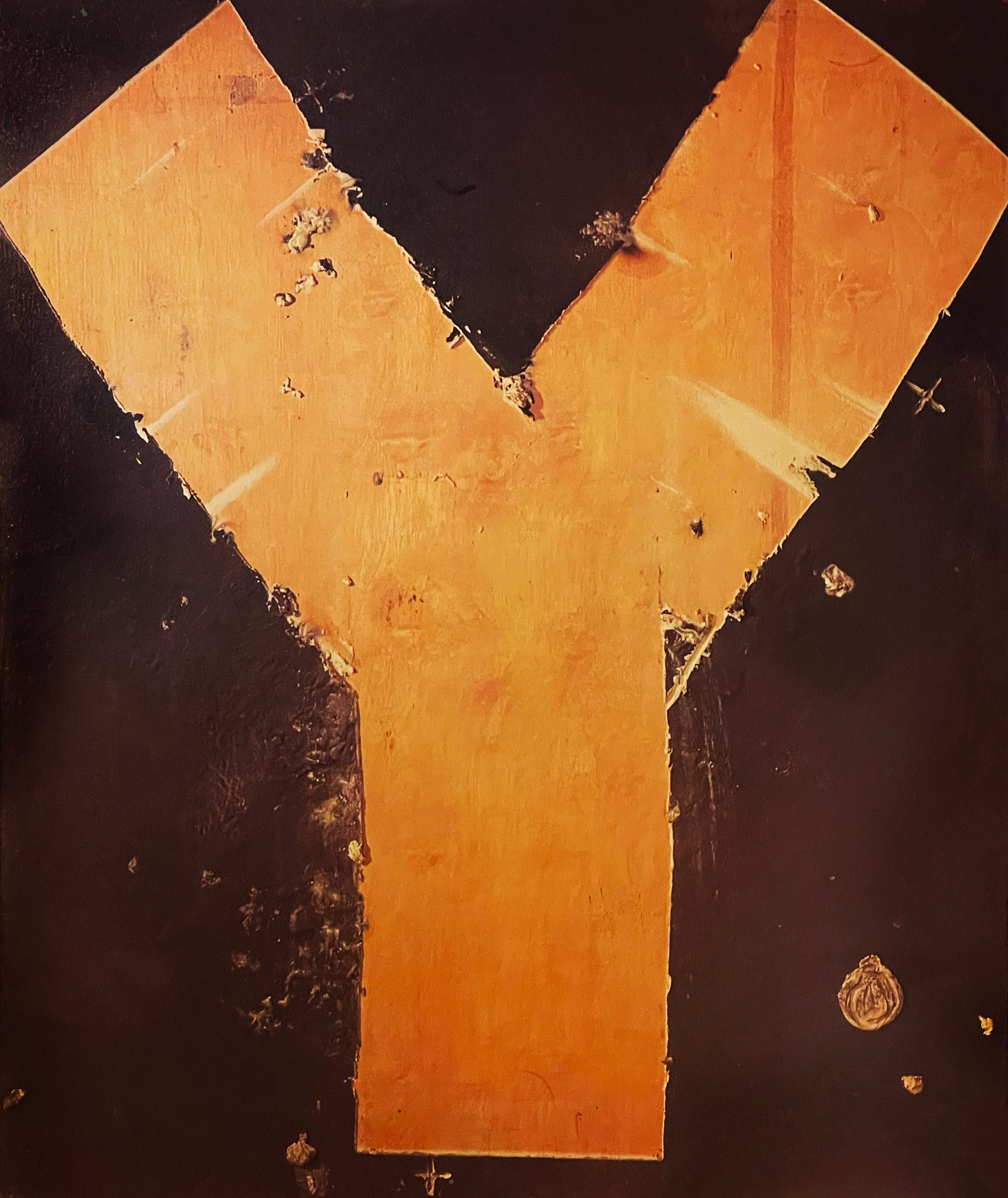
Quick response to thought and the experience of full engagement live alongside trails of matter and scribbled words. His visual vocabulary repeats images: the cross or X, the hand, leg, or foot, the diagonal with or without the box, the tilted letter T, the numeral 8, and many others you’ll find. He incorporated familiar physical objects such as shirts and socks in his work, appreciating their reality and the shapes they contributed to the composition. He studies how things behave. Amor and the heart are ever present.


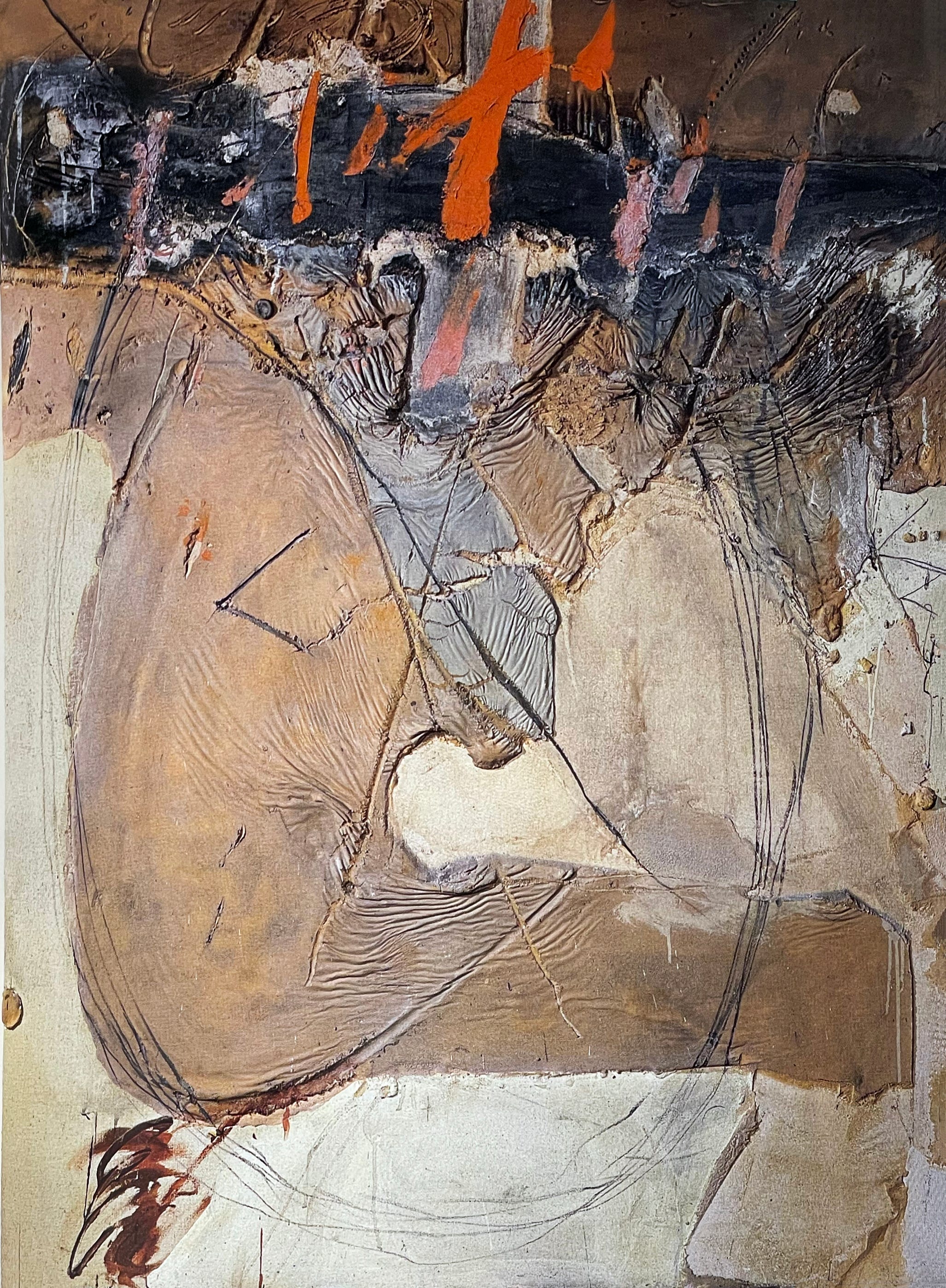
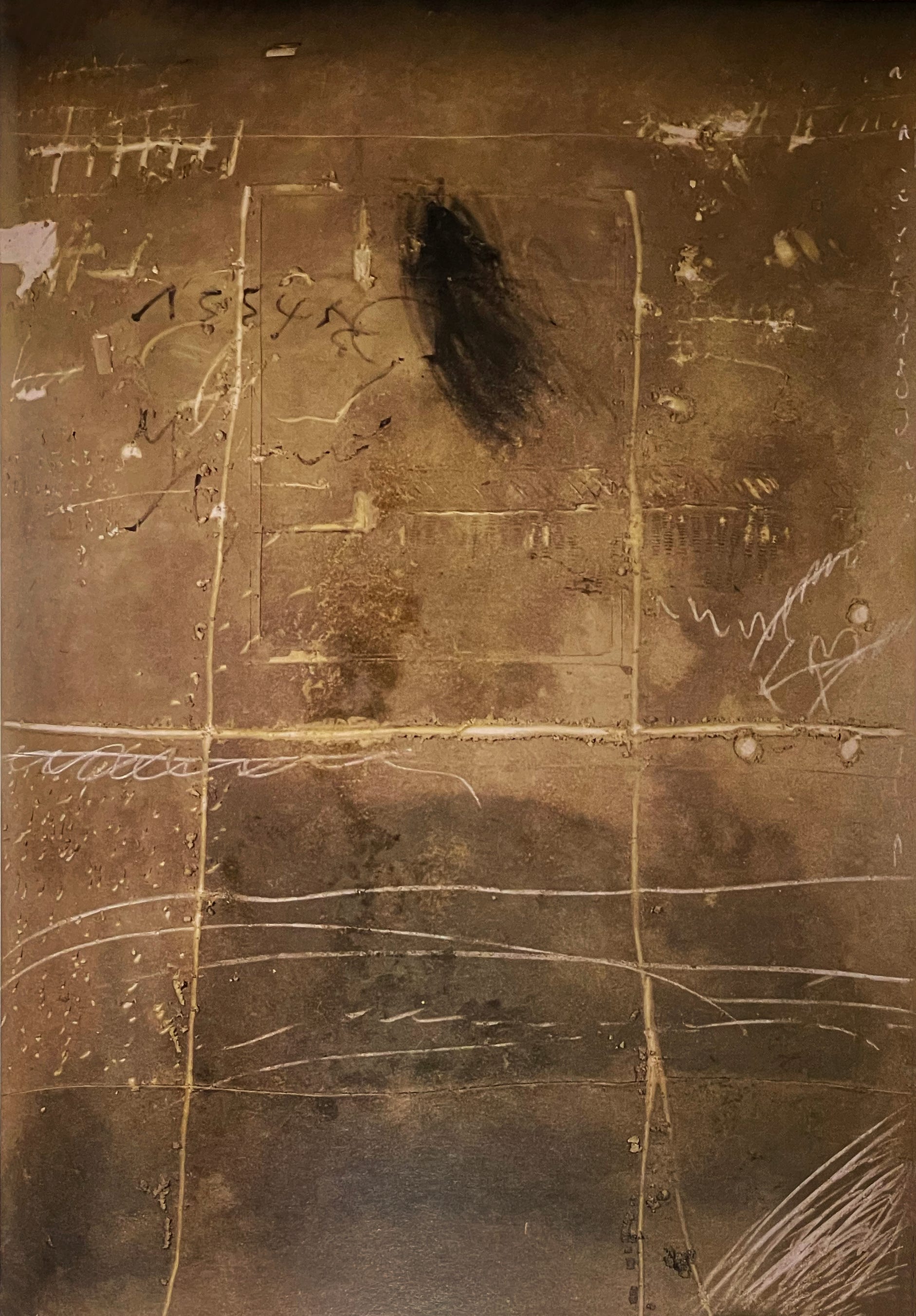
Texture
Take in the deep textures as you follow his movements through the material, or matter. The polarity between substance and non-matter is everpresent in his work.


He mixed sand and marble dust into his paint. This Great Painting piece is reminiscent of a vellum or skin. Note the negative T shape at the right margin. He often painted on unfolded cardboard boxes.

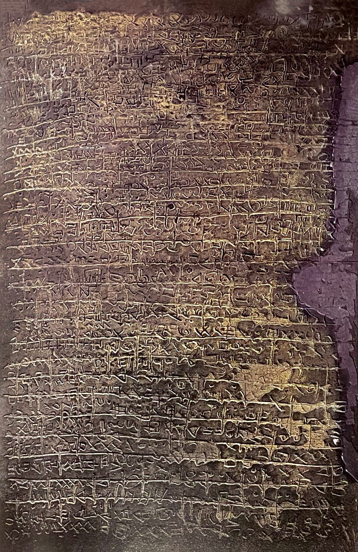
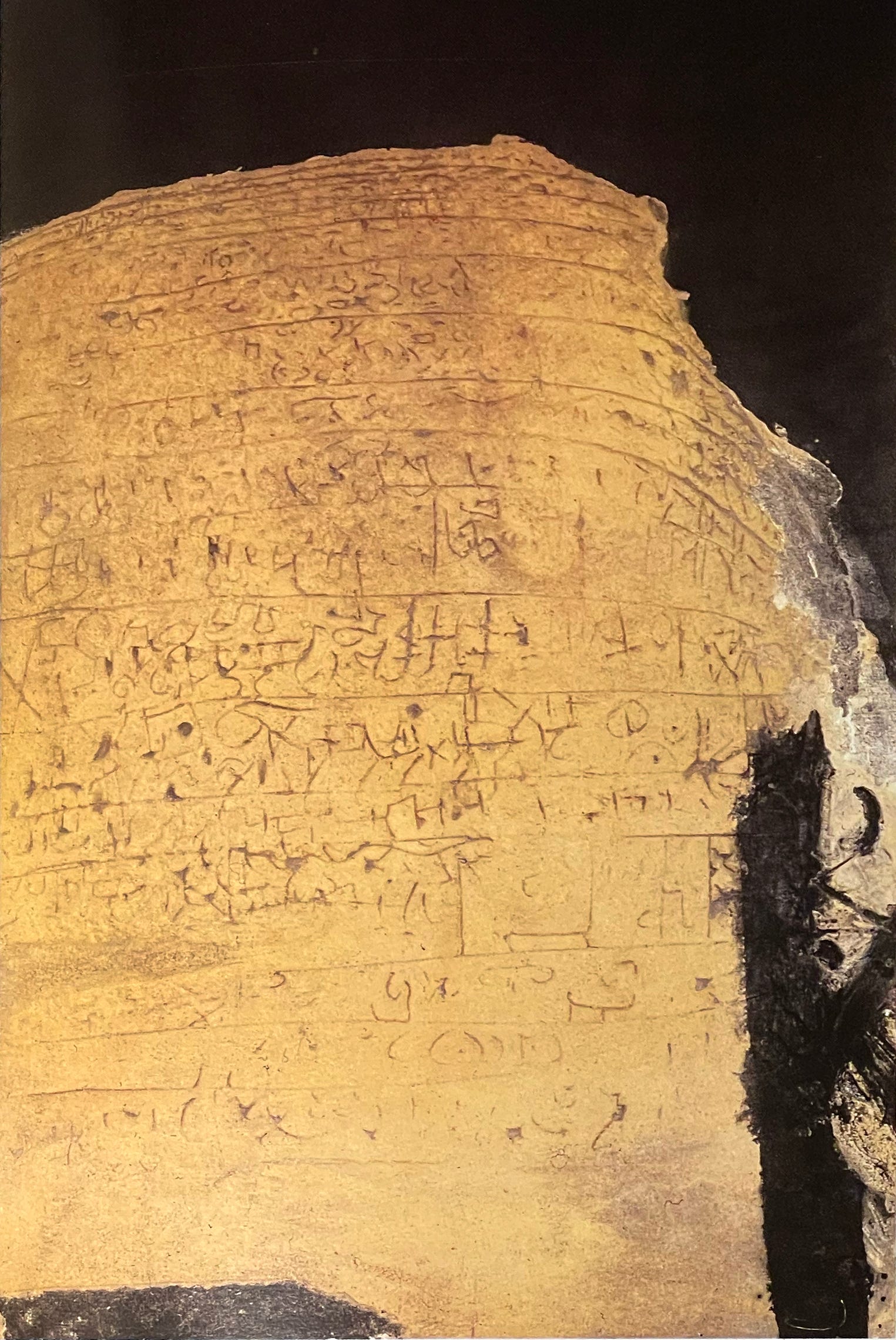
Calligraphy, hieroglyphics, and graffiti
Many works use a grid, referencing writing, architecture, or book arts. We see tallies, graffiti, numerals of varying sophistication, and gestural motions. Note how he solves the corners of his images.

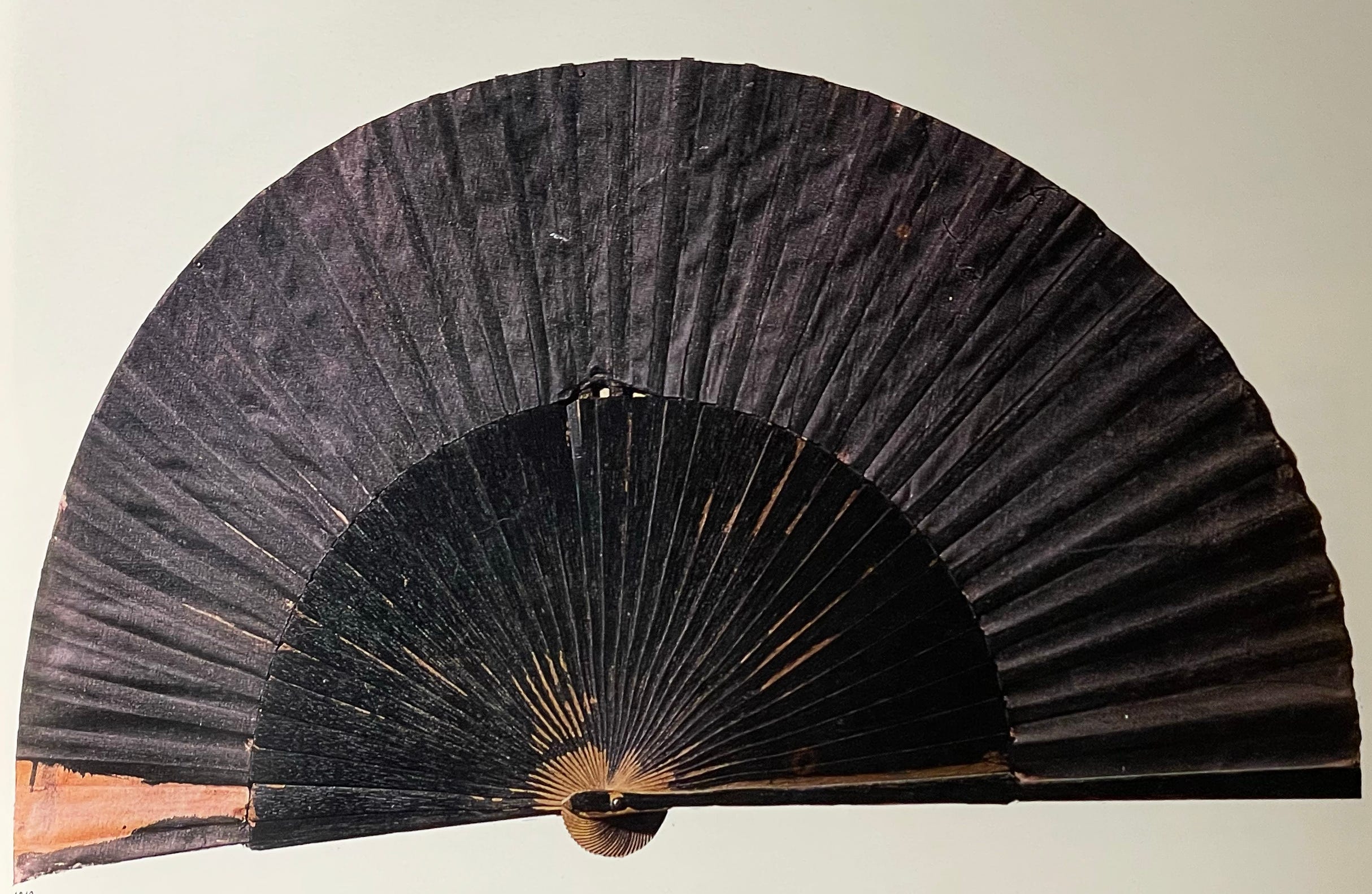
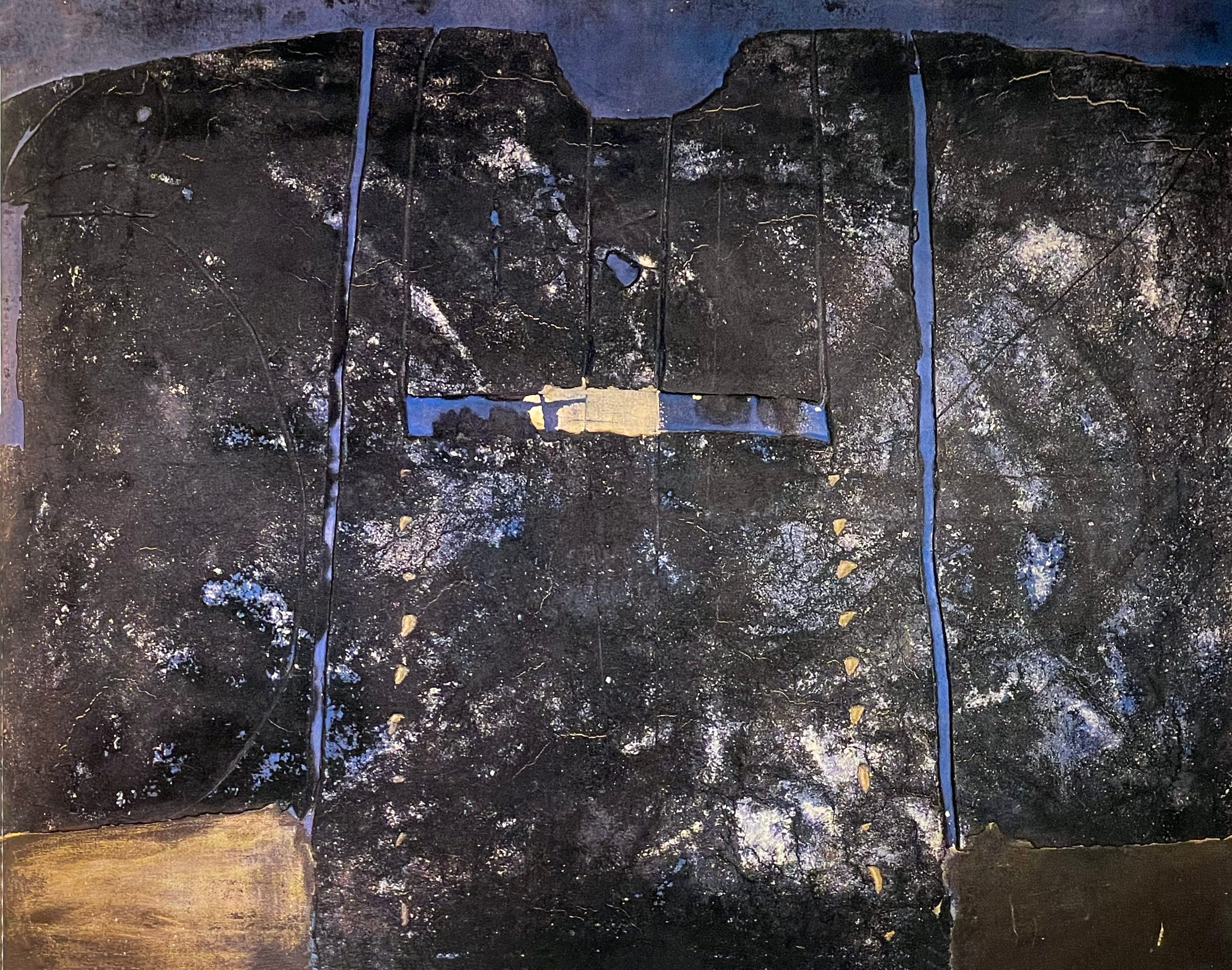
Eastern Influences
The aesthetics of the East were an important subject and influence in his thought process.

These objects reflect the actual Japanese fan and in Blue Painting you see a kind of kimono shape.
This Composition In India Ink resonates massively with its tatami style grid, the spots of splashed ink, the feathery stroke with just the tip of a large shodo brush, and then his sumi-dipped footprints walking across from top left to bottom right. Three passages, three kinds of presence. You know this piece was done on the floor.

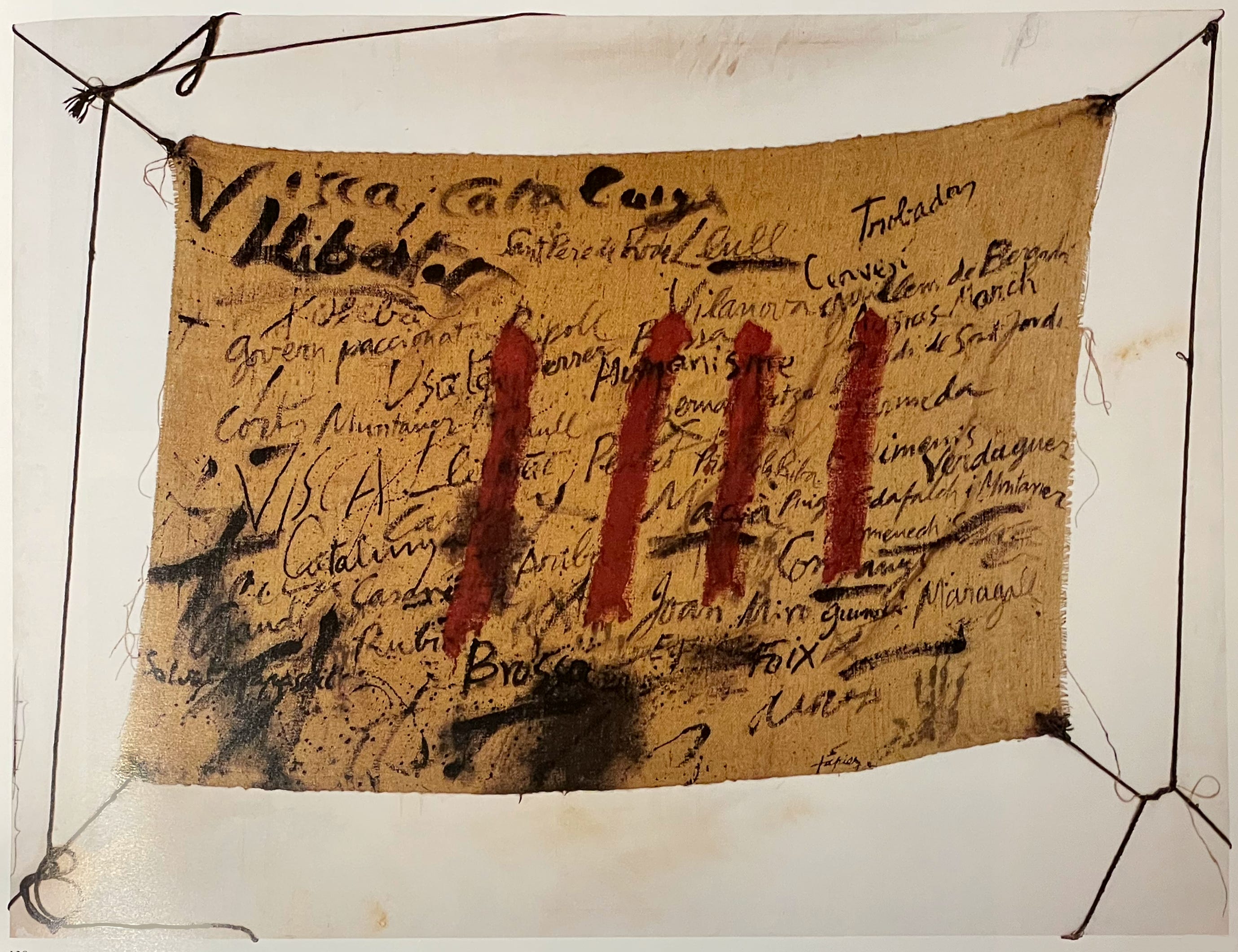
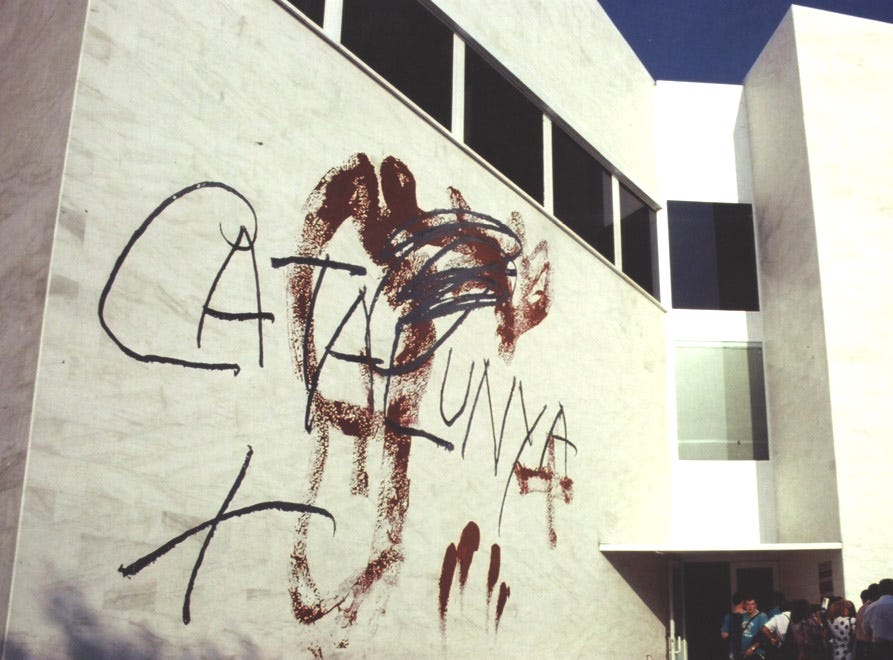
Political Activism
His work speaks volumes for freedom and support for protesters. He was one of the few artists to remain in Barcelona during the Franco period.


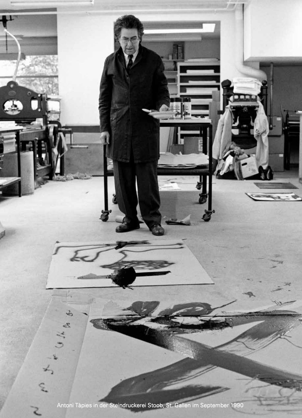
A photo of Antoni Tàpies working at St. Gallen. He worked in many places and onsite, but most of all in his own studio in Barcelona.
Read more on Tàpies. Infuse yourselves with his enormous body of work as best you can, perhaps in your local library armchair. The books are heavy, I’m warning you. One five-volume set in my library weighs over 50 lbs.
LINKS
Pace Gallery Article, 2019
The Guardian, Obituary, 2012
Gallerie Boisseree, 2019
His Barcelona Studio
Thank you all for reading and enjoying my posts. It’s great to be here with you.
NOTE TO ALL: This blogpost on Substack will always be free. Upgrade to Paid for interactive activities, individual comments and discussion, and content-rich articles. Your contribution is always immensely appreciated, and helps keep things coming your way. All images copyrighted by Ann Miller unless otherwise noted.
PAID SUBSCRIBERS: All paid subscriptions are now $75 annually or $7.50 monthly. I am eager to devote time to interactive projects and individual discussions on this basis. For you, it’s an ongoing investment in growing your graphic skills and supporting your performance in the areas of book arts, handwriting, letterformation, and calligraphy.
EDUCATIONAL DISCOUNT: I’m now offering a special 50% discount on the annual paid subscription for art instructors [your school.edu] and those in the art education field.
ART 50 - Calligraphy and Letterform class at Stanford Continuing Studies—my overview of the history, methods, models, and practice of handlettering—opens in 2 days, on Wednesday, July 9, and the first session is on July 16, 2025. Visit the Stanford Registration Page to download the Syllabus and Supplies List and register. Few spaces are available. All levels of experience are welcome, to enjoy an in-depth review of the basics of calligraphy (and beyond).